Sunday, April 29, 2012

Magnetic bookmark

I have a slight obsession with bookmarks. I've always loved buying and collecting them. I have a plastic pencil box overfilled with all different sizes, shapes and styles of bookmarks, some of them from when I was in elementary school. And when I pick up a book to read, I have to find a bookmark that coordinates with the book somehow, such as the color of the tassel matching the color on the cover. (It's silly, I know.) So making bookmarks is always a fun little project. Plus, many of friends and family members are avid readers, so they make a fun little gift add-on, too.

Supplies (all Stampin' Up!® unless otherwise noted):
Card stock: Not Quite Navy, The Thrift Shop paper pad (October Afternoon)
Accessories: Fun Flowers die, Perfect Polka Dots embossing folder, 1-3/4" scallop circle punch, 1" circle punch, Scallop Edge Border punch, magnet strips (unknown), Scor-Tape (Scor-Pal)

I've seen many variations of magnetic bookmarks such as this, but I had never made one myself before this weekend. It was really fun and easy, and you could replace the flower with just about any shape: a snowflake or a heart for a seasonal gift, a large circle with an image or an inspiring word/quote, or even a small photo matted on card stock.

This is the completed bookmark when opened.


To make my bookmark, I cut a strip of the floral patterned card stock about 1-1/2" wide by 8" long. (It is card stock weight, so it is heavier than just patterned paper.) I folded the strip in half and then opened it to punch the scallop edges. Tip: On the front of my Scallop Edge Border punch, there is a little notch that shows where the middle of the punch is. I slid my (opened) strip of card stock in the punch and aligned the crease with that notch. Then I punched out the scallops to the right, then the left, then turned the strip around and punched the other side. By lining up the paper this way, the scallops on the front and the back of the bookmark match up when the bookmark is folded in half but not on a page. (They aren't exactly perfect but very close.)
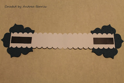
This is the back of the completed bookmark when opened.
I assembled both flowers and adhered one of them to one end of the strip of card stock. Then I folded the bookmark and turned it over so the first flower was face-down. I placed the adhesive on the other end of the card stock strip and glued on the second flower, making sure that the two die-cuts were aligned. I cut two strips of magnet tape and adhered them to the back of the floral card stock, one piece on either end. (Because this will be inside a book, you want to be sure to use fairly thin magnet strips or tape, which should be available at any craft store.) And that's it!

The next time I give someone a book for a gift, I think I'll make a bookmark to put inside of it -- and it will probably have to match the book, too. Thanks for stopping by!

Friday, April 27, 2012

Stamping friends

Usually when I create a scrapbook, I put multiple pictures on a page; they might be different sizes or shapes, but there are several of them. (I suppose that's probably because most of my scrapbooks are vacation memories, so I always have a lot of pictures I want to include.) I don't think I've ever made a layout with just one picture. But that was my crafty challenge today: make a scrapbook page with only one 5" x 7" photo.

Scrapbook page with picture of friends from Convention 2011 and the title "what's life without a few good friends."
Supplies (all from Stampin' Up!® unless otherwise noted):
Paper: Admiral card stock (Bazzill Basics Paper); Night of Navy, Brilliant Blue card stock; Ice Cream Parlor Designer Series Paper
Ink/paint: White gel pen; Wicker White, Hot Pink acrylic paint (Plaid)
Accessories: On Board Loads of Letters chipboard, 1-3/8" square punch, 1/2" circle punch, Dimensionals, Mono Multi liquid glue, pencil with eraser

This picture, which was taken at The Gateway in Salt Lake City last summer, makes me smile. For the past two years I've attended the Stampin' Up! convention, and one of my favorite things about the experience has been making new stamping friends. I just wish we weren't spread across the country!

For the title of this page I doodled the first few words freehand at the top of the page and then used chipboard letters for the last word at the bottom. I mixed three different fonts of letters, painted them white and added pink dots (with a pencil eraser dipped in paint) to three of the letters. I repeated the look of the dots on the page by punching out 1/2" Night of Navy circles and adhering them with Dimensionals in groups of three. For the three pennant strips, I used a square punch to create the pointed ends. I matted the photo with Brilliant Blue card stock, doodled a frame around the photo and added a little journaling.

The doodling (which I've done on cards but not scrapbook pages) wasn't as intimidating as I thought it would be. I guess one of the nice things about doodling is that it's inherently imperfect, so the little "mistakes" aren't so noticeable.

All in all, I'm pretty pleased with this scrapbook layout. Now if only I could see these stamping friends more often. Thanks for stopping by!

Wednesday, April 25, 2012

Scrapbooking Scrabble

There are a lot of things that make me happy; two of them are playing Scrabble and taking vacations in warm places. It's even better when I can combine those two things. And making a fun scrapbook page about it makes me happy, too.

Scrapbook page with background made of punched 3/4" squares arranged to look like a Scrabble board.
Supplies:
Cardstock: Lilywhite (Bazzill Basics), Bluebelle (Paper Reflections), pink, red, turquoise, light tan, medium tan (unknown)
Accessories: 3/4" square punch (EK Success), wooden-tile letter stickers (Making Memories), black pen (ZIG Millennium), Dotto re-positionable adhesive (Herma)

This is definitely an example of a project getting a little bit out of hand: I punched out and glued down all those little colored squares. Yep, all 225 of them. (All I have to say is thank goodness for re-positionable adhesive!) When I started, I knew I wanted to use the wooden-tile letter stickers for the page title, and I was going to punch enough squares only for that. But then I wasn't sure how I would combine the title section with the pictures and make everything work together. Obviously it was a much better idea to just make an entire Scrabble "board." Right?

Fast forward several hours on my Sunday afternoon and I was still punching and gluing card stock while examining one of my many Scrabble boards to be sure I was getting the right arrangement of colors. Somewhere around a quarter of the way through I realized that I wasn't going to have enough of the light tan card stock to finish the page. Serious bummer. By that point I wasn't really interested in starting from scratch. My first thought was to remove the tan squares that were going to be hidden behind the pictures and use them elsewhere on the page. Still not enough. So I looked through my card stock, found the closest color I had and figured I'd have to make do. I knew I couldn't just switch colors in the middle of the page, so I went back over what I had already done and randomly pulled off some of the light tan squares and replaced them with the darker color. (Again, re-positionable adhesive to the rescue.) Then I was able to use squares of both tan colors as I finished creating the rest of the "board." Honestly, I think I like this better than I would have with just one color tan; it has a little more depth and character (or something like that).

The rest of the layout is pretty straightforward. I decided where I wanted to place the pictures and played around with the letters to figure out what words I could spell in a crossword style. Because the layout of this page didn't really lend itself to journaling (which is something I generally do a fair amount of in my scrapbooks), I used the letter stickers to spell out a few additional key words, including the place and our names.

I really like how this page turned out, and I think it might just need to be framed. Thanks for stopping by!

Sunday, April 22, 2012

Petite Purse favors


In a couple of weeks I'm hosting a craft retreat/girls' weekend for some friends and family, and I'm really looking forward to it. I wanted to give little "party" favors, and I thought it would be appropriate to give something handmade. So this weekend I've been busy making these adorable little purses.

I used the new Petite Purse die from Stampin' Up!® along with a variety of card stock colors, Designer Series Paper (DSP) patterns and embellishments. The purses were very easy and quick to assemble; the die cuts out the shape for the purse (with score lines) and the handle from one piece of card stock about 5" x 8-1/2". So I just had to fold, glue, decorate and attach the handle.
For some of the purses I glued the handle to the side of the purse and then added a pearl or rhinestone over it. For others I used brads to attach the handle. I liked using the brads because then the handle could be swiveled back so it was a bit easier to fill the purses. But then I also had the prongs of the brads inside the purse, and sometimes they caught on the goodies I was putting inside the purses.

Speaking of goodies, deciding what to put in the purses was fun, but also a bit challenging since they are small. I finally decided on a lip gloss, two Dove chocolates and a small pad of Post-It notes. (A note about the lip glosses: They are from a company called Crazy Rumors, and they are wonderful. They're vegan, cruelty-free (no animal testing), contain organic ingredients and come in wonderful flavors like Amaretto, French Vanilla, Raspberry Sorbet, Lemonade and many, many more. I highly recommend them!)

The design for the Post-It pad was not my original idea. I had received a small pad like this from another Stampin' Up! demonstrator at the 2010 convention. (Unfortunately I don't know the demonstrator's name, so I can't give more specific credit.)
The size of the Post-It pad is about 1-3/8" x 1-7/8". The cover for the pad is a piece of glossy white card stock 2-1/16" wide by 5" long. It is scored at 1-1/4", 1-11/16", 3-1/4" and 3-11/16". I removed the backing and stuck the pad on the non-glossy side of the card stock. I folded over the flaps and wrapped a 1" x 4-1/2" strip of DSP around the pad, gluing down the strip where the ends overlapped. Then I adhered the owl to the DSP.

It was tight, but I did manage to fit everything inside the purse. (The lip gloss is underneath the two chocolates.)

I do have one little confession: I worked really hard to coordinate the card stock, DSP, Post-It pad and lip gloss for each purse. It didn't always work out perfectly, and I'm sure no one will ever notice, but it was fun. I can't wait to give these out at the retreat; I hope everyone enjoys them!

Thanks for stopping by!


Friday, April 20, 2012

Clean and simple thank you

This afternoon I needed to make a quick thank-you card, so I decided to use a fairly clean and simple layout.

Supplies (all Stampin' Up!® unless otherwise noted):
Card:
Stamps: Garden Variety (Unity Stamp Company), Thank You Kindly
Card stock: Really Rust, Whisper White
Ink: Jet Black StazOn, Really Rust, Almost Amethyst, Vintage Violet, Old Olive
Accessories: Blender Pen, Wisteria Wonder baker's twine, silver clip, Dimensionals, small paint brush (unknown)
Envelope:
Paper: Almost Amethyst Designer Series Paper (DSP) Prints
Accessories: Simply Scored tool, diagonal scoring plate, corner rounder, Scor-Tape (Scor-Pal)

I used a Blender Pen to color in the floral image, and I tried to focus on the shading. It's not perfect, but I think I'm getting better at it. I tied two strands of baker's twine in a bow around a clip and placed the clip on the Whisper White card stock with the focal image. Then I mounted that piece on a second piece of Whisper White card stock with Dimensionals.

Before adhering the focal image to the card, I wanted to add something to the Really Rust background. Nothing too busy, but a little visual interest. So I dipped a small paint brush in a few drops of Really Rust reinker (I placed the ink on the inside of the ink pad cover) and then tapped the handle of the paintbrush to create splatters, rotating the card every few taps. Be careful while splattering; I ended up with Really Rust ink spots all over my hands and even a few on my nose. (And I don't need any more freckles, thank you very much.)

To create the envelope I used a piece of DSP that coordinated with the flowers on the card. I made the envelope with the Simply Scored tool and diagonal scoring plate from Stampin' Up! It was very quick and easy, and the instructions are included with the diagonal scoring plate. To adhere the side and bottom flaps of the envelope, I used 1/4" Scor-Tape. To seal the envelope for mailing, I used 1/8" Scor-Tape.

Thanks for stopping by!

Thursday, April 19, 2012

Blossoms and banner

I've made and shared a few cards using the Bright Blossoms stamp set during the past month or so. (See Bright blossoms and Button blossom trio.) But it dawned on me that so far I've only used that stamp set with bright colors. Of course, I can't say that really surprises me since the set is called Bright Blossoms. Power of suggestion and all. So I decided to give it a try with some more subtle colors.

Supplies (all Stampin' Up!®):
Stamps: Bright Blossoms
Card stock: Whisper White, Blushing Bride, Peach Parfait
Ink: Blushing Bride, Peach Parfait, Pear Pizzazz
Accessories: Basic pearls, Vintage Wallpaper embossing folder, Blushing Bride stitched-poly ribbon, Scallop Trim Border punch, square punch

I did some basic collage, or random, stamping on the Whisper White background and mounted it on a Blushing Bride card base. To make the banner I cut a strip of Blushing Bride card stock and used a square punch on one of the ends to create the points. I punched two strips of Peach Parfait card stock with the Scallop Trim border punch and then adhered them behind the banner piece, trimming the edges to align with the points. Then I embossed the whole piece with the Vintage Wallpaper embossing folder. (I actually meant to emboss just the Blushing Bride piece before I added the scallop edges, but I forgot. Oh, well. It worked fine; it's just hard to see the texture on the scallops because they're so skinny.) Finally I added three small pearls on the banner and a larger pearl in the lower right corner of the card.

I didn't add a greeting to this card so it can be used for any occasion. But for some reason it really reminds me of a wedding card. Too bad I don't know anyone getting married soon. But at least I discovered that the Bright Blossom stamps work very well with pastel colors.

Thanks for stopping by!

Monday, April 16, 2012

Under the sea

So the rain we had yesterday turned into snow today. None of it stuck to the ground or anything (at least not around here), but it's still not really what you want to see on a Monday morning in April. So I thought today would be a good day to share a card that brings to mind warmer days and sunny places.

Card that looks like an under the sea scene. Stamped and cut-out seaweed, turtles and octopi along with fish brads.
Supplies (all Stampin' Up! unless otherwise noted):
Stamps: Summer Splash
Card stock: Pool Party, Island Indigo, Crumb Cake, Whisper White, Summer Sun, Perfect Plum, Lucky Limeade, Calypso Coral
Ink: Island Indigo, Concord Crush, Always Artichoke, Cajun Craze
Accessories: Build a Cupcake punch, 3/4" circle punch, scallop edge punch, paper snips, fish brads (Recollections), paper piercer, mat pack, Tombow Mono Multi liquid glue, Dimensionals

I had a lot of fun making this card. It all started with the adorable fish brads I bought over the weekend. When I saw them I knew they would be perfect for an under-the-sea-themed card.

I started with an Island Indigo card base. I punched a scallop edge on a piece of Pool Party card stock and glued that along the top of the card to create the sky and the look of waves. For the sand at the bottom, I tore a piece of crumb cake card stock, misted it with water, crumpled it up and flattened it, let it dry, and adhered it along the bottom of the card. I repeated those steps to add a second layer of "sand."

The rest of the sea part of this card involved a lot of cutting. The turtles are stamped in Always Artichoke on Lucky Limeade card stock, and the octopi are stamped in Concord Crush on Perfect Plum card stock. Before I glued them to the card, I decided where I wanted them to be placed and stamped the air bubbles. To create the seaweed or coral, I stamped the octopus twice in Cajun Craze on Calypso Coral card stock, cut the "legs" apart into groups of four and glued them on the card upside-down. Then I added the fish brads. (Hint: To make holes for brads in the middle of a card or piece of card stock, use a paper piercer and a foam mat behind the card stock.)

To finish off the card I punched out a sun (3/4" circle) and clouds (the top of the cupcake from the Cupcake Builder punch) and adhered them to the sky part of the card. Makes me long for a tropical vacation!

Thanks for stopping by!

Sunday, April 15, 2012

Button blossom trio

It's been a dreary, rainy day here (which is OK since we do need the rain), so I thought I would brighten it up with a fun trio of flowers.

Supplies (all Stampin' Up!®):
Stamps: Bright Blossoms
Card stock: Early Espresso, Whisper White, Real Red, Daffodil Delight, Pumpkin Pie
Ink: Early Espresso and Old Olive markers
Accessories: Perfect Polka Dots embossing folder, Edgelits dies, extra large oval punch, Decorative Label punch, Brights Collection buttons, white baker's twine, Mini Glue Dots, Dimensionals

There isn't anything very complicated with this card, but it just makes me feel happy. To create the stamped images, I used markers to apply the two colors directly on the rubber stamp and then stamped on Whisper White card stock. I punched out the images with an oval punch and layered each one on a different color of card stock punched with the Decorative Label punch. I used Mini Glue Dots to stick small flower buttons, with a knot of baker's twine in the middle, at the top of the stems. I adhered the three layered pieces to the card base with Dimensionals.

I kept the card base pretty simple, too. I like how the embossed polka dots add a little texture to the card and are similar to the pattern on the stamped vases. Likewise, the curved edge at the bottom of the card, created with the Edgelits dies, echoes the shape of the Decorative Label punches.

I hope you have a bright day! Thanks for stopping by!

Saturday, April 14, 2012

Into the woods

In the next month or so I'm hoping to send my next shipment of cards off to Operation Write Home, and I want to include plenty of masculine cards in the box. So today I created three cards with a woodsy theme.

Supplies (all Stampin' Up!® unless otherwise noted):
Stamps: Backwoods
Card stock: Bordering Blue, Close to Cocoa, Chocolate Chip, Always Artichoke, Garden Green
Ink: Jet Black StazOn
Accessories: Moose brads (Creative Impressions), brown Scrapper's Floss (Karen Foster Design), paper snips, Tombow Mono Multi liquid glue, Dimensionals

For the background of this card, I stamped the image of trees several times on Always Artichoke and Garden Green card stock. I cut out the trees, played around with the layout until I had an arrangement I liked and then glued them down. I stamped the cabin on Chocolate Chip and Close to Cocoa card stock then cut out the window, door and roof from the Close to Cocoa image and glued them to the Chocolate Chip image. I adhered the cabin to the card with Dimensionals. I thought the moose brads added a fun touch to this little scene.

Supplies (all Stampin' Up, unless otherwise noted):
Stamps: Wolf
Card stock: Bordering Blue, Always Artichoke, Very vanilla
Ink: Jet Black StazOn, VersaMark; markers: Bordering Blue, Always Artichoke, Going Gray, Basic Gray
Accessories: Metallic brads (making Memories), color spritzer tool, Dimensionals

As I was working on the layout for this card, I decided I wanted to add some texture to the focal image. So I sprayed a piece of Always Artichoke card stock with water, crumpled it up (being sure to work in plenty of creases) and then opened it back up. I let it sit for awhile to dry, adhered it to the colored image with Dimensionals and then adhered it to the card base.

Supplies (all from Stampin' Up!):
Stamps: Yukon
Card stock: Close to Cocoa, Very Vanilla, Not Quite Navy, River Rock
Ink: Jet Black StazOn; markers: CLose to Cocoa, Chocolate Chip, River Rock, Not Quite Navy
Accessories: 1/4" square punch, Stripes embossing folder, linen thread, Dimensionals

I love the image of this moose; it's by far the stamp I use most often from this set. I thought about placing three brads in the lower right corner, but I'm glad I decided to use the punched squares instead. I think they look better with the rest of the clean, straight lines on the card. I think this is my favorite of the three cards.

Thanks for stopping by!

Thursday, April 12, 2012

The growing little project

Did you ever sit down to do a quick little project and it somehow got bigger and bigger? Yesterday I started making a set of six little cards. Easy peasy. Then I decided to make twelve cards instead of six. A little more stamping, punching and gluing, but still manageable. Then I decided I had to make a coordinating box for the cards. Suddenly I was digging around in my various stashes of craft supplies to find a box, paint and brush and then spending time, quite literally, watching paint dry. Don't get me wrong, it was a fun project, and I'm pleased with the end result; I'd just planned on getting more stamping done during the past two days. Oh well, the best laid plans ... At any rate, here is my growing little project:

Supplies for cards and coordinating box (all Stampin' Up!® unless otherwise noted):
Stamps: Small Sayings
Card stock: Very Vanilla, Blue Bayou, Riding Hood Red, Blushing Bride, Lucky Limeade, Pool Party, So Saffron, The Thrift Shop patterned card stock (October Afternoon)
Ink: Basic Gray
Accessories: Very Vanilla Pocket Notes cards and envelopes, Dotted Scallop Ribbon Border punch, Itty Bitty Shapes punch pack, Modern Label punch, 1" circle punch, basic pearls, Dimensionals, Tombow Mono Multi liquid glue, kraft box (unknown), acrylic paint (white wash [Accent], light ivory [Delta Ceramcoat]), matte interior varnish (Delta Ceramcoat), foam brush (unknown)

I love the patterns in this paper, and I think that they make a fun set of little cards when combined with the greetings in the Small Sayings stamp set. I used each pattern, greeting and card stock color twice in the set, but I mixed up the combinations so no two cards are the same. The cards are 3-1/2" x 2-1/2" so they are too small to be mailed (unless you put them in a larger envelope), but they are the perfect size to tuck in a gift, lunch bag, or briefcase or just hand deliver.

The box I wanted to decorate to coordinate with the card set started out a kraft color. I was going to just work with that, but that would have been too easy. So in the spirit of this "little" project, I decided I had to paint the box (inside and out, of course).

I assumed it would take a couple coats of paint to completely cover the box, and I was worried I wouldn't have enough cream acrylic paint left. So I used white paint for the first coat, like a primer, and then finished with the cream. (It was a good thing, too, because I barely had enough cream paint to finish just the second coat.) While the paint was drying I punched several 1" circles out of the same patterned papers I used for the cards. I glued the circles around the bottom and on the cover of the box. Then I painted over the entire box with matte varnish. And finally my little project was done!

Thanks for stopping by!

Monday, April 9, 2012

Birthday spotlight

Today I'm going to share another card I made using the Packed for Birthday images I received from my friend Faith last week.

Black card with a background of multi-colored circles. Focal image features a variety of birthday things -- balloons, presents, etc. -- in black and white with certain areas colored in.
Supplies (all Stampin' Up!®):
Stamps: Packed for Birthday, Birthday Greetings
Card stock: Basic Black, Whisper White, Summer Sun, Green Galore, Only Orange, Ballet Blue, Pixie Pink
Ink: Black; markers: Summer Sun, Green Galore, Only Orange, Ballet Blue, Pixie Pink
Accessories: 3/4" circle punch, tinsel trim, Tombow Mono Multi liquid glue, Dimensionals

When I made my first card with the Packed for Birthday image, I just colored it. I wanted to do something a little different with this card, so I used the spotlight technique. This technique works really well with line-art images. The end result is that most of the stamped image is left black and white, with a few areas colored, as if they are in a spotlight.

Close up of focal image: a variety of birthday things -- balloons, presents, etc. -- stamped in black and white with certain areas colored in.
To start, stamp your image on two pieces of card stock, and set one of them aside. Using the other stamped image, punch out the areas you want to spotlight with a circle punch. I decided I wanted to have three "spotlights" on this card, and since this image isn't terribly large, I had to use a small circle punch. I could have used a larger punch to spotlight just one or two items, such as the cake or pinata.

Color in the images on the punched circles and adhere them over the matching places on the first stamped image. (I used Dimensionals to adhere the circles so they stood out.) Another option would be to color the spotlight areas before punching out the circles; the end result will be the same, and it might be easier than trying to hold onto a tiny circle of card stock while you're trying to color it in. I'm just sayin' ...

Inside of card with stamped sentiment. The inside parts of letters are colored in to coordinate with the front of the card.
For the background of the card, I punched out multicolored card stock circles and glued them randomly over the card front, with some of the circles overlapping each other or going over the edges of the card. I wrapped a piece of tinsel trim around the card front three times and tied it in a bow. Then I adhered the Packed for Birthday image, matted with Basic Black card stock, over the tinsel.

With all the colors on the front of the card, I didn't want to leave the inside too plain. So after I stamped the greeting on a layer of Whisper White card stock, I used markers to color in the middle of the letters. I think it's a fun little detail for what is, at least in my opinion, a pretty fun birthday card.


Thanks for stopping by!

Sunday, April 8, 2012

Happy Easter, everybunny!

Happy Easter! I didn't have much success making Easter cards this year; there always seemed to be something else that needed to get done first. In fact, I made (and mailed) a grand total of only two Easter cards. I have several adorable Easter stamp sets (how could bunnies and chicks not be adorable?), and I was disappointed I didn't get more use out of them this year. So I decided to use my newest Easter set and make just a couple really quick Easter cards this morning that I could hand deliver at our family dinner this afternoon.

Sahara Sand card base with embossed flowers and yellow ribbon. Focal image is a bunny riding in an Easter Egg hot air balloon.
Supplies for both cards (all Stampin' Up!®):
Stamps: Everybunny
Card stock: Sahara Sand, Whisper White, So Saffron
Ink: Jet Black StazOn, Sahara Sand; markers: Sahara Sand, Peach Parfait, So Saffron, Creamy Caramel, Baja Breeze, Wild Wasabi, Blushing Bride
Accessories: Labels Collection Framelits dies, Elegant Bouquet embossing folder, basic pearls, 5/8" So Saffron grosgrain ribbon, So Saffron taffeta ribbon, Dimensionals

Sahara Sand card base with stamped mushrooms and yellow ribbon. Focal image is a bunny with an Easter Egg and chick.
I used the same colors and the same basic layout for each card. To add a little variety, I changed the main images, the backgrounds, and the type of ribbon used.

There isn't much to explain with these cards, but here is one tip: To create the thin border around the label die cuts, first cut out the image with the desired size Framelit die. Then place that same on the card stock to be used for the mat, trace along the "lip" of the die, and cut out the shape along the traced line. Of course, you can always use the next larger size Framelit die to cut out the mat, but that will result in a wider border around the image. For these cards, I wanted a fairly thin border.

I hope you and your loved ones have a joyful Easter. Thanks for stopping by!

Saturday, April 7, 2012

Words of wisdom

It's been a few weeks since I made any progress toward my stamping challenge goal, so today I decided to pull out an old stamp set (and some old ink and card stock colors) and make a set of cards.

Supplies (all Stampin' Up!®):
Stamps: Sage Advice
Card stock: Naturals White, Cool Caribbean, True Thyme, Vintage Violet, Really Rust
Ink: Jet Black StazOn, Cool Caribbean, True Thyme, Vintage Violet, Really Rust
Accessories: Labels Collection Framelits dies, Framed Tulips embossing folder, Beautiful Wings Embosslits die, Sherbet Ribbon Originals, 3/8" twill tape, stitched Vintage Violet ribbon, stitched True Thyme ribbon, Dimensionals, Mini Glue Dots


Each card base was embossed with the Framed Tulips embossing folder. Then I wrapped a piece of coordinating ribbon around the card front about 2-1/2" from the fold on the left side.

To make the focal pieces, I stamped the images in the background (being sure to stamp on a piece of scratch paper first so the images were a bit lighter) and then stamped the greeting over the images. I cut out each piece with one of the Labels Collection Framelits dies and adhered it over the ribbon with Dimensionals.

The final detail for each card was to add the butterflies. The Beautiful Wings Embosslit die creates five embossed butterflies each time you run it through the Big Shot. I didn't want to use all five butterflies on each card front, so I used Mini Glue Dots to adhere three of the butterflies to the card front and the other two inside the card.

I also decided to stamp the envelopes so they coordinated with the cards. I stamped the images in the lower left corner of the envelope and on the middle of the flap on the back. I don't always do this step, but it does add a fun little touch to a set of cards, especially if it's going to be a gift.

I made a total of eight cards for this set: two cards in each color. I love the quotes in this stamp set, and I think they work great for an all-occasion set of card. Thanks for stopping by!

Friday, April 6, 2012

Bold, bright birthday

Yesterday I received a fun surprise in the mail: an absolutely adorable Easter card from my friend Faith. But that wasn't all. Inside the card she had included several stamped images of the Packed for Birthday stamp that is in the 2012 Occasions mini catalog from Stampin' Up!® I don't have that stamp yet, but I really liked the birthday image, and Faith was nice enough to stamp the image several times (more than I expected!) on white card stock and send them to me so I could play with them. I was so excited to get them that I wanted to make a card with one of the images as soon as I could:

Light blue birthday card with bright circles along the side (red, yellow, green, light blue, dark blue). Focal collage-type image includes a banner, cake, pinata, balloons and presents.
Supplies (all Stampin' Up! unless otherwise noted):
Stamps: Packed for Birthday, Happiest Birthday Wishes
Card stock: Whisper White, Pool Party, Island Indigo, Poppy Parade, Daffodil Delight, Lucky Limeade
Ink: Black, Island Indigo; markers: Poppy Parade, Daffodil Delight, Lucky Limeade, Pool Party, Island Indigo
Accessories: Deckle scissors (Fiskars), Island Indigo baker's twine, 3/4" circle punch, Dimensionals

With some of the stamped pieces Faith sent, I'm planning to cut out the different little images to use on cards, but for my first try I wanted to just do some basic coloring. Yes, the stamp does have a lot of tiny images to color, but it wasn't as bad as I expected. And I thought these bright, bold colors would be perfect for a birthday card.

The layout of the card is pretty simple. I trimmed the stamped image with a deckle scissors and used Dimensionals to adhere it to a piece of Island Indigo card stock that was wrapped with baker's twine. I wanted to bring all the colors from the stamped image onto the rest of the card, so I punched a 3/4" circle out of each card stock color and glued them along the left side. Then I just added a birthday greeting to the bottom of the card. And that's it!

I'm looking forward to seeing what other ideas I can come up with for the rest of my Packed for Birthday images. Thanks for stopping by!

Tuesday, April 3, 2012

For a fabulous friend

Today I needed to make a combination happy birthday and thank you card for one of my good friends. I knew exactly which stamp set I wanted to use, and here is the finished card:

Supplies (all Stampin' Up!®, unless otherwise noted):
Stamps: Polka-Dot Posies, Essential Messages (Hero Arts) (for the greeting inside the card)
Card stock: Naturals White, Riding Hood Red, So Saffron, Tea for Two Mini Deck patterned card stock (Cosmo Cricket)
Ink: Pear Pizzazz, Riding Hood Red, So Saffron
Accessories: Riding Hood Red pleated satin ribbon, mini jewels - Lily White assortment (Doodlebug Design Inc.), corner rounder, 1/2" circle punch, Boho Blossoms punch, Mini Glue Dots, Tombow Mono multi liquid glue

For the top half of the card, I stamped the yellow flowers and green leaves directly on the card base. I stamped the red flower centers on a separate piece of card stock, punched them out with a 1/2" circle punch and glued them to the flowers. For the bottom half of the card I used a piece of striped card stock. (I chose my color combination from this card stock, and I love the stripes with the flowers and polka dots.) But instead of cutting the card stock in a straight line, I created a wave along the top edge. Then when I adhered the ribbon to the card, I just followed the curved edge of the card stock. (The pleats in the ribbon allow it to be glued down in gentle curves without bunching.)

I used two colors to ink up the greeting stamp to provide some visual interest and to accent the last line of the greeting. I matted the greeting and adhered it to the card with Dimensionals. Finally I used the Boho Blossoms punch and some self-adhesive jewels to add a few embellishments.

When I make a card I don't always decorate the inside of the card. But I wanted this card to have a little extra something, so I stamped a couple of flowers to match the front of the card. (Of course, I'm going to go ahead and write my message over them, but you'll still be able to see them.) I also stamped another greeting inside the card, and I think it fits perfectly with the greeting on the card front.

I love the bright, fun and playful feel of this card. I think it would be a great card to send to a friend for any occasion -- or for no occasion at all!


Thanks for stopping by!