Tuesday, July 28, 2020

July Christmas cards: Playing with paper

Usually when I make my monthly Christmas cards, I focus on a particular stamp set, or maybe a die or stencil. This month I decided to do something a little different: I played with paper. It started with a pack of eeBoo holiday paper chains that I received as a Christmas gift from a friend a few years ago. I had never put the paper chain together because I thought some of the designs could be used to make Christmas cards. Well, I finally tried out that idea:

Supplies:
Stamps: Christmas Sampler (Paper Smooches)
Paper: Long Notes cards and envelopes (Stampin' Up!), Basic Black card stock (Stampin' Up!), paper chains (eeBoo)
Ink: Memento Tuxedo Black (Tsukineko)
Accessories: Frosted sequins (Stampin' Up!), Box of Chocolate sequins (Craft Medley), All Year Cheer washi tape (Sstampin' Up!)

What do you think? They're not terribly fancy, but I love the colors and images for a different style of Christmas card.

I will admit that I struggled with a layout for these cards. The strips for the paper chains are about 10" long, so obviously too long for a U.S. standard A2 card size. And I like the images, so I didn't want to cut off too much of the pattern. I thought for a loooong time and then finally remembered that I still have some of the Long Notes cards and envelopes that Stampin' Up! sold years ago. (I think these colors are Cool Caribbean and Wild Wasabi.) They are about an inch longer and an inch narrower than an A2 card, which worked perfectly: I could use a longer piece of the paper chain, and there wasn't a lot of card space left to have to fill.

I made two cards of each of these designs by glueing the paper chain strip to the card base, trimming the ends, and adding a border on the top and bottom with either thin strips of black card stock or copper washi tape. That left just enough space to stamp a sentiment on the bottom, and I had to give the cards a little sparkle with a few sequins.

While I had been looking for the Long Notes cards and envelopes, I came across a stack of vintage choral sheet music that I got at a church several years ago. I decided I wanted to use some of the pages from Christmas carols to make some collage-style cards. Here is the first group:

Supplies for all collage cards:
Paper: Naturals Ivory, Crumb Cake card stock (Stampin' Up!), gold foil sheets (Stampin' Up!), Christmas on Market Street paper pad (My Mind's Eye), vintage choral sheet music (unknown)
Ink: Crumb Cake (Stampin' Up!), gold Wink of Stella glitter brush pen (Kuretake)
Accessories: Snowflake punch (Stampin' Up!), green tree glitter tape (Paper Source), Country Houses die (Poppy Stamps), Christmas on Market Street enamel dots (My Mind's Eye), jute twine (May Arts Ribbon), puffy gold star (unknown), sponge (Stampin' Up!), Art Glitter Glue (Art Institute)

I have to say that I have a deep admiration for people who make collages. I have a hard time being "free" enough to do it well, and my left brain prefers more structure. (One of the reasons I've never been able to get into keeping an art journal, even though I really want to.) But when all was said and I done, I love the way these cards turned out; they might be my favorites so far this year. (I think they look prettier in real life than in the photos.)


Not only did I upcycle some old sheet music for these cards, but I also used up a bunch of leftover strips of patterned paper and a sheet of enamel dots. Even the gold snowflakes were already punched out (I must have planned to use them on a previous project and then changed my mind). Gotta love that!

For each card, I started by flicking gold Wink of Stella ink over a Naturals Ivory card base and then sponging the edges of the card base with Crumb Cake ink. Then I layered on the patterned paper (there are two separate strips on each card) and added a torn piece of the sheet music on top. Here's a tip for tearing paper: to help your tears go in a fairly straight line, use a slightly damp paintbrush to trace along the line where you plan to tear. This weakens the fibers a bit so they will tear easier.

Once the sheet music was glued down, I also sponged those edges with Crumb Cake ink. Then I added the embellishments: a strip of green tree glitter tape, a gold snowflake, a twine bow, and a few enamel dots.


These last three cards had little twists in the layout. For the left and right cards, I used different patterns for the papers above and below the sheet music. I also swapped the placement of the trees and the star.

For the card in the middle, I had two strips of sheet music left, and I wanted to use both. So I combined them with a Crumb Cake die cut of country houses and trees and used a puffy gold star instead of a snowflake. I still wanted some color, though, so I used a couple tiny scraps of patterned paper to make little banners and tucked them under the top piece of sheet music and then added a few enamel dots.


I love that the music for this card is from "It Came Upon a Midnight Clear." That little village seems perfect for the lyrics.

That makes fourteen Christmas cards made this month! Whew! I'll have to count up how many cards I have and start making a card list so I know how many more I still need to make. Pretty soon I'll need to start working on other Christmas projects. Thanks for stopping by!

Friday, July 24, 2020

Under the sea

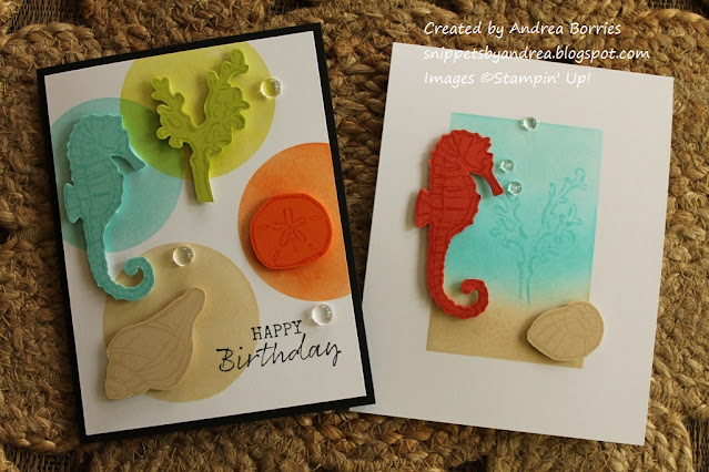
After the tropical vibe of my last two posts, I'm going to segue into a little ocean theme and share a few cards featuring animals and scenes from under the sea.


These first two clean and simple cards both use masking stencils from Taylored Expressions and the Seaside Notions stamp set from Stampin' Up!, and it was my first time playing with both of these products.

Supplies:
Stamps: Seaside Notions (Stampin' Up!)
Paper: 110-lb Solar White card stock (Neenah); Sea Glass, Key Lime, Tangerine Twist, Sandy Beach card stock (Gina K Designs)
Ink: Memento Tuxedo Black (Tsukineko); Sea Glass, Key Lime, Tangerine Twist, Sandy Beach (Gina K Designs)
Accessories: Circle masking stencils (Taylored Expressions), blender brushes (Taylored Expressions), clear droplets (Pretty Pink Posh), Art Glitter Glue (Art Institute), foam tape (3M)

 
This is a fun layout, and I think it would work with just about any type of image: flowers or foliage (ooh - four different leaves with rich autumn colors), animals, crafty-themed images, etc.

For this card I started by choosing four images from the stamp set and four colors of coordinating ink and card stock. I stamped each image on one color card stock using the same color ink, trimmed them using a paper snips, and set them aside.

For the background, I used circle masking stencils and blender brushes to create one circle for each ink color on a panel of white card stock. (Note: Be sure to wipe off the stencil after each circle so the colors don't get muddied.) I used a random placement for the circles, letting some of them go off the edge of the card stock and/or overlap with another color.

I stamped a birthday sentiment in the lower right corner and then adhered the panel to a black card base. Using foam tape, I adhered each of the stamped, cut-out images over the corresponding circle. I finished the card with three bubble-y clear droplets.

Supplies:
Stamps
: Seaside Notions (Stampin' Up!)
Paper
: 110-lb Solar White card stock (Neenah); Coral Reef, Sandy Beach card stock (Gina K Designs)
Ink
: Coral Reef, Sandy Beach, Turquoise Sea, Sea Glass (Gina K Designs)
Accessories
: Rectangle masking stencils (Taylored Expressions), blender brushes (Taylored Expressions), clear droplets (Pretty Pink Posh), Art Glitter Glue (Art Institute), Dimensionals (Stampin' Up!)


For this card I used the rectangle masking stencil to create a subtle background scene. With the stencil attached to a white card base (use removable tape on the back so the card doesn't shift), I applied Sandy Beach ink near the bottom of the opening and then blended Turquoise Sea and Sea Glass inks to cover the rest of the stencil opening. After I removed the stencil -- look at that perfectly even chunky white border! -- I stamped dot clusters over the sand and one coral image in the water.

For the main images, I  used Coral Reef ink and card stock for the seahorse and Sandy Beach ink and card stock for the seashell. I stamped and cut out the images and attached them to the card base using Dimensionals, placing them so they extended past the borders of the ink-blended rectangle. Again, three clear droplets finish the card.

Supplies (all Stampin' Up! unless otherwise noted):
Stamps: Whale Done
Paper: Whisper White, Shaded Spruce, Pretty Peacock, Pool Party card stock; Whale of a Time Designer Series Paper (DSP)
Ink: Pretty Peacock
Accessories: Whale punch, Seabed 3D embossing folder, foam tape (3M)

These are two very simple cards that I put together just to try out some new Stampin Up! goodies. I embossed the card bases with the Seabed 3D embossing folder (Pretty Peacock on the left, Shaded Spruce on the right), and I have to say that I love all the texture and detail! For the focal layer on each card, I cut a 6" x 6" piece of DSP into 3" x 3" pieces and matted two of the pieces with Pool Party card stock. Using foam tape I adhered one square to each card base.

I tried two different styles for the whales. For the card on the left I stamped the whale using Pretty Peacock ink on white card stock and then punched out the image with the main part of the Whale Punch. For the card on the right, I used the punch with Pretty Peacock and white card stock and then glued the pieces together to make the whale. (I made the eye with a dot of black marker.) I added the whales to the DSP squares and finished each card with the sentiment "Thanks a ton" stamped on a little card stock banner.

Thanks for stopping by today! I hope you have a "swimmingly" good weekend!

Monday, July 20, 2020

Sending tropical sunshine

I'm back with a couple more tropical-themed cards today. And boy do I wish I could snap my fingers and find myself in the middle of these scenes!


I made these two cards with the new Sending Sunshine stamp set from Stampin' Up! I knew I would get this set as soon as I saw it in the catalog.

Supplies:
Stamps: Sending Sunshine (Stampin' Up!)
Paper: Whisper White, Bermuda Bay, Coastal Cabana card stock (Stampin' Up!)
Ink: Bermuda Bay, Coastal Cabana, Crumb Cake, Mango Melody, Shaded Spruce (Stampin' Up!); Sugar Cube (Taylored Expressions); Balmy Blue, Crumb Cake Blends markers (Stampin' Up!)
Accessories: Birthday Wishes Frame die (Simon Says Stamp), opaque bright white superfine embossing powder (WOW! Embossing Powder), Oceanside dew drops (Honey Bee Stamps), foam tape (3M)

This set has multiple stamps so it's easy to layer on the different colors (and it was pretty easy to line up the stamps, too). For this first card, I stamped all the images on white card stock. To create the blue sky, I just colored the card stock with a Balmy Blue Blends alcohol marker. (You could also try using a blender brush or brayer to apply ink, but since it was a relatively small area, I decided I had more control with a marker.) Then I stamped and embossed the clouds in the sky.

I wanted this scene to look like a photo, so I die cut the Birthday Wishes Frame from white card stock and then just used snipped off the words from the middle of the frame. It makes a perfect-looking Polaroid picture! I adhered the stamped panel behind the frame and stamped the sentiment along the bottom.

For the card base I used Coastal Cabana card stock with a strip of Bermuda Bay card stock along the left side. I added score lines every 1/4" on the Bermuda Bay card stock to add a little bit of texture. I attached the focal "photo" to the card with foam tape and finished off the card with three dew drops.

Supplies:
Stamps: Sending Sunshine
Paper: Whisper White, Pool Party, Crumb Cake card stock (Stampin' Up!)
Ink: Coastal Cabana, Bermuda Bay, Shaded Spruce, Crumb Cake, Mango Melody (Stampin' Up!); Sugar Cube (Taylored Expressions)
Accessories: Sea Life wooden shapes (Darice), Corner Chomper (We R Memory Keepers)

For this card I started with a Pool Party card base and added a layer of Crumb Cake card stock to the bottom half of the card for the sand. I stamped the cluster of dots to add texture to the sand and then added a sentiment and a few little grasses.

I stamped the water and sun images on white card stock and then cut out the full image and glued it on the "sand" so the horizon lined up with top of the Crumb Cake card stock. I stamped a few fluffy white clouds and used the larger grass image on the side to look like a tree branch. (I saw that idea in a sample in the catalog, and I thought it was so clever!)

The card still needed "something," and I remembered that I have a set of nautical-themed wooden shapes. This little sailboat floating toward the sunset seemed like the perfect finishing touch!

Thanks so much for stopping by today!

Friday, July 17, 2020

A taste of the tropics

Yay, the weekend! I'm happy to see the end of the week (especially since I don't have to work this weekend!), and I'm hoping to get some card projects finished in the next couple of days. It will be a prefect weekend to stay inside and craft because it's feeling tropical around here, and being out in the heat and humidity is not my favorite thing. But it is a great reason to share a few tropical cards!

Supplies (all Stampin' Up! unless otherwise noted):
Stamps: Timeless Tropical
Paper: Pool Party, Bermuda Bay, Crushed Curry, Crumb Cake, Whisper White card stock
Ink: Old Olive, Soft Suede, Crumb Cake
Accessories: In the Tropics dies, Beach Chair dies (Rubbernecker Stamps), 1-1/4" circle punch, foam tape (3M), Art Glitter Glue (Art Institute)

I'm pretty sure I would enjoy the tropical weather more if I had a nice chair and a view like this!

This card is mostly layers of card stock. I started with a Pool Party card base and added a piece of Bermuda Bay card stock just below the middle of the card to make the ocean. I punched a circle out of Crushed Curry card stock, cut it in half, and glued it right at the top of the Bermuda Bay card stock in the middle of the card.

To create the sand, I cut two pieces of Crumb Cake card stock. I tore the top edge off one of the pieces and adhered it over the Bermuda Bay card stock. Then I stamped and die cut two of the palm tree images and adhered them to the Crumb Cake card stock on either side of the sun. Then I tore the top off the second piece of Crumb Cake card stock, making sure it was shorter than the first piece, stamped the sentiment near the right side, and added it to the card base. The final touch was to die cut the chair out of white card stock and glue it next to the sentiment. I added a birthday sentiment inside the card, but this would also be a great retirement card.

Supplies (all Stampin' Up! unless otherwise noted):
Stamps: Timeless Tropical
Paper: Watercolor paper (Strathmore), Pool Party card stock
Ink: Mango Melody, Poppy Parade, Old Olive, black journaling marker
Accessories: In the Tropics dies, jute twine (May Arts Ribbon), foam tape (3M)

I tried something a little different with this card, and I think I had mixed results. I wanted to use the flower images from the Timeless Tropical stamp set, but I didn't want to stamp them in black and then paint or color them. So instead I stamped them with colored ink on water color paper and then used a damp paintbrush to pull the color from the stamped lines into the "empty" part of the images.

I think it worked pretty well with the large flowers (especially the bottom one) because the Mango Melody ink, which looked pretty orange when stamped, became more yellow as it mixed with the water on the paint brush. So you can still see some definition in the flower. The leaves turned out okay, too. But that technique didn't work so well with the smaller flower. The Poppy Parade ink was just too strong, and I ended up losing all the lines in the flower when I added the water. I restamped the image again after I watercolored, and that helped, but I still wasn't thrilled with that one.

I tied some twine around a Pool Party card base and then layered on the flowers and leaves. It still needed something, so I doodled a border and some little clusters of dots.

Supplies (all Stampin' Up! unless otherwise noted):
Stamps: Timeless Tropical
Paper: Very Vanilla, Baked Brown Sugar card stock
Ink: Baked Brown Sugar, Art Philosophy Metallic Accents paints (Prima)
Accessories: Layering Ovals and Stitched Shapes dies, linen thread, brulap ribbon trim, Tiny Attacher stamper (Tim Holtz), blender brush (Picket Fence Studios), Dimensionals, foam tape (3M)

I love the vintage feel of these two cards -- and the neutral color scheme makes them great masculine birthday cards. To create these cards, I repeatedly stamped various images on a piece of Very Vanilla card stock using Baked Brown Sugar ink. (The flower images are the same as in the card above so you can see what the stamped image looks like.) I cut the card stock in half and then used a blender brush to blend ink around the edges of each piece. I usually use a sponge to apply ink on card stock edges, but I think I like the brushes better; it create a softer look. I wanted to add a little accent, so I used metallic paint to make a gold splatter.


Once the paint was dry, I embellished each background piece with ribbon or twine, adhered it to a Baked Brown Sugar card base, and used Dimensionals to add a layered sentiment.

And now for some more color ...

Supplies (all Stampin' Up! unless otherwise noted):
Stamps: Timeless Tropical
Paper: Thick Whisper White, Whisper White, Pineapple Punch, Granny Apple Green, Calypso Coral, Baked Brown Sugar card stock
Ink: Baked Brown Sugar
Accessories: In the Tropics dies, Subtle embossing folder, Dimensionals, Corner Chomper (We R Memory Keepers), Art Glitter Glue (Art Institute)

This card was one I made to include in a "box of sunshine" that I sent to a friend. The box was full of fun yellow and orange things to make her smile, so this bright yellow card fit right in. I started with a white card base, and for the background I used a piece of (perfectly appropriate) Pineapple Punch card stock embossed with the Subtle embossing folder. (I rounded two opposite corners before adhering it to the card base.) Then I die cut the pineapple and glued it to the background. I stamped the sentiment on a strip of white card stock and used Dimensionals to adhere it over the bottom of the pineapple. For a final touch I added a few Calypso Coral die-cut flowers.


Now I'm ready for a cold tropical drink with a pretty umbrella!

I have a few more tropical cards to share next time. Thanks for stopping by today!

Wednesday, July 8, 2020

Llama love trio

It has been hot and humid in my neck of the woods lately, so it seems like a fitting time to share a few cards made with bold, "hot" colors. Bonus: there are llamas!

Supplies:
Stamps: Whole Llama Love (Taylored Expressions)
Paper: Sahara Sand, Basic Black, Blush Blossom, Whisper White card stock (Stampin' Up!); Fiesta Forever Card Stock Stack (DCWV)
Ink: Memento Tuxedo Black (Tsukineko); Bermuda Bay, Mango Melody Blends markers (Stampin' Up!)
Accessories: No Drama Llama dies (Taylored Expressions); Large Stitched Rectangle Stackables dies (Lawn Fawn); Nested Squares X-Stitch Border dies (Rubbernecker Stamps); Go Green, Citrus, Rhythm N Blues sequins; Nested Banners dies (Simon Says Stamp); foam tape (3M); Art Glitter Glue (Art Institute)

These llamas make me smile! Since they are all die-cut pieces (except the stamped face), I thought they would be fussy to assemble. But really the only tricky parts were the tiny pieces for the ears and hooves. And I think they are totally worth that extra little effort.

So I started these cards with the Fiesta Forever Card Stock Stack. I just love the bright colors and festive patterns of these papers, and I used a different pattern for the background of each of these cards.

The pack also includes some subtle tone-on-tone prints, so I used those to cut out the blankets and other accessories for the llamas. No searching for matching card stock colors!

With the llamas all cut, stamped, and assembled, it was time to build the cards. For the first card (top photo, on the left) I created a simple scene with a banner-printed background paper and a strip of green along the bottom to act as the grass. I added the llama and sentiment banner to the scene with foam tape and finished the card with three sequins.

For the other two cards, I adhered each llama to a die-cut layer of white card stock to help it stand out from the busy background. I stamped the sentiments directly on the white card stock -- and the sentiments and font in this set are fabulous; all the punny-ness makes me happy -- added the panels to the card bases with foam tape, and again finished the cards with sequins.

On a personal note, I just finished reading White Fragility by Robin DiAngelo, and I highly recommend it. It challenges what we (specifically white people in the U.S.) consider racism and illustrates how racism isn't limited to "bad" people. I have a lot to learn about racial justice -- and our country has a long, long way to go -- but it's important for me to work on improving.

Thanks for stopping by!

Wednesday, July 1, 2020

In Color card challenge

Last week I shared a card I made with pieces I received as part of a card challenge. I had fun doing that challenge, so I decided to create one of my own with my little group of Stampin' Up! customers. When I sent out the new annual catalogs, I included 6" x 6" pieces of card stock and Designer Series Paper (DSP) for each of the new In Colors: Just Jade, Bumble Bee, Cinnamon Cider, Magenta Madness, and Misty Moonlight. I asked everyone to use at least two of the card stock and/or DSP pieces in their card(s) -- the amount and how they used the papers was up to them -- and to send me pictures of their cards by July 1. Here are the cards I received, as well as the two I created.

Supplies (all Stampin' Up!):
Stamps: Sunshine Sayings
Paper: Whisper White, Misty Moonlight, Bumble Bee, Just Jade, Cinnamon Cider card stock; 2020-22 In Color DSP
Ink: Night of Navy
Accessories: Fun Flower, Leaf, 3/4" circle punches; Sunshine Wishes dies; 2020-22 In Color Enamel Dots; Dimensionals

I'll start with the cards I made for the challenge. I used lots of new In Colors on this one! The card base is Misty Moonlight with a layer of Misty Moonlight DSP on the background. I punched the flowers from a piece of Bumble Bee DSP and used the Bumble Bee card stock for the die-cut word (I cut out the word twice and layered them together to add a little dimension). Finally I used Cinnamon Cider card stock for the flower centers and Just Jade card stock for the punched leaves. I also used three Bumble Bee enamel dots for a little embellishement (one of them is the dot in the i in sunshine).

A typical A2-sized card is 4-1/4" x 5-1/2", but this card is actually 4" x 5-1/2". The reason for the difference is because I used 12" x 12" card stock instead of 8-1/2" x 11" to cut the card base. With 12" x 12" card stock, I cut off a 1" strip, leaving me with a 12" x 11" piece. Then I cut that into three pieces that are each 4" x 11", score them in middle, and fold them in half to create three card bases. No one will ever notice that the card is 1/4" smaller, and you can let elements go past the sides of the card just a bit, as I did here with the flowers and die-cut word.

Supplies (all Stampin' Up!):
Stamps: Peaceful Moments
Paper: Thick Whisper White, Whisper White, Magenta Madness, Granny Apple Green card stock; 2020-22 In Color DSP
Ink: Night of Navy
Accessories: Petite Petals punch, Dotted Scallop Ribbon Border punch, Stitched Shapes dies, Layering Circles dies, White Perfect Accents, Dimensionals

Magenta Madness was the only new In Color I didn't use on my first card, so I wanted to include on this one. But it's an intense pink, so I toned it down by adding a strip of Misty Moonlight DSP on the white card base. I used magenta for the flowers and the scallop borders behind the white circle and the background strip. I wanted a bright green for the leaves, so I used a bit of Granny Apple Green card stock. I actually used the flower punch to make the leaves, too -- just punch a flower from the green card stock and use paper snips to trim apart the "petals"!

And now for the cards from my guest designers: Dixie, Lisa, and Ginny.


This flower image is so pretty -- I can't decide if I like it better in blue (above) or yellow (below). I love how Dixie used the Misty Moonlight woodgrain paper on the blue card; it's the perfect background for the flowers. And the layer of Just Jade card stock behind the focal image on the green card makes it look like a piece of framed art. The pearls on both cards are just the right finishing touch.


Lisa's first card is a bright, fun birthday card. I love how she used a tag as the focal layer and added the three pieces of DSP in the background. And how cute are those banners?

The second card Lisa made (below) is a clean and simple monochromatic card that could be used for any occasion. I love that dandelion image, and the touch of ink around the edges of the focal layer helps it stand out from the background but doesn't overpower the image.

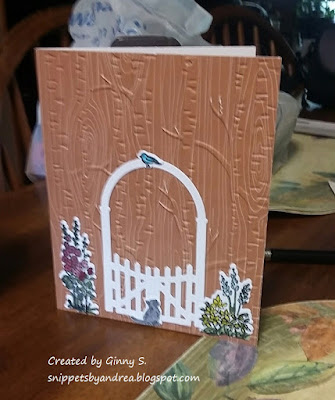
The scene on Ginny's first card is so sweet, with the flowers, gate, and kitten keeping a close watch on that little blue bird. The Cinnamon Cider woodgrain DSP embossed with trees is so clever and a perfect background.

Ginny's second card is bright and bold and would bring cheer to anyone! The Magenta Madness die-cut layer over the Magenta Madness DSP is pink perfection, and I love the rhinestone flower centers.

I had a little prize for this challenge, so I wrote all three names on slips of paper and had my sister choose a random winner. And the winner is ... drum roll, please ... Ginny! Congratulations! Your prize will be in the mail soon. I hope my guest designers enjoyed the challenge -- and I hope you found some inspiration in these beautiful cards.

Thanks for stopping by!