Tuesday, January 31, 2012

'Quilted' card

One of the things I love about Stampin' Up!®'s Designer Series Paper (DSP) is that each pack contains twelve different prints that all coordinate. That makes it really easy and fun to create cards that use more than one patterned paper. And because the paper is double-sided, if I don't like a certain print, I can always use the print on the back. (Of course, there are those times when I love the patterns on both sides ...). Last weekend I used an older pack of DSP to make this quilt card:

Supplies (all Stampin' Up!):
Paper: Spring Showers DSP, textured Bashful Blue card stock, Very Vanilla card stock (or any color to use behind the patterned squares)
Accessories: Vintage Wallpaper embossing folder, Signo white gel pen, 1" square punch, Chocolate Chip taffeta ribbon, basic pearls

I chose seven of the prints in the pack of DSP and punched three 1" squares from each print. I applied several strips of adhesive along the edges and the middle of a 4" x 5" piece of Very Vanilla card stock and just started adhering the squares next to each other. (I used twenty of the twenty-one punched squares.) There are a few places where I didn't get the squares lined up exactly right, which was frustrating, but at least they're not too noticeable over the Very Vanilla card stock.

To create more of a quilt look on this card, I used a white gel pen to make faux stitches diagonally through the squares. Then I embossed the whole piece with the Vintage Wallpaper embossing folder. I tied a piece of Chocolate Chip taffeta ribbon around the "quilt" and adhered it to a card base of textured Bashful Blue card stock. Because I wanted an even border, I trimmed the card base slightly to 4-1/4" x 5-1/4" instead of the standard A2 size (4-1/4" x 5-1/2"). For a last little detail I applied a pearl to the four corners of the "quilt" and to each space where four of the squares met.

I think a design like this would be great for a set of matching cards to give as a gift. I'll have to get to work on that!


Sunday, January 29, 2012

The Lion King

Last night I saw The Lion King at the Orpheum theater in Minneapolis, and as always, it was wonderful. This was the third time I have seen the show, and it never ceases to amaze me. (There was a little technical difficulty with the sound toward the end of the first act, but they paused for a brief intermission and got everything fixed.)

The entire performance is filled with beautiful colors, movement, sound and effects. But my favorite part by far is "The Circle of Life" number at the beginning of the first act. The cast enters the stage -- some through the aisles in the audience -- in animal costumes, and it is breathtaking. It makes me smile, fills me with wonder and awe, and the sheer grandness of it all gives me the chills. The costumes (and that word doesn't even seem sufficient) themselves are stunning, and it's so impressive to me that someone had the idea, let alone the ability, to execute them in such a creative way. But the actors are also wonderful at portraying the mannerisms of the different animals -- the prowling cheetahs, prancing zebras, regal giraffes, and so many more. Every time I've seen The Lion King, I've commented that I would be content paying to see just that opening number, and that is still true.

So if you haven't seen The Lion King, I would wholeheartedly, unabashedly recommend that you go. I can't wait until I get to see it again!

Saturday, January 28, 2012

Clean and simple valentine

I am almost finished making my valentines this year. It's funny how I was so excited to start them after all the Christmas cards, but now I've about had my fill of hearts and frills. I think I only have one more left to make, and then it's just a matter of getting everything signed, sealed and delivered.

I realized last weekend that I needed a couple of slightly more masculine valentines to send to a couple of my great uncles. That can be hard with valentines, since the holiday is basically a red and pink bonanza. But I managed to come up with a design that is clean, simple and not too froufrou:

Supplies (all Stampin' Up!®):
Stamps: Easy Events
Card stock: Pool Party, Whisper White, Riding Hood Red
Ink: Early Espresso pad and marker, Riding Hood Red and Lucky Limeade markers
Accessories: 2-1/2" circle punch, 2-3/8" scalloped circle punch, Small Heart punch, striped Riding Hood Red ribbon, Simply Scored tool, Dimensionals

I left the Pool Party card base mostly plain. I did add randomly spaced score lines on the bottom portion of the card for a little bit of texture, and then I adhered the ribbon just above the score lines. I stamped and colored the image, punched it with a scallop circle punch and layered it on a slightly larger circle. The focal point is adhered over the ribbon with Dimensionals, and a little heart in the upper corner adds some interest to the right side of the card.

That's it! Very quick and simple. Thanks for stopping by!

Friday, January 27, 2012

A 'little' stamping challenge

I spent a lot of time last week deciding, un-deciding and re-deciding what I wanted to put on my Stampin' Up!® order during the Sale-A-Bration promotion. After a bit of hair-pulling, I finally hit the Submit button on my order, and I realized that I ordered quite a few more stamp sets on this order than I have in quite a while.

When I first started buying Stampin' Up! products, I ordered a lot of stamp sets. (And that was back before the stamp images were die-cut in the rubber; you had to trim each stamp image before applying it to the wood block. So while it was immensely fun to pull all those stamp sets out of the shipping box, it was decidedly not fun to cut them all apart.) But as my stamp collection has grown, grown some more and even outgrown my stamping space (despite having donated about thirty sets to our local Ronald McDonald House Charities and pulling out another group of sets to go in a second donation), I've slowed down a bit in how many new sets I purchase. Don't get me wrong, I still love Stampin' Up!'s stamps and would probably by all of them if I had unlimited funds and space. But sadly, a girl has her limits.

So as I await the new stamps that will be arriving next week, I was thinking about the dozens (hundreds? I'm too afraid to count) of stamp sets I have. I love each set for a specific reason, but it never fails that the newer sets always see more ink than my older sets. That fact led me to a decision. Starting in February, I am going to make (at least) one card for each and every stamp set I own. A little clarification: I might use more than one stamp set on a card, but I will only "count" the set that is most prominent. Also, I am not planning to use every stamp in each set. For some sets that would easy and probably even natural. But for others, especially greeting sets, it wouldn't really be possible to use them all on one card, and if I had to make a card for each greeting in every set, why, I think that would have to become my life's work. As it is I'm not sure how long it will take me to complete this "little" challenge.

I'm not sure how many of the cards I will post here on my blog. I started out thinking I would share each one in a separate post, but then I realized that would probably be more blogging than I have time for. What I might do is try to post groups of them in themes: masculine, thank-you, clean and simple, etc. I'm actually looking forward to pulling out some of my "oldies but goodies" and finding out what new ideas I have for them!

If you have some poor, neglected stamps sitting around, I'd love for you to join in my little challenge. Thanks for stopping by!

Tuesday, January 24, 2012

My first easel card

One thing I would like to do more of in my card-making is trying new techniques. Well, last weekend I made my first easel card! An easel card is one that is flat when closed, like a traditional card, but when you open it, it can be propped up so it stands open. (There is a great tutorial for making easel cards on the Splitcoaststamper site.) I actually made the card in two stages. I had made the card base and focal image about a week earlier, but I didn't assemble the whole card. When I came back to it, I didn't really like how they looked together, so I revamped the background. It's still not my favorite, but it's not bad for my first easel card.

Supplies (all Sstampin' Up!®):
Stamps: Greeting Card Kids, Happy Hearts, Holiday Best
Card stock: Very Vanilla, Chocolate Chip, Poppy Parade, Calypso Coral
Ink: Jet Black StazOn, Chocolate Chip; markers: Chocolate Chip, Calypso Coral, Poppy Parade, Blush Blossom
Accessories: Labels Collection Framelits dies, Chocolate Chip satin ribbon, corner rounder, Extra-large Oval punch, Decorative Label punch, Small Heart punch, Dotted Scallop Ribbon Border punch, Crystal Effects, paper-piercing tool, mat pack, Dimensionals

To make the heart background, I chose three heart shapes from the Happy Hearts set, one for each color ink, and randomly stamped them on the card stock. Here's a tip: When doing this type of stamping, start with the lightest color and move to the darkest, so if you overlap images as you stamp, you don't pick up the darker ink colors on your stamp.

The focal image and the mat behind it were cut out with the Labels Collection Framelits dies. For a little texture, I used my paper piercer to punch a border around the edge of the larger label shape. To finish off the card front I added some satin ribbon and a little heart, covered with Crystal Effects, in the lower right corner.

For the inside of the card, I adhered a strip of card stock, punched with the Dotted Scallop Ribbon Border punch, about 1" from the bottom of the card. I stamped and colored the greeting (which I think works perfectly with the image of this sweet little girl holding a valentine heart) then punched it out with the oval punch and layered it on a Decorative Label punched shape. I used Dimensionals to adhere that piece to the card, centered over the punched strip. Another little heart in the lower left corner finishes off the inside.

Making an easel card wasn't as hard as I thought it would be. If you haven't already made one, you should give it a try!

Sunday, January 22, 2012

Birthday ensemble

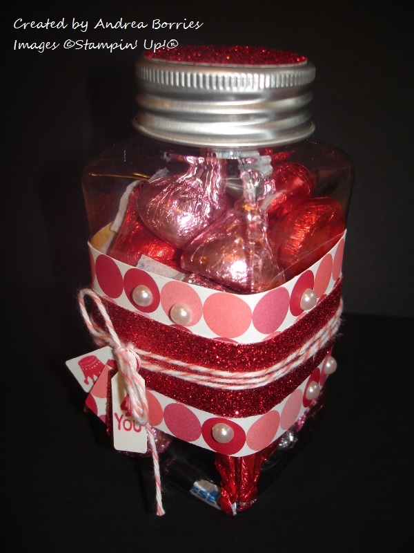
When I sat down at my crafting table today, I decided I was going to create a little set of birthday treats to send to one of my stamping buddies in February. (I hope she doesn't see this, but just in case ... Stop reading, Faith, or you'll spoil your surprise!) Originally my plan was to use colors that were not at all valentine-y (yes, that's the technical term) since I wanted to keep her birthday separate from the holiday. But when all was said and done, I somehow ended up with pink and red anyway:

Supplies (all Stampin' Up!®, unless otherwise noted):
Stamps: Easy Events, Tiny Tags
Paper: Pink Flamingo Designer Series Paper (DSP), Whisper White, Real Red, red glimmer paper
Ink: Jet Black StazOn, Real Red
Accessories: Pearls, Calypso Coral baker's twine, Dazzling Details, 1/4" hole punch, scallop circle punch, Jewelry Tag punch, 1-3/8" circle punch, Lace Ribbon Border punch, Itty Bitty Shapes punch pack, Sticky Strip, Dimensionals, electric tealight candle (various manufacturers), small jar (Making Memories)

I was pretty pleased with how everything turned out. I kept the color scheme simple by using just one of the patterns from the Pink Flamingo DSP, and I love the sparkle from the red glimmer paper. Here are pictures and a few details for each of the separate items:

I adhered a strip of red glimmer paper to a wider strip of DSP and wrapped them around the jar. I applied adhesive just on the overlapping end of the strip, so it's not adhered directly to the jar. However, the sides of the jar get a bit wider at the top and bottom, so the paper doesn't slip off.

I wrapped a pice of Calypso Coral baker's twine around the jar three times, then I knotted the twine, added the four tags I punched (one stamped "4 you," one stamped with a crown, one from the DSP and one from the glimmer paper) and tied the bow. I randomly added pearls to some of the circles on the DSP (and I placed them off-center purposely). For the top of the lid, I just glued on a circle of red glimmer paper. I considered adding ribbon around the lid, but I decided I liked the metallic look with the glimmer paper and the shiny wrappers on the Hershey's Kisses.

I've made one of these tealight candle birthday cakes before, and they are really simple and adorable. (I should have turned it on before I took the picture!) There is a great tutorial for this project on Splitcoaststampers. I made a couple of modifications to the tutorial: The strip I used around the tealight is 7/8" instead of 3/4" to hide the on/off switch on the bottom of the candle, and after Step 5, I tested my scallop circle to be sure it fit over the "flame," and then I punched a 1/4" hole in the center before gluing it down. And here's one more tip: If you put something like pearls on the scallops of the circle, apply them before you glue it on the candle. (I applied them after the fact, and it was a little tricky.) The shape on top the scallop circle is punched with the Lace Ribbon Border punch; I just punched a piece of glimmer paper once and then cut out one flower shape.

This is a 3" x 3" card, which will fit perfectly in this gift. I used a piece if DSP for the background and wrapped a piece of Calypso Coral baker's twine around the card front three times. For the focal point I stamped the cupcake image on Whisper White and on a piece of DSP. I cut out the part of the image with the cupcake wrapper from the DSP and glued it on the Whisper White. I left the "frosting" white but covered it with Dazzling Diamonds for a little sparkle. A glimmer paper flower and pearl are the perfect "garnish." I left the cupcake stand plain because I wanted the cupcake to really stand out, but I did add little pearls to the fringe. I layered the image with glimmer paper, and adhered it to the card with Dimensionals.

I think this little ensemble (and it sounds really impressive if you say it with a French accent) will show a good friend that I'll be thinking about her on her birthday even if I can't celebrate with her. But here's the sad post-script to this post: After I finished taking these pictures, my camera decided to stop working with no good reason. It was working, and then it wasn't. I had made a couple of other cards today, and my sister let me use her camera to take pictures of those. But now I need to either get my camera fixed or buy a new one. Bummer.

Thanks for stopping by!

Thursday, January 19, 2012

Festive frog

I had some time to be creative after work today and put together a "hoppy" birthday card with a festive little frog:

Dark blue card with presents stamped on the background. The focal image is a layer of yellow polka dot paper, a layer of polka dot embossed green card stock and a white layer stamped with a from wearing a birthday hat. A banner is stamped with "happy birthday wishes."
Supplies (all Stampin' Up!®):
Stamps: Turtle & Co.
Paper: Designer Series Paper (DSP) Patterns Stack - Brights Collection (Daffodil Delight); card stock: Whisper White, Island Indigo, Lucky Limeade
Ink: Jet Black StazOn, Island Indigo; markers: Lucky Limeade, Daffodil Delight, Island Indigo
Accessories: Labels Collection Framelits dies, Perfect Polka Dots embossing folder, Lucky Limeade ruffled ribbon, In Color Designer Printed Brads, Dimensionals

For the background I repeatedly stamped the presents image on an Island Indigo card base. In the middle of the card I adhered a piece of polka dot Daffodil Delight DSP cut with the third largest Labels Framelits die. Then I glued a piece of ruffled ribbon along the middle of the card. I used the third smallest Labels Framelits die to cut a piece of Lucky Limeade card stock, and then I embossed the label shape with polka dots and used Dimensionals to adhere it over the ribbon.

For the focal image, I stamped the frog and hat on Whisper White card stock, colored it and cut it out with the smallest Labels Framelits die. To create the "flag," I first applied Island Indigo ink to just a portion of the greeting and stamped it on a strip of Whisper White card stock. Then I trimmed the right end of the strip into a V and glued the left end to the back of the frog image. I adhered the frog to the layered labels and glued the right end of the greeting flag to the card base so that the flag curves up just a bit instead of lying flat. A brad in the lower left corner is the finishing touch.

I love this fun, bright color combination, and this happy frog with his party hat just makes me smile. Thanks for stopping by!

Tuesday, January 17, 2012

Inspired valentine

My favorite way to create a card (or anything, really) is just to sit down and play. I try combining different colors, layouts, stamps and embellishments until I have a finished product that I like. Most of the time that method works (although the length of time it takes to get to that finished product can vary quite a bit), but occasionally I get stuck, and nothing seems to come out right. And (of course!) when this does happen, it's usually at a time when I really need to make a card for a certain occasion.

I've been struggling with that a little bit the past week or so. I had to create a card design for a make-and-take at a Stampin' Up!® workshop. The design needed to be fairly simple so no one would feel rushed or frustrated trying to make the card, but I didn't want it to be too plain, either. I had a couple of ideas, but nothing seemed quite right. So I decided to go looking for some inspiration.

I found it in the 2012 Occasions Mini Catalog from Stampin' Up! In the upper right corner on Page 8 of the catalog is a simple, but adorable, valentine. I love the layout, the hearts with different sizes and textures, and even the greeting in the Modern Label punch. But I don't have the stamp set and some of the other products used to make that card. Even if I did, I wouldn't want to copy that card exactly. Instead I used it as an inspiration for my own valentine:

Supplies (all Stampin' Up!):
Stamps: Teeny Tiny Wishes
Card stock: Pink Pirouette, Calypso Coral, Lucky Limeade, Whisper White
Ink: Calypso Coral Classic Ink pad, Pink Pirouette marker
Accessories: Color Spritzer, corner rounder, 1/8" Calypso Coral organdy ribbon, Fashionable Hearts Embosslits die, Perfect Polka Dots embossing folder, Full Heart punch, Word Window punch, Modern Label punch, Itty Bitty buttons, Calypso Coral baker's twine, Dimensionals, Mini Glue Dots

I used the Color Spritzer tool with the Pink Pirouette marker to create a subtle background texture, and then I rounded all the corners on the card. For the large heart, I embossed a piece of card stock with the Perfect Polka Dots embossing folder and then punched out a heart. The other hearts are made with the Fashionable Hearts Embosslits die. I punched out the greeting with the Word Window punch, matted it with a Modern Label punch, and adhered it over a piece of ribbon I wrapped around the lower part of the card. For the last little detail, I tied a piece of baker's twine through a small heart-shaped button and glued it to the card next to the top pair of hearts.

This is actually the second version of my "inspired valentine." The first one is okay, but I wasn't thrilled with it. I'm glad I decided to try again with this color combination, because I'm really excited about how this one turned out.

I hope you find inspiration whenever and wherever you need it. Thanks for stopping by!

Monday, January 16, 2012

DVD case notepad holder

I love making quick, easy and cute gifts with my hoard of paper crafting supplies, and it's even better when the gifts are useful. So today I made a notepad holder using a DVD case.

Supplies (all Stampin' Up!®, unless otherwise noted):
Paper: Petal Patch Designer Series Paper (DSP); card stock: Chocolate Chip, Bashful Blue, Certainly Celery, Whisper White
Accessories: Chocolate Chip satin ribbon, Bashful Blue taffeta ribbon, Bird Builder punch, Scallop Edge Border punch, 1/4" circle punch, Cherry Blossom Embosslits die, Scor-Tape (Scor-Pal), DVD case, RSVP pen, 4" x 6" scratch pad

I've made one of these notepad holders before, although I can't take credit for the original idea, and they are really fun to make. The hard case is nice, too, because it doesn't get tattered from being carried around in a purse, tote bag or back pack.

For this holder, I decided to use the Petal Patch  DSP -- I think my all-time favorite pack of DSP. To make the inserts for the front and back of the case, I layered two of the prints together with a piece of Chocolate Chip ribbon providing a little separation. Because these inserts are slipped under the plastic sleeve on the DVD case, they need to be fairly flat (i.e., no bulky embellishments), so I added a simple die-cut flower and punched leaves. (I love how well the flower and leaves coordinate with the papers; that was a happy discovery.) I did place a little bit of adhesive in the middle of the back of the inserts to keep them from falling out of the case (although they are pretty secure as is), but you could leave them loose, so the inserts could be changed.

The size of the front and back inserts is about 4-7/8" x 7". The insert for the back is the same as the front, but without the flower and leaves. For the spine I inserted a strip of Chocolate Chip card stock that is about 1/4" x 7".

 For the inside of the notepad holder I cut two 4-1/2" x 6-1/2" pieces of Chocolate Chip card stock. (I wanted them slightly smaller than the size of the case so you can still see a border of the print on the reverse side of the inserts.) In one of the pieces I cut a slit (about 4-1/8" long by 1/8" tall) about 1/4" from the top, then placed adhesive just around the edges and adhered the card stock to the right side of the notepad holder. The cardboard backing on the notepad is slipped through the slit, so the notepad can be replaced as needed.

For the left side of the holder I created a pocket to hold notes, coupons, etc. The pocket is 4-1/4" wide and approximately 4-1/2" high. I cut the paper for the pocket slightly larger (I added 1/2" on each side and 1" on the bottom) then scored fold lines and folded the flaps back. Then I used the Scallop Edge Border punch along the top of the pocket, added Chocolate Chip satin ribbon about 1" from the scalloped edge, placed adhesive on the flaps and glued the pocket to the Chocolate Chip card stock. I added another flower and leaves to the ribbon on the pocket.

The last part of the notepad holder is the pen. I rolled up a small strip of DSP and slipped it inside the barrel of an RSVP pen and tied a small piece of Bashful Blue taffeta ribbon to the cap. For the pen holder, I placed adhesive on one end of a small piece of Chocolate Chip satin ribbon. I rolled the ribbon into a loop, making sure it was large enough to slip the pen in and out easily, and secured the adhesive. Then I adhered the loop to the spine of the DVD case. (The case still closes even with the notepad and pen.) Done!

I have to make two more of these notepad holders for gifts in the next couple of months, and I'll be sure to share those designs when they're done. Thanks for stopping by!

Sunday, January 15, 2012

Birthday 'fishes'

One of my cousins is turning five this week, so it's time for another birthday card. I needed a cute boyish card, and frankly, it was nice to have a little change of pace from the pink and red valentines. Without further ado, here is the final product:

Blue side stair-step card designed to look like an ocean scene. Light brown card stock stamped with seashells is the sand, and stamped and cut-out turtle, octopus and fish are attached to the "steps." Greeting is "birthday fishes."
Supplies (all Stampin' Up® unless otherwise noted):
Stamps: Rough Edges Alphabet, Summer Splash, Shore Thing
Card stock: Pumpkin Pie, Old Olive, Crushed Curry, Crumb Cake, outer stair step card - Festive Variety pack (The Paper Cut)
Ink: Pumpkin Pie, Old Olive, Crushed Curry, Crumb Cake, Bermuda Bay
Accessories: Itty Bitty Shapes punch pack, Dimensionals, Mini Glue Dots, Wire Works copper wire, multipurpose liquid glue

I bought a pack of pre-cut and -scored stair-step cards several months ago, and I thought this would be a good time to try them out. I decided an ocean theme would work well because the sea animals could be popping out of the "waves" created by the steps.

Close up of light brown card stock stamped with seashells as the sand.
I started by making a layer of "sand" at the bottom of the card by stamping a strip of Crumb Cake card stock with the speckled sand image from the Shore Thing set. I ripped along the top of the strip to add more texture and then stamped, cut out and adhered a few seashells and a little crab.

To create the "ocean," I first stamped the wave images in Bermuda Bay repeatedly on the steps of the card base. Then I stamped and cut out a turtle, octopus and three fish from Pumpkin Pie, Old Olive and Crushed Curry card stock.

Close up of octopus on blue "step" and two fish attached with wire.
I needed something to fill the empty space on the right side of the card above the top fold so I decided to have two of the fish leaping out of the "water." I cut two pieces of wire and used liquid glue to adhere the wires to the backs of two of the fish. (To cover the wire and to make it a bit more stable, I glued a small circle of the same color card stock over the wire.) I gently curved the wires and glued the ends to the front of the top step. I let the glue dry a bit and used a Dimensional to adhere the octopus over the ends of the wires. Then I added the turtle and the last fish on the lower step.

I wanted to create my own greeting for the left side of the card, so I went with a little pun: "birthday fishes." To add some color on that side, I used the Rough Edges Alphabet set to stamp the individual letters for the greeting on the different colors of card stock. I punched them out with the circle punch from the Itty Bitty Shapes punch pack and adhered them to the card with Mini Glue Dots.


I had a"fin" time making this card. Thanks for stopping by!

Thursday, January 12, 2012

Watercolor blooms

This afternoon I had fun playing with one of my stamping supplies that I don't use very often: Watercolor Wonder Crayons. I paired them up with one of my floral stamp sets and made a bright, spring-feeling card:

Supplies (all Stampin' Up!®):
Stamps: Awash with Flowers, Sincere Salutations
Paper: Watercolor paper; card stock: Very Vanilla, Basic Black, Certainly Celery
Ink: Jet Black StazOn, Certainly Celery; Watercolor Wonder Crayons: So Saffron, Certainly Celery, Always Artichoke, Regal Rose, Rose Red
Accessories: Aqua Painter, 1/8" Basic Black taffeta ribbon, basic pearls, oval punch, scalloped oval punch, paper piercer, mat pack, Dimensionals

There's nothing too complicated here: I stamped the flowers on watercolor paper, colored them with the Watercolor Wonder Crayons and then used an Aqua Painter to blend the colors. It's hard to tell in the photo, but I stamped and colored the three large leaves on a separate sheet of watercolor paper, cut them out and adhered them on the card with Dimensionals. I embellished the card with some ribbon, pearls and a greeting.

One of the things I've always liked about watercolor art is the free, imperfect look of it, the colors blending together and flowing outside the lines. That was what I wanted to achieve here, but I didn't quite get there. The blending is okay (it looks better in person than in this picture), but the colors still aren't "flowy" enough. Overall, though, I'm pleased with the result. I'll just have to keep trying it and find out if practice makes perfect.

Monday, January 9, 2012

Kids valentines

Between all the kids at the childcare where I work and all of my cousins' kids, I mail and hand out a lot of kids valentines each year. I don't always make all those valentines myself, but that's what I decided to do this year. Of course, that meant I needed a quick and simple, but still cute, card design that I could mass produce.

Various 3" x 3" valentine cards with circle focal layer and a stamped image of an animal and a heart.
I thought animals would be a good theme since they aren't either too boyish or too girly. I worked on the cards yesterday afternoon and today after work and made a total of fifty kids valentines. That should be enough with a few left over (just in case I miscounted).

I decided to make 3" x 3" cards because A) they seem like a good kid size and B) you can get eight cards of that size from one piece of 12" x 12" card stock. I used textured card stock for the card bases in a variety of colors: Pixie Pink, Real Red, Chocolate Chip, More Mustard, Not Quite Navy, Ballet Blue and Bashful Blue.

Various 3" x 3" valentine cards with circle focal layer and a stamped image of an animal and a heart.
For the images I used five different stamp sets: Punch Bunch, Very Punny, Animal Stories, Wild About You, and Turtle & Co. I stamped the images on Whisper White card stock and colored them if needed. The line images are stamped in Chocolate Chip, Basic Gray or Jet Black StazOn ink and colored with markers. The solid images are stamped in Basic Gray, More Mustard, Ballet Blue or Not Quite Navy.

I was going to leave it at that, but the cards looked a little too plain. So I added just a little bit of ribbon on each card. (Note: All the products I used for these cards were from Stampin' Up!® except the ribbon.)

Various 3" x 3" valentine cards with circle focal layer and a stamped image of an animal and a heart.
For most of the cards, I stamped the image of the thought bubble and heart (from the Turtle & Co. set) along with the animal. But there were a couple of images where that didn't quite work. So for those cards I punched a small heart from red card stock and glued it on the image. Inside each card is another 2-1/2" white circle stamped with the greeting "be my valentine."

That's about it. Definitely quick and easy, and it feels good to know that I already have them done!

Thanks for stopping by!

Saturday, January 7, 2012

Hearts and flowers

I had some stamping time last night and this afternoon, so I have a few cards to share. I've still been focused on valentines, with a birthday card thrown in here and there for good measure. Of course that means there are plenty of hearts and flowers:

Supplies (all Stampin' Up!®):
Stamps: Easy Events
Card stock: Very Vanilla, Early Espresso, Lucky Limeade, Poppy Parade
Ink: Early Espresso pad and marker, Poppy Parade and Lucky Limeade markers
Accessories: Perfect Polka Dots embossing folder, Small Heart punch, Lace Ribbon Border punch, Labels Collection Framelits dies, 1/8" Lucky Limeade organdy ribbon, Dazzling Details, Dimensionals, Multipurpose Liquid Glue

I used my new Framelits dies with this card -- the second smallest die for the Very Vanilla piece and the third smallest for the Poppy Parade mat. I love that with the Framelits you can see exacltly where you are cutting so you can easily cut out stamped images (although I still managed to end up with this one a bit crooked).

For the accent along the middle of the card, I punched a strip of Lucky Limeade card stock with the Lace Ribbon Border punch. I wove the ribbon through the holes in the punched piece of card stock and around the card front and then tied a bow in the front. To make sure the punched strip stayed secure I also put dots of Multipurpose Liquid Glue on the back.

For a little sparkle, I added Dazzling Details to the punched heart in the corner and also the heart on the tree. I like that this card doesn't look too valentine-y (that's the technical term); it could be a get well, thinking of you, miss you or anniversary card.

Supplies (all Stampin' Up!):
Stamps: Easy Events
Card stock: Whisper White, Pear Pizzazz, Blushing Bride, Pink Pirouette
Ink: Pear Pizzazz
Accessories: Perfect Polka Dots embossing folder, Cherry Blossom Embosslits die, Jewelry Tag punch, Bird Builder punch, 5/16" Neutrals brads, Blushing Bride stitched-poly ribbon, white baker's twine, paper piercer, mat pack, Dimensionals

For the "birthday wishes" tags on this card I used the sentiments from two different stamps in the Easy Events set: "happy birthday" and "wedding wishes." I applied ink only to the word I wanted then stamped it on Whisper White card stock and punched it out. One little tip: Because the jewelry tags are small, I've found that it's easier to make holes in the ends of the tags with a paper piercer than a hole punch.

Supplies (all Stampin' Up!):
Stamps: Filled with Love, Teeny Tiny Wishes
Card stock: Very Vanilla, Calypso Coral, Poppy Parade, Lucky Limeade
Ink: Lucky Limeade, Calypso Coral
Accessories: Vintage Wallpaper embossing folder, Small Heart punch, Boho Blossoms punch, Word Window punch, Modern Label punch, 1/16" hole punch, 1/8" Lucky Limeade and Calypso Coral organdy ribbon, Basic Pearls, Stamp-a-Ma-Jig, Dimensionals

When I stamped the flower stems for this card, I used the Stamp-a-Ma-Jig tool to line them up (mostly) evenly. I covered the hearts at the top of the stamped images with an alternating pattern of punched hearts and flowers. And naturally the flowers needed little pearl centers.

To make the ribbon ruffle at the bottom of the focal piece, I applied a strip of adhesive on the back of the card stock along the bottom edge. Then I started at one end of the adhesive strip and pressed down the ribbon, making little loops as I moved to the other side. I used Dimensionals to adhere the whole piece to the card. I'd never tried this technique before, but I think it worked well with the width and thinness of this ribbon.

Thanks for stopping by!

Thursday, January 5, 2012

New stamping goodies

Yesterday I got an order with some new Stampin' Up!® goodies -- yea! -- so I had to put some of them to use today:

Supplies (all Stampin' Up!):
Stamps: Best Friends Forever, Grateful Greetings
Card stock: Soft Suede, Very Vanilla, Poppy Parade, Calypso Coral
Ink: Soft Suede, Lucky Limeade
Accessories: Fashionable Hearts Embosslits die, Labels Collection Framelits dies, Scallop Edge Border punch, mat pack, paper piercer, Lucky Limeade ruffled ribbon, Everyday Enchantment brads and ribbon (Calypso Coral 1/8" organdy ribbon), Glue Dots, Dimensionals


I think I was most excited to try out the new Framelits dies. I love that there are different size dies in the same shape so you can make mats and frames. For this card I used the third-largest die from the Labels Collection to cut the shape for the focal image. I randomly stamped the stems and leaves image from the Best Friends Forever set in Lucky Limeade along the bottom of the label shape and adhered a few hearts (cut with the Fashionable Hearts Embosslits) with Glue Dots and Dimensionals so they looked like flowers. I stamped a greeting in Soft Suede at the top of the label.

Along the left edge of the card I adhered layers of Calypso Coral and Poppy Parade card stock punched with the Scallop Edge Border punch. For the top, bottom and right edges I used a paper piercer and the mat pack to make a subtle border.

I wanted to add ribbon to the card, so I tied a piece of Calypso Coral ribbon over the scalloped pieces. I even managed to tie a decent-looking bow, which always makes me happy. Much to my chagrin, bow tying is not really one of my strengths. So for the Lucky Limeade bow on the label, I used a little trick with the brad. Here is a quick mini tutorial:

Step 1. Cut a piece of ribbon and adhere one end over the other to make a loop. (I forgot to take a picture of this step -- sorry!)
Step 2. Keeping the prongs of the brad bent, pull them apart and away from the back of the brad.
Step 3. Flatten the ribbon loop and place it between the open prongs and against the back of the brad. I used a piercing tool to help push the edges of the ribbon under the prongs.

Step 4. Bend the prongs back up together over the ribbon loop. Then place the brad through your card stock as you normally would. It's really easy and a fun way to add a little ribbon accent.


I really enjoyed making this card; it's always fun to play with new stamping toys! Thanks for stopping by!

Tuesday, January 3, 2012

Mini valentines

With Christmas and New Year's past, it's time to start making cards for Valentine's Day! Here is the first set of valentines I made over the weekend:

Supplies (all Stampin' Up!®):
Cardstock: Soft Sky, Real Red
Accessories: Love Impressions rub-ons, Real Red 1/8" taffeta ribbon, 2-3/8" scallop circle punch, 1-3/4" circle punch, Dimensionals

These are pretty simple 3" x 3" cards. For the most part, I just used a sheet of the Love Impressions rub-ons (from last year's Occasions Mini Catalog from Stampin' Up!) - no stamps or ink! I did dress them up with a little ribbon (and a couple of punched shapes in the top right card), but that's it!

These cards probably will be sent to a few of my extended family members. I'm planning to put them in slightly bigger envelopes (about 3" x 5") so I can also tuck in a scratch-off lottery ticket or two and maybe make someone's Valentine's Day a little extra special!

This was a pretty short post, but I'm sure I'll have more Valentine's Day projects to share with you in the coming days and weeks. Thanks for stopping by!

Sunday, January 1, 2012

Happy new year!

It seems crazy, but 2012 is here! I know it's going to take me some time to get used to writing that in dates; I feel like I just mastered 2011. But then yesterday morning I went to the grocery store, and when I wrote the date on my check, I almost wrote 12/31/99. Oops. It happens every once in a while that I come up with some random year while I'm writing the date, like 1986 or something. Strange.

My sister and I had a quiet celebration last night. Our parents and brother came over with dinner (Chinese food!) and then we played a few games. For Christmas I gave my brother a game called Munchkin. It's a dungeon-adventure card game -- slaying monsters, cursing opponents, getting funny magic items and the like. It's fairly popular, was recommended to me and sounds like a lot of fun. Word of warning: don't start trying to learn this game at 11 p.m. We read through about half the instructions, which was a lot of explanation about the different types of cards and how/when to use them, and pretty much just gave up. I'm sure it's very fun and amusing once you have those basics down, but it was a little too much for us in our already-tired-but-we-have-to-stay-up-until-midnight state. Then we did the countdown, yelled "Happy new year" (in a reserved way, since we're in an apartment after all) and that was pretty much it.

One thing I didn't spend any time doing last night was thinking up resolutions. I've tried making resolutions a few times, but it always seems like a great big way to set yourself up for disappointment. Just because I hang up a new calendar doesn't mean I'm going to become a different person overnight, so why create more stress about it? Of course, that doesn't mean there aren't things I want to change or improve about myself. But I try (note the key word "try") to think about and work toward those things all year round, not just save them all up for January 1. I know, however, that resolutions are important to a lot of people, so if you've made any for yourself, I wish you much success in your endeavors!

Well, I guess that's about it for now. I've been doing a little stamping today, so maybe I'll have some cards to share with you tomorrow. Thanks for stopping by and have the happiest of new years!