Friday, February 22, 2013

Bathroom color inspiration

You never know where you'll find inspiration for a card. The cover of a book, a magazine ad, a child's toy. Anywhere, really. Personally, my eye is often drawn to colors, from the serene hues of a misty morning on the beach (Mother Nature never makes a mistake with colors!) to the bold, bright packaging of a product in the grocery store. Yesterday I made cards inspired by two color combinations I found in, of all places, my bathroom.

My first inspiration was the group of bottles in my shower caddy. I knew I had to try this combo soon -- before the bottle second from the right was empty. (It would look really different without the yellow, wouldn't it?) The colors are: Pumpkin Pie, Lucky Limeade, silver glimmer paper, Summer Starfruit, Tempting Turquoise. They aren't exact matches, but they're close. I was a little skeptical at first because I didn't think Summer Starfruit would work at all with the bright colors, but I discovered that in this grouping Summer Starfruit looks a lot brighter itself.

And here is the inspired card:
Supplies (all Stampin' Up!®):
Stamps: Bring on the Cake
Card stock: Basic Black, Whisper White, Pumpkin Pie, Lucky Limeade, Summer Starfruit, Tempting Turquoise, silver glimmer paper
Ink: Jet Black StazOn, Pumpkin Pie, Lucky Limeade, Summer Starfruit, Tempting Turquoise
Accessories: Petite Curly Label punch, rhinestones, Dimensionals

What do you think? I noticed after I made the card that even the way I used the colors -- not just the colors themselves -- was inspired by the bottles. Each of the four pennants features one main color, just like the bottles. I decided to keep the colors in the same order as the bottles (except for the silver, which I moved to the background) because I really liked how they looked in that arrangement.

My second inspiration was the shower curtain I bought at Ikea last fall when we moved into our new place. Honestly, I would have expected myself to pick a flowery shower curtain, but I immediately loved the colors and funky graphics in this one. And the rest of my bathroom is very, very white, so the bold colors are perfect. The colors are: Real Red, Pumpkin Pie, Pear Pizzazz, Ballet Blue, Basic Gray, Going Gray. (In the photo, the blue card stock looks pretty different from the blue in the shower curtain, but in reality, they are close to a perfect match.)

Here is the card:
Supplies (all Stampin' Up!):
Card stock: Textured Whisper White, Real Red, Pumpkin Pie, Pear Pizzazz, Ballet Blue, Basic Gray, Going Gray
Ink: Basic Black marker
Accessories: 1" square punch, corner rounder, rhinestones, Tombow Mono Multi liquid glue

On the shower curtain the colors are spread around and repeated, so I took that approach with the card, too. The card is 5-1/4" square, and all the margins are approximately 1/4". I added the faux stitching as an afterthought, and I'm not sure I would do it again with this layout. But I love the clean and simple design that really lets the colors speak for themselves.

I'd love to know what has inspired you lately. Thanks for stopping by!

Wednesday, February 20, 2013

Birthday pinwheel

One of the things I got in my last Stampin' Up!® order was the new Pinwheel Sizzlits die. I was really excited to use this die to make masses of adorable little pinwheels for birthday cards and maybe even coordinated packaging. Well, I now can honestly say that I don't think I will be making masses of pinwheels without a lot more practice. Don't get me wrong, they are definitely adorable. And I love that the die, which is very reasonably priced, cuts them to the perfect shape and even makes a hole on each flap so they can be aligned for placing on a brad. The problem, however, is that my fingers are far from dainty, and it's quite tricky to get everything folded in and held together while trying to slip a tiny brad through five tiny holes.

I did discover that it's easier to make the pinwheels with Designer Series Paper (DSP) than with card stock. And when I have a chance I'll do a little research to see what tips other crafters might have. For now I have one clean and simple pinwheel birthday card to share with you.

Supplies (all Stampin' Up!):
Stamps: Teeny Tiny Wishes
Paper: Shimmery White, Pool Party, Early Espresso card stock; Polka Dot Parade DSP
Ink: Early Espresso
Accessories: Top Note die, Cloudy Day embossing folder, Pinwheel Sizzlits die, mini silver brad, Brights buttons, white baker's twine

I love the combination of Real Red with Pool Party, and I think the Cloudy Day embossing folder will be one of my favorites. So all in all, I really like how this card turned out, even with a little extra effort for the pinwheel.

Thanks for stopping by!

Tuesday, February 19, 2013

Ears to You and Hello, Foxy

Today I have a couple of cards to share that use two of Stampin' Up!®'s single stamps: Ears to You and Hello, Foxy.

Supplies (all Stampin' Up!):
Stamps: Ears to You
Paper: Midnight Muse, Gumball Green, Very Vanilla card stock; Print Poetry Designer Series Paper (DSP) stack
Ink: Midnight Muse, Crumb Cake
Accessories: Labels Collection Framelits dies, Festive Paper-Piercing Pack, paper-piercing mat and tool, Crumb Cake seam binding ribbon, pearls, Dimensionals

I love the little bunnies in this stamp. One of my friends has a pet bunny, so I made this card with her in mind. (Her birthday isn't until June, so I'm actually ahead of the game on this one.) Here are a few details about this card:
~ To make the layered shape for the focal image, I used one of the Labels Collection Framelits dies to cut a piece of Very Vanilla card stock. Then I traced around the same die on Gumball Green card stock and cut it out by hand.
~ I stamped the bunnies with Midnight Muse on the focal layer and then with Crumb Cake on scrap card stock. I cut out one of Crumb Cake bunnies and adhered it to the focal image with Dimensionals.
~ I lightly sponged around the edges of the banner with Midnight Muse card stock so it would stand out against the focal image. To add some dimension to the banner I put two Dimensionals (on top of each other) in the middle of the banner and then adhered the ends to the card base.

Supplies (all Stampin' Up!):
Stamps: Hello, Foxy
Card stock: Tangerine Tango, Baja Breeze, Natural Ivory
Ink: Jet Black StazOn, Tangerine Tango
Accessories: Window Collection Framelits dies, Perfect Polka Dots embossing folder, Festive Paper-Piercing Pack, paper-piercing mat and tool, Baja Breeze seam binding ribbon, Itty Bitty Shapes punch pack, rhinestones, Dimensionals

I will admit that although I think this image is adorable, I had a hard time figuring out how to use it. I stamped and colored the image several times with different colors and techniques until I finally settled on this one. For the layout, I went with a design similar to the previous card, but I changed it up with a different shape Framelits die and an embossed background instead of the DSP. I' m still not completely satisfied with this card, though; I'll have to keep working with this stamp.

Thanks for stopping by!


Sunday, February 17, 2013

Simple vintage

I love the look of vintage-inspired cards: the images, colors, layers and embellishments. But while I really admire them, I have a hard time making them. Putting together all the elements so they look "right" is sometimes a struggle for me. So today I made a simple vintage card.

Supplies (all Stampin' Up!®):
Stamps:Vintage Verses, Feeling Sentimental, Lovely Little Labels
Card stock: Crumb Cake, Early Espresso
Ink: Crumb Cake (pad and marker), Early Espresso
Accessories: Early Espresso baker's twine, corner rounder, color-spritzer tool, Vintage Trinkets, Little Labels punch pack, sponge, bone folder

I used a neutral color combination of Crumb Cake and Early Espresso. I stamped the bicycle image in Crumb Cake ink on a piece of Crumb Cake card stock for a subtle tone-on-tone effect. Then I used Early Espresso ink to stamp the sentiment, slightly overlapping the first image. To add a distressed look to the layer, I spritzed it with a Crumb Cake marker and the color-spritzing tool, sponged the edges with Early Espresso and then ran a bone folder along the edges to curl them up just a little.

I adhered the Crumb Cake layer to an Early Espresso card base and tied Early Espresso baker's twine around the top of the card. I stamped and punched out two images from the Lovely Little Labels stamp set in Early Espresso ink on Crumb Cake card stock. Then I put the tags on a small safety pin and attached the pin to the knot in the baker's twine.

I really like the way this card turned out with its vintage feel and simple layout. I hope it gives you a bit of inspiration. Thanks for stopping by!

Saturday, February 16, 2013

Thanks a ton

Last week I needed to make a few quick thank-you cards, and here is the 3" x 3" card I designed:

Supplies (all Stampin' Up!®):
Stamps: Patterned Occasions
Card stock: Perfect Plum, Pear Pizzazz, Very Vanilla
Ink: Perfect Plum, Pear Pizzazz, So Saffron, Bordering Blue markers
Accessories: Decorative Label punch, So Saffron 5/8" grosgrain ribbon, white baker's twine, pearls, Dimensionals

I started with a Perfect Plum card base, tore a strip off the bottom of the card front and adhered a piece of Pear Pizzazz card stock to the inside of the card front. (I used to use this technique a lot when I made cards, and it was fun to try it again.) I wrapped a piece of So Saffron ribbon around the card front so the ends of the ribbon were on the right side of the card. Tip: I used a little adhesive to secure the ribbon to the card stock. Then I wrapped a piece of baker's twine around the ends of the ribbon several times, pulling the twine tightly to gather the ribbon, and tied the twine in a knot. I trimmed the ends of the ribbon to look a little more decorative.

For the focal point, I used markers to color the elephant image from the Patterned Occasions stamp set, stamped it on Very Vanilla card stock and punched it out with the Decorative Label punch. I then used Perfect Plum to color the ear part of the image, stamped it on scratch card stock, cut it out and used a Dimensional to adhere it to the main image. I also used Dimensionals to attach the punched image to the card, and for a final detail I added a small pearl to the flower on the stamped image and a large pearl to the upper left corner of the card.

Thanks (a ton) for stopping by!

Tuesday, February 12, 2013

Cuteness in a card

Today I have a couple of birthday cards to share that I think are just plain cute.

Supplies (all Stampin' Up!®):
Stamps: For the Birds
Card stock: Whisper White, Marina Mist, Daffodil Delight
Ink: Jet Black StazOn, Marina Mist, Daffodil Delight
Accessories: Cloudy Day embossing folder, white baker's twine, Brights buttons, Dimensionals

See? Total cuteness. ("It's your birthday!" is stamped inside the card to complete the sentiment.)

To create this layout, I started with the stamped focal image. I liked the extra white space below the image and wrapped white baker's twine around the card stock to add some subtle visual interest. I chose a Marina Mist card base to represent the sky and embossed it with the Cloudy Day embossing folder for the perfect texture. I toyed around with the idea of using punches to create a sun, but that didn't seem quite right. Instead I used a Daffodil Delight button tied with a bit of baker's twine. I wanted to repeat that color, so I created a Daffodil Delight pennant, distressed the edges a bit and adhered it to the card base. I used Dimensionals to adhere the focal image over the pennant.

Supplies (all Stampin' Up!):
Stamps: Stacks of Wishes
Paper: Crumb Cake, Whisper White card stock; Polka Dot Parade Designer Series Paper (DSP)
Ink: Real Red, Marina Mist, Old Olive
Accessories: Linen thread, corner rounder, Dimensionals

This card is 3" x 6" and features four panels. The three pieces of DSP are each 1" x 2-1/2", and the focal image is 1-3/4" x 2-1/2". All the margins measure 1/4" (or at least they're supposed to; mine are a wee bit off in a few places). I adhered the three DSP panels to the card and then wrapped the linen thread around the card front two times and tied it in a knot. Using Dimensionals, I adhered the focal image over the linen thread. To create the multicolor effect on the stamped image, I used markers to color directly on the rubber stamp. I didn't add any extra embellishments because I was trying to keep this card gender-neutral, but I thought long and hard about adding some rhinestones to the pieces of DSP. But even without them, I still think it's a cute card.

Thanks for stopping by!

Monday, February 11, 2013

Last-minute valentines

As I was addressing my valentines over the weekend, I realized that I was a few cards short. I didn't have time to create anything too elaborate, so I decided to start with a layout I used in my "Valentines or anytime" post and make it just a little more festive.

Supplies (all Stampin' Up!® unless othewise noted):
Stamps: Turtle & Co.
Cardstock: Whisper White, Gumball Green, Primrose Petals
Ink: Jet Black StazOn, Gumball Green, Primrose Petals
Accessories: Chevron embossing folder, small heart punch, Fairy Tale Ribbon Originals, corner rounder, google eyes (Inkadinkadoo), Dimensionals

I embossed a 4" x 5-1/4" piece of Gumball Green card stock and adhered it to a card base of the same color. I adhered a piece of pink stitched grosgrain ribbon across the card front and added a small Primrose Petals punched heart in the bottom right corner. For the focal point I stamped and colored the frog and the heart/thought bubble on Whisper White card stock. I rounded the corners of the panel, matted it with Primrose Petals card stock and used Dimensionals to adhere to to the card over the ribbon. For a fun little touch I glued google eyes on the frog.

I made a couple of cards with this design and thought I was done. Well, apparently my counting skills are sometimes lacking because when I got down to the last five valentines, I realized I was still one card short. Good grief. Happily, I remembered that I have some Valentine's Day-themed patterned paper, so I pulled out a sheet and put together one last quick card.

Supplies (all Stampin' Up! unless otherwise noted):
Stamps: Filled with Love
Paper: Pool Party card stock, Sweet Stripes printed paper (Little Yellow Bicycle)
Ink: Basic Gray
Accessories: Full and small heart punches, Pool Party baker's twine, Dimensionals

I cut a 3-3/4" x 5" piece of striped paper (it's also shimmery, but that's hard to see in the photo) to a Pool Party card base. I also used a scrap of the striped paper to cut out an arrow freehand. I punched out one large and three small hearts from Pool Party card stock and stamped a greeting on the large heart. I used a craft knife to make a slit on either side of the greeting and then slid the arrow through the heart. I glued the hearts to the card front, using Dimensionals for the small hearts, and wrapped Pool party baker's twine around the bottom of the card. Minimal time and supplies, but maximum valentine fun.

Thanks for stopping by!

Sunday, February 10, 2013

Valentine trucks

I have a few boys in my toddler class who are completely obsessed with trucks. They play with them (i.e., fight over them), watch them out the window, and know the official names of more construction trucks then I thought existed. Needless to say, truck-themed valentines seemed in order.

3" x 3" red Valentine cards with images of dump trucks and pick-up trucks carrying hearts.
Supplies (all Stampin' Up!® unless otherwise noted):
Stamps: Cars and Trucks stamp set (DeNami Design)
Card stock: Confetti White, Soft Sky, Basic Black, textured Real Red
Ink: Jet Black StazOn pad; Basic Black, Going Gray, Chocolate Chip, Pumpkin Pie, Daffodil Delight, Marina Mist, Garden Green, Pacific Point markers
Accessories: 2-1/2" circle punch, Owl Builder punch, Dimensionals, Tombow Mono Multi liquid glue

I always  keep my toddler valentines simple (one- and two-year-olds don't really appreciate the work that goes into a handmade card after all). For these cards I started with a 3" x 3" card base and adhered a 2-1/2" circle of Soft Sky card stock to the middle of the card. I used the 2-1/2" circle punch again to punch just a part of the circle out of Basic Black card stock for the road. I stamped, colored and cut out a dump truck and a pick-up truck and glued a small heart to the back of each truck. (I used the Owl Builder punch to make the little hearts.) Then I used Dimensionals to attach the trucks to the card so it looks like they're driving on the road. Before passing out the valentines, I will write each recipient's name in the space above the trucks. That's it - quick, easy and fun!

Thanks for stopping by!

Wednesday, February 6, 2013

Candy Conversations valentines

Valentine's Day is just about a week away. I'm not sure how that happened. But since I'll need to get my valentines in the mail this weekend, I thought I should make a few more.

Supplies (all Stampin' Up!®):
Stamps: Candy Conversations
Card stock: Whisper White
Ink: Soft Suede, So Saffron, Certainly Celery, Regal Rose, Wisteria Wonder
Accessories: Adorning Accents embossing folder, corner rounder, Certainly Celery and Regal Rose grosgrain ribbon, Wisteria Wonder ruffled ribbon, Dimensionals

I really like how these clean and simple one-layer cards turned out. The focal image stamp includes the "Be Mine, Valentine" greeting and five conversation hearts with different sentiments: "be mine," "xoxo," "kiss me," "love you" and "sweet talk". I stamped the image in Soft Suede ink on each card base (after embossing the bottom of the card fronts) and then stamped it in So Saffron, Certainly Celery, Wisteria Wonder and Regal Rose on leftover Whisper White scraps. Note: Stamp the image a few times in each color so you have plenty of hearts for mixing and matching colors and sentiments.

I intended to use the small heart punch to punch out the colored hearts for a really quick card, but I discovered that the punch is slightly smaller than the stamped image. That's great if you want to use the hearts separately -- there would be no white border around the hearts -- but it didn't work on this card because you would have been able to see part of the Soft Suede hearts stamped on the card. So instead I cut out each heart by hand. A little more time consuming, but a better result for what I wanted. I finished each card by rounding the top corners and adding a piece of coordinating ribbon.

Thanks for stopping by!

Tuesday, February 5, 2013

Simple thanks

I love the combination of yellow and gray, and those are the colors I used for the simple, but sweet, thank-you card I 'm going to share with you today.

Supplies (all Stampin' Up!®):
Stamps: Basic Label, Vintage Verses
Paper: Basic Gray, Whisper White, Daffodil Delight card stock; Polka Dot Parade Designer Series Paper (DSP)
Ink: Basic Gray
Accessories: Apothecary Accents Framelits dies, Itty Bitty Shapes punch pack, Daffodil Delight stitched grosgrain ribbon, pearls, Essentials paper-piercing pack, paper-piercing tool and mat, Dimensionals, Tombow Mono Multi liquid glue

I started with a Basic Gray card base and added a 2" wide strip of Daffodil Delight Polka Dot Parade DSP along the bottom of the card. For the focal point I stamped one of Stampin' Up!'s new single stamps, Basic Label, in Basic Gray ink on Whisper White card stock and then stamped a sentiment from the Vintage Verses set inside the label. I used the Apothecary Accents Framelits dies to cut out the label, and then I set the label on the card (without any adhesive on it) so it was overlapping the DSP. Then I used the Essentials paper-piercing pack, tool and mat to pierce a border around the label. Note: Be sure the card is open before piercing so you don't make holes in the back of the card.

I attached a piece of Daffodil Delight ribbon to the card along the top edge of the DSP and then used Dimensionals to adhere the label within the pierced border and over the ribbon. For embellishment, I added two Daffodil Delight flowers to the label and three Basic Gray flowers on the bottom right corner of the DSP. Each flower is made with two punched shapes -- the bottom one is flat, and the top one has the petals folded up -- and a pearl in the center.

Thanks for stopping by!

Monday, February 4, 2013

Razzleberry sparkle birthday

I have two quick birthday cards to share today. Actually, it's two slightly different versions of the same card. Which do you like better?

Supplies (all Stampin' Up!®):
Stamps: Patterned Occasions
Paper: Rich Razzleberry, Whisper White card stock; silver glimmer paper; Polka Dot Parade Designer Series Paper (DSP)
Ink: Rich Razzleberry, Pacific Point, Daffodil Delight
Accessories: Honeycomb embossing folder, 1-3/4" circle punch, 2-3/8" scallop circle punch, Sticky Strip, Dimensionals

This card was the make-and-take project at my Sale-A-Bration hostess club meeting last weekend, and I let the stampers choose which version they wanted to make. I thought everyone would choose the more colorful option, which was made by using markers to color directly on the stamp. But the monochromatic option was actually more popular. I suppose I shouldn't be too surprised; monochromatic cards are often easier and faster to make (no need to worry about which colors work together), and they are very striking.

The Polka Dot Parade DSP, which was used for the tails of the focal piece, comes in six colors: Rich Razzelberry, Marina Mist, Old Olive, Daffodil Delight, Pumpkin Pie and Real Red. This would be a fun to card design to make in each of those colors and then give away as a card set or just keep in your own stash of birthday cards.

Thanks for stopping by!


Sunday, February 3, 2013

Pop-Up Posies card, bookmarks

When I first saw the new Pop-Up Posies Designer Kit in the Stampin' Up!® spring catalog, I was intrigued by it. I liked the elements in the kit -- the dimensional flowers, tags and stamp -- but I don't typically make many gift tags, so I didn't know how I would use it. I decided to buy the kit and see what other projects I could make with the supplies.

Supplies (all Stampin' Up!):
Stamps: Feeling Sentimental
Card stock: Naturals Ivory, Basic Black
Ink: Jet Black StazOn, Crumb Cake
Accessories: Pop-Up Posies Designer Kit, sponge, Dimensionals

I started by using one of the die-cut, embossed tags and pieces of twine from the kit to make this clean and simple birthday card. I stamped the Ferris wheel image from the Feeling Sentimental set on the tag and tied the twine around the bottom of the tag. Using Dimensionals, I mounted the tag on a 2-3/8" x 3-3/8" piece of Basic Black card stock and then adhered the piece in the middle of the card. (Note: When cutting this card base, I managed to measure it incorrectly, so it is 4-1/4" x 5-1/4" instead of 5-1/2". But it actually worked to my advantage because that created an even border around the Basic Black card stock.) I stamped the greeting in the bottom right corner of the card and then used a sponge to lightly apply Crumb Cake ink around the edges of the card to create an aged look.

Deciding what to make with the flowers took a little more effort. My first thought, of course, was to use them as an embellishment on a card. I wouldn't be able to mail said card because the flowers aren't flat, but I could always hand deliver it or tuck it in a gift bag. But I wasn't feeling too inspired with that idea, so I decided to try making bookmarks instead.

Supplies (all Stampin' Up!, unless otherwise noted):
Stamps: Summer Silhouettes, Pursuit of Happiness
Card stock: Early Espresso, Very Vanilla
Ink: Early Espresso, Pool Party, Summer Starfruit
Accessories: Pop-Up Posies Designer Kit, corner rounder, extra-large oval punch
Other (unknown): Craft knife, magnet strips

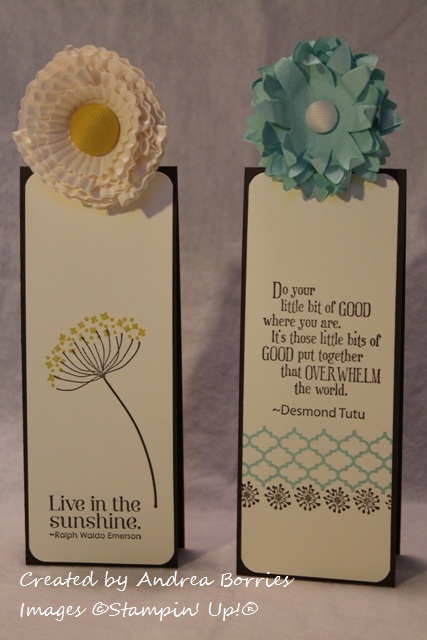
Aren't they cute? I'm really happy with how they turned out. To make the bookmark bases, I started with a standard 4-1/4" x 5-1/2" card base folded on the short side. (So unfolded the card stock measured 4-1/4" x 11".) I cut the card base in half along the short side (2-1/8") to create two bookmarks, which will slip over a page in a book with the fold resting along the top of the page.

I cut two 2" x 5-3/8" pieces of Very Vanilla card stock for the decorative panels on the bookmarks. I rounded the corners of the panels, stamped them with a sentiment and floral or border images, and adhered them to the bookmarks.

In order for a book to close while one of the bookmarks is in it, I needed a way to add the flowers above the fold in the card stock. I placed the bookmark, still folded, face down on the table. Then I punched an extra-large oval from a scrap piece of card stock and set it across the fold of the card stock so approximately half the oval was on the bookmark. I traced around the half oval on the back of the bookmark, opened the bookmark, and used a craft knife to cut along the traced line. I refolded the bookmark, leaving the half oval unfolded, and added the flower to this tab.

The bookmarks could be done at this point, but I decided to add magnet strips inside the bookmarks. Now if your book falls open when you pick it up, your bookmark stays in place.

The Pop-Up Posies Kit comes with enough supplies to make nine flowers, three Very Vanilla, three Pool Party, and three Calypso Coral (in the same style as the Pool Party flowers). These flowers would also make adorable toppers for small gift boxes or embellishments on a piece of framed art. You could use them on napkin rings or place cards for a spring table setting. They might even work as decorative hair barrettes for older children (but not in the rain since they are just paper). What other uses can you think of for these fun flowers?

The one item from the Pop-Up Posies Designer Kit that I haven't used yet is the "just for you" stamp. But that's a versatile all-occasion greeting, so I'm sure I'll be putting that to good use soon.


Thanks for stopping by!

Saturday, February 2, 2013

Butterfly card candy

Today I had the first workshop for my small Sale-A-Bration hostess club, and I wanted to make a little gift for the hostess. Last year I made DVD case notepad holders, so I wanted to do something completely different this year. I settled on card candy -- premade embellishments that the recipient can simply add to a card, scrapbook page or other papercraft item.

Supplies (all Stampin' Up!®):
Paper: Primrose Petals, Raspberry Ripple, Summer Starfruit, Gumball Green, Midnight Muse card stock; Print Poetry Designer Series Paper (DSP) stack
Accessories: Elegant Butterfly punch, Bitty Butterfly punch, pearls, rhinestones, Tombow Mono Multi liquid glue, Dimensionals, Glue Dots

These were really quick, easy and fun to make, and I really like how they look arranged on this Crumb Cake card stock. (This could almost be the front of a sweet all-occasion card.)

To make the card candy, I first punched two Elegant Butterfly shapes from each of five colors: Primrose Petals, Raspberry Ripple, Summer Starfruit, Gumball Green, Midnight Muse. These are Stampin' Up!'s 2012 - 2014 In Colors, and I chose them because they are the main colors in the Print Poetry DSP stack. I chose five prints from the DSP stack -- one to coordinate with each card stock color -- and punched two Bitty Butterfly shapes from each print. I gently folded the Bitty Butterfly shapes in the middle, placed a little liquid glue along the crease and adhered them to the Elegant Butterfly shapes, leaving the wings folded up just a bit. I added a strip of three pearls or rhinestones along the middle of each butterfly.

To adhere the butterflies to the card stock base, I placed a Dimensional on the middle of the back of each butterfly, leaving the backing paper on the Dimensionals. Then I placed a Glue Dot on the backing paper and attached the butterflies to the card stock. To use the butterflies, you just gently pull them off the Dimensional backing paper and apply them to your project.

These butterflies really make me long for spring, but I have a feeling that's still a long way off. Thanks for stopping by!