Valentine's Day is just about a week away. I'm not sure how that happened. But since I'll need to get my valentines in the mail this weekend, I thought I should make a few more.
Supplies (all Stampin' Up!®):
Stamps: Candy Conversations
Card stock: Whisper White
Ink: Soft Suede, So Saffron, Certainly Celery, Regal Rose, Wisteria Wonder
Accessories: Adorning Accents embossing folder, corner rounder, Certainly Celery and Regal Rose grosgrain ribbon, Wisteria Wonder ruffled ribbon, Dimensionals
I really like how these clean and simple one-layer cards turned out. The focal image stamp includes the "Be Mine, Valentine" greeting and five conversation hearts with different sentiments: "be mine," "xoxo," "kiss me," "love you" and "sweet talk". I stamped the image in Soft Suede ink on each card base (after embossing the bottom of the card fronts) and then stamped it in So Saffron, Certainly Celery, Wisteria Wonder and Regal Rose on leftover Whisper White scraps. Note: Stamp the image a few times in each color so you have plenty of hearts for mixing and matching colors and sentiments.
I intended to use the small heart punch to punch out the colored hearts for a really quick card, but I discovered that the punch is slightly smaller than the stamped image. That's great if you want to use the hearts separately -- there would be no white border around the hearts -- but it didn't work on this card because you would have been able to see part of the Soft Suede hearts stamped on the card. So instead I cut out each heart by hand. A little more time consuming, but a better result for what I wanted. I finished each card by rounding the top corners and adding a piece of coordinating ribbon.
Thanks for stopping by!
Wednesday, February 6, 2013
Tuesday, February 5, 2013
Simple thanks
I love the combination of yellow and gray, and those are the colors I used for the simple, but sweet, thank-you card I 'm going to share with you today.
Supplies (all Stampin' Up!®):
Stamps: Basic Label, Vintage Verses
Paper: Basic Gray, Whisper White, Daffodil Delight card stock; Polka Dot Parade Designer Series Paper (DSP)
Ink: Basic Gray
Accessories: Apothecary Accents Framelits dies, Itty Bitty Shapes punch pack, Daffodil Delight stitched grosgrain ribbon, pearls, Essentials paper-piercing pack, paper-piercing tool and mat, Dimensionals, Tombow Mono Multi liquid glue
I started with a Basic Gray card base and added a 2" wide strip of Daffodil Delight Polka Dot Parade DSP along the bottom of the card. For the focal point I stamped one of Stampin' Up!'s new single stamps, Basic Label, in Basic Gray ink on Whisper White card stock and then stamped a sentiment from the Vintage Verses set inside the label. I used the Apothecary Accents Framelits dies to cut out the label, and then I set the label on the card (without any adhesive on it) so it was overlapping the DSP. Then I used the Essentials paper-piercing pack, tool and mat to pierce a border around the label. Note: Be sure the card is open before piercing so you don't make holes in the back of the card.
I attached a piece of Daffodil Delight ribbon to the card along the top edge of the DSP and then used Dimensionals to adhere the label within the pierced border and over the ribbon. For embellishment, I added two Daffodil Delight flowers to the label and three Basic Gray flowers on the bottom right corner of the DSP. Each flower is made with two punched shapes -- the bottom one is flat, and the top one has the petals folded up -- and a pearl in the center.
Thanks for stopping by!
Supplies (all Stampin' Up!®):
Stamps: Basic Label, Vintage Verses
Paper: Basic Gray, Whisper White, Daffodil Delight card stock; Polka Dot Parade Designer Series Paper (DSP)
Ink: Basic Gray
Accessories: Apothecary Accents Framelits dies, Itty Bitty Shapes punch pack, Daffodil Delight stitched grosgrain ribbon, pearls, Essentials paper-piercing pack, paper-piercing tool and mat, Dimensionals, Tombow Mono Multi liquid glue
I started with a Basic Gray card base and added a 2" wide strip of Daffodil Delight Polka Dot Parade DSP along the bottom of the card. For the focal point I stamped one of Stampin' Up!'s new single stamps, Basic Label, in Basic Gray ink on Whisper White card stock and then stamped a sentiment from the Vintage Verses set inside the label. I used the Apothecary Accents Framelits dies to cut out the label, and then I set the label on the card (without any adhesive on it) so it was overlapping the DSP. Then I used the Essentials paper-piercing pack, tool and mat to pierce a border around the label. Note: Be sure the card is open before piercing so you don't make holes in the back of the card.
I attached a piece of Daffodil Delight ribbon to the card along the top edge of the DSP and then used Dimensionals to adhere the label within the pierced border and over the ribbon. For embellishment, I added two Daffodil Delight flowers to the label and three Basic Gray flowers on the bottom right corner of the DSP. Each flower is made with two punched shapes -- the bottom one is flat, and the top one has the petals folded up -- and a pearl in the center.
Thanks for stopping by!
Monday, February 4, 2013
Razzleberry sparkle birthday
I have two quick birthday cards to share today. Actually, it's two slightly different versions of the same card. Which do you like better?
Supplies (all Stampin' Up!®):
Stamps: Patterned Occasions
Paper: Rich Razzleberry, Whisper White card stock; silver glimmer paper; Polka Dot Parade Designer Series Paper (DSP)
Ink: Rich Razzleberry, Pacific Point, Daffodil Delight
Accessories: Honeycomb embossing folder, 1-3/4" circle punch, 2-3/8" scallop circle punch, Sticky Strip, Dimensionals
This card was the make-and-take project at my Sale-A-Bration hostess club meeting last weekend, and I let the stampers choose which version they wanted to make. I thought everyone would choose the more colorful option, which was made by using markers to color directly on the stamp. But the monochromatic option was actually more popular. I suppose I shouldn't be too surprised; monochromatic cards are often easier and faster to make (no need to worry about which colors work together), and they are very striking.
The Polka Dot Parade DSP, which was used for the tails of the focal piece, comes in six colors: Rich Razzelberry, Marina Mist, Old Olive, Daffodil Delight, Pumpkin Pie and Real Red. This would be a fun to card design to make in each of those colors and then give away as a card set or just keep in your own stash of birthday cards.
Thanks for stopping by!
Supplies (all Stampin' Up!®):
Stamps: Patterned Occasions
Paper: Rich Razzleberry, Whisper White card stock; silver glimmer paper; Polka Dot Parade Designer Series Paper (DSP)
Ink: Rich Razzleberry, Pacific Point, Daffodil Delight
Accessories: Honeycomb embossing folder, 1-3/4" circle punch, 2-3/8" scallop circle punch, Sticky Strip, Dimensionals
This card was the make-and-take project at my Sale-A-Bration hostess club meeting last weekend, and I let the stampers choose which version they wanted to make. I thought everyone would choose the more colorful option, which was made by using markers to color directly on the stamp. But the monochromatic option was actually more popular. I suppose I shouldn't be too surprised; monochromatic cards are often easier and faster to make (no need to worry about which colors work together), and they are very striking.
The Polka Dot Parade DSP, which was used for the tails of the focal piece, comes in six colors: Rich Razzelberry, Marina Mist, Old Olive, Daffodil Delight, Pumpkin Pie and Real Red. This would be a fun to card design to make in each of those colors and then give away as a card set or just keep in your own stash of birthday cards.
Thanks for stopping by!
Sunday, February 3, 2013
Pop-Up Posies card, bookmarks
When I first saw the new Pop-Up Posies Designer Kit in the Stampin' Up!® spring catalog, I was intrigued by it. I liked the elements in the kit -- the dimensional flowers, tags and stamp -- but I don't typically make many gift tags, so I didn't know how I would use it. I decided to buy the kit and see what other projects I could make with the supplies.
Supplies (all Stampin' Up!):
Stamps: Feeling Sentimental
Card stock: Naturals Ivory, Basic Black
Ink: Jet Black StazOn, Crumb Cake
Accessories: Pop-Up Posies Designer Kit, sponge, Dimensionals
I started by using one of the die-cut, embossed tags and pieces of twine from the kit to make this clean and simple birthday card. I stamped the Ferris wheel image from the Feeling Sentimental set on the tag and tied the twine around the bottom of the tag. Using Dimensionals, I mounted the tag on a 2-3/8" x 3-3/8" piece of Basic Black card stock and then adhered the piece in the middle of the card. (Note: When cutting this card base, I managed to measure it incorrectly, so it is 4-1/4" x 5-1/4" instead of 5-1/2". But it actually worked to my advantage because that created an even border around the Basic Black card stock.) I stamped the greeting in the bottom right corner of the card and then used a sponge to lightly apply Crumb Cake ink around the edges of the card to create an aged look.
Deciding what to make with the flowers took a little more effort. My first thought, of course, was to use them as an embellishment on a card. I wouldn't be able to mail said card because the flowers aren't flat, but I could always hand deliver it or tuck it in a gift bag. But I wasn't feeling too inspired with that idea, so I decided to try making bookmarks instead.
Supplies (all Stampin' Up!, unless otherwise noted):
Stamps: Summer Silhouettes, Pursuit of Happiness
Card stock: Early Espresso, Very Vanilla
Ink: Early Espresso, Pool Party, Summer Starfruit
Accessories: Pop-Up Posies Designer Kit, corner rounder, extra-large oval punch
Other (unknown): Craft knife, magnet strips
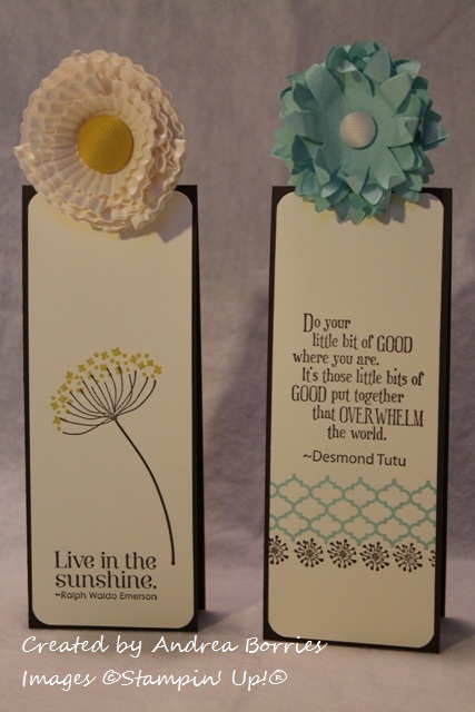
Aren't they cute? I'm really happy with how they turned out. To make the bookmark bases, I started with a standard 4-1/4" x 5-1/2" card base folded on the short side. (So unfolded the card stock measured 4-1/4" x 11".) I cut the card base in half along the short side (2-1/8") to create two bookmarks, which will slip over a page in a book with the fold resting along the top of the page.
I cut two 2" x 5-3/8" pieces of Very Vanilla card stock for the decorative panels on the bookmarks. I rounded the corners of the panels, stamped them with a sentiment and floral or border images, and adhered them to the bookmarks.
In order for a book to close while one of the bookmarks is in it, I needed a way to add the flowers above the fold in the card stock. I placed the bookmark, still folded, face down on the table. Then I punched an extra-large oval from a scrap piece of card stock and set it across the fold of the card stock so approximately half the oval was on the bookmark. I traced around the half oval on the back of the bookmark, opened the bookmark, and used a craft knife to cut along the traced line. I refolded the bookmark, leaving the half oval unfolded, and added the flower to this tab.
The bookmarks could be done at this point, but I decided to add magnet strips inside the bookmarks. Now if your book falls open when you pick it up, your bookmark stays in place.
The Pop-Up Posies Kit comes with enough supplies to make nine flowers, three Very Vanilla, three Pool Party, and three Calypso Coral (in the same style as the Pool Party flowers). These flowers would also make adorable toppers for small gift boxes or embellishments on a piece of framed art. You could use them on napkin rings or place cards for a spring table setting. They might even work as decorative hair barrettes for older children (but not in the rain since they are just paper). What other uses can you think of for these fun flowers?
The one item from the Pop-Up Posies Designer Kit that I haven't used yet is the "just for you" stamp. But that's a versatile all-occasion greeting, so I'm sure I'll be putting that to good use soon.
Thanks for stopping by!
Supplies (all Stampin' Up!):
Stamps: Feeling Sentimental
Card stock: Naturals Ivory, Basic Black
Ink: Jet Black StazOn, Crumb Cake
Accessories: Pop-Up Posies Designer Kit, sponge, Dimensionals
I started by using one of the die-cut, embossed tags and pieces of twine from the kit to make this clean and simple birthday card. I stamped the Ferris wheel image from the Feeling Sentimental set on the tag and tied the twine around the bottom of the tag. Using Dimensionals, I mounted the tag on a 2-3/8" x 3-3/8" piece of Basic Black card stock and then adhered the piece in the middle of the card. (Note: When cutting this card base, I managed to measure it incorrectly, so it is 4-1/4" x 5-1/4" instead of 5-1/2". But it actually worked to my advantage because that created an even border around the Basic Black card stock.) I stamped the greeting in the bottom right corner of the card and then used a sponge to lightly apply Crumb Cake ink around the edges of the card to create an aged look.
Deciding what to make with the flowers took a little more effort. My first thought, of course, was to use them as an embellishment on a card. I wouldn't be able to mail said card because the flowers aren't flat, but I could always hand deliver it or tuck it in a gift bag. But I wasn't feeling too inspired with that idea, so I decided to try making bookmarks instead.
Supplies (all Stampin' Up!, unless otherwise noted):
Stamps: Summer Silhouettes, Pursuit of Happiness
Card stock: Early Espresso, Very Vanilla
Ink: Early Espresso, Pool Party, Summer Starfruit
Accessories: Pop-Up Posies Designer Kit, corner rounder, extra-large oval punch
Other (unknown): Craft knife, magnet strips
Aren't they cute? I'm really happy with how they turned out. To make the bookmark bases, I started with a standard 4-1/4" x 5-1/2" card base folded on the short side. (So unfolded the card stock measured 4-1/4" x 11".) I cut the card base in half along the short side (2-1/8") to create two bookmarks, which will slip over a page in a book with the fold resting along the top of the page.
I cut two 2" x 5-3/8" pieces of Very Vanilla card stock for the decorative panels on the bookmarks. I rounded the corners of the panels, stamped them with a sentiment and floral or border images, and adhered them to the bookmarks.
In order for a book to close while one of the bookmarks is in it, I needed a way to add the flowers above the fold in the card stock. I placed the bookmark, still folded, face down on the table. Then I punched an extra-large oval from a scrap piece of card stock and set it across the fold of the card stock so approximately half the oval was on the bookmark. I traced around the half oval on the back of the bookmark, opened the bookmark, and used a craft knife to cut along the traced line. I refolded the bookmark, leaving the half oval unfolded, and added the flower to this tab.
The bookmarks could be done at this point, but I decided to add magnet strips inside the bookmarks. Now if your book falls open when you pick it up, your bookmark stays in place.
The Pop-Up Posies Kit comes with enough supplies to make nine flowers, three Very Vanilla, three Pool Party, and three Calypso Coral (in the same style as the Pool Party flowers). These flowers would also make adorable toppers for small gift boxes or embellishments on a piece of framed art. You could use them on napkin rings or place cards for a spring table setting. They might even work as decorative hair barrettes for older children (but not in the rain since they are just paper). What other uses can you think of for these fun flowers?
The one item from the Pop-Up Posies Designer Kit that I haven't used yet is the "just for you" stamp. But that's a versatile all-occasion greeting, so I'm sure I'll be putting that to good use soon.
Thanks for stopping by!
Saturday, February 2, 2013
Butterfly card candy
Today I had the first workshop for my small Sale-A-Bration hostess club, and I wanted to make a little gift for the hostess. Last year I made DVD case notepad holders, so I wanted to do something completely different this year. I settled on card candy -- premade embellishments that the recipient can simply add to a card, scrapbook page or other papercraft item.
Supplies (all Stampin' Up!®):
Paper: Primrose Petals, Raspberry Ripple, Summer Starfruit, Gumball Green, Midnight Muse card stock; Print Poetry Designer Series Paper (DSP) stack
Accessories: Elegant Butterfly punch, Bitty Butterfly punch, pearls, rhinestones, Tombow Mono Multi liquid glue, Dimensionals, Glue Dots
These were really quick, easy and fun to make, and I really like how they look arranged on this Crumb Cake card stock. (This could almost be the front of a sweet all-occasion card.)
To make the card candy, I first punched two Elegant Butterfly shapes from each of five colors: Primrose Petals, Raspberry Ripple, Summer Starfruit, Gumball Green, Midnight Muse. These are Stampin' Up!'s 2012 - 2014 In Colors, and I chose them because they are the main colors in the Print Poetry DSP stack. I chose five prints from the DSP stack -- one to coordinate with each card stock color -- and punched two Bitty Butterfly shapes from each print. I gently folded the Bitty Butterfly shapes in the middle, placed a little liquid glue along the crease and adhered them to the Elegant Butterfly shapes, leaving the wings folded up just a bit. I added a strip of three pearls or rhinestones along the middle of each butterfly.
To adhere the butterflies to the card stock base, I placed a Dimensional on the middle of the back of each butterfly, leaving the backing paper on the Dimensionals. Then I placed a Glue Dot on the backing paper and attached the butterflies to the card stock. To use the butterflies, you just gently pull them off the Dimensional backing paper and apply them to your project.
These butterflies really make me long for spring, but I have a feeling that's still a long way off. Thanks for stopping by!
Supplies (all Stampin' Up!®):
Paper: Primrose Petals, Raspberry Ripple, Summer Starfruit, Gumball Green, Midnight Muse card stock; Print Poetry Designer Series Paper (DSP) stack
Accessories: Elegant Butterfly punch, Bitty Butterfly punch, pearls, rhinestones, Tombow Mono Multi liquid glue, Dimensionals, Glue Dots
These were really quick, easy and fun to make, and I really like how they look arranged on this Crumb Cake card stock. (This could almost be the front of a sweet all-occasion card.)
To make the card candy, I first punched two Elegant Butterfly shapes from each of five colors: Primrose Petals, Raspberry Ripple, Summer Starfruit, Gumball Green, Midnight Muse. These are Stampin' Up!'s 2012 - 2014 In Colors, and I chose them because they are the main colors in the Print Poetry DSP stack. I chose five prints from the DSP stack -- one to coordinate with each card stock color -- and punched two Bitty Butterfly shapes from each print. I gently folded the Bitty Butterfly shapes in the middle, placed a little liquid glue along the crease and adhered them to the Elegant Butterfly shapes, leaving the wings folded up just a bit. I added a strip of three pearls or rhinestones along the middle of each butterfly.
These butterflies really make me long for spring, but I have a feeling that's still a long way off. Thanks for stopping by!
![]() |
Subscribe to:
Posts (Atom)