About a month ago I ordered the By the Tide stamp set from Stampin' Up!®. I loved the set as soon as I saw it in the spring catalog, and when it arrived I mounted the stamps on the wood blocks and then ... did nothing. I was stumped. (Everyone I know thinks I just sit down and magically start producing cards, but it's really not that easy.) The images are gorgeous and make me think of all things beachy (oh, what I wouldn't give to be on a beach right now!), but I just couldn't figure out how to put them together on a card. So I decided the only way to get going was to just start playing with the stamps. The end product was two cards: one feminine and one masculine.
Supplies (all Stampin' Up!):
Stamps: By the Tide
Card stock: Pool Party, River Rock
Ink: Pool Party, River Rock, Basic Gray
Accessories: Pearls, Dimensionals
Not very many supplies, right? I wanted a clean and simple layout for the feminine card, so I stamped the coral image in Pool Party ink on a Pool Party card base. To create the look of sand along the bottom of the card, I tore the edge off a strip of River Rock card stock and then crumpled and creased the card stock. After I smoothed out the strip, I gently rubbed my River Rock ink pad over it so the edges and creases were lightly inked and then adhered it to the bottom of the card. I also used River Rock ink and card stock for the shell, which I cut out and adhered to the card with Dimensionals. I stamped the poem over part of the coral image with Basic Gray ink and added a few pearls beneath it. To fill the emptiness in the top right corner of the card, I cut two small banners from Pool Party card stock and adhered them above the poem; I like how the tone-on-tone detail adds a subtle visual interest but doesn't detract from the stamped images.
Supplies (all Stampin' Up! unless otherwise noted):
Stamps: By the Tide, Teeny Tiny Wishes
Card stock: Naturals Ivory, Not Quite Navy
Ink: Not Quite Navy, River Rock, Always Artichoke, Soft Suede
Accessories: Woodgrain embossing folder, Natural Trim ribbon, hemp twine, medium metallic brad (Making Memories), Dimensionals
For the masculine card, I used collage-style stamping. I randomly stamped images over a piece of Naturals Ivory card stock using Not Quite Navy (seahorse), Always Artichoke (shell), River Rock (coral) and Soft Suede (fish). I embossed the card stock with the Woodgrain embossing folder to add some texture (I think the wavy lines are reminiscent of water) and mounted the piece on a Not Quite Navy card base. I distressed a piece of Natural Trim ribbon by fraying the ends and then adhered it along the bottom of the card, leaving it bunched and curved in some places. I wrapped a piece of hemp twine around the right side of the card twice, making an X shape. For the focal point, I cut out a stamped fish image, used Dimensionals to adhere it over the knot in the twine and added a thin strip of card stock stamped with "Happy Father's Day." The brad in the corner was a bit of an afterthought, but I'm glad I added it.
So which card do you like better? I think I'm leaning toward the more feminine card, but I have to admit that the masculine one is growing on me. Now that I've got a start with this stamp set, I'm excited to see what else I can create. Thanks for stopping by!
Saturday, March 23, 2013
Wednesday, March 20, 2013
Polka-dot daisy card set
As promised in my last post, today I'm going to share the second card set I made last weekend. For this set I was inspired by a bright floral card I made a couple of weeks ago (the first card in the "Flower power" post).
Supplies (all Stampin' Up!®):
Stamps: Pick a Petal
Card stock: Whisper White, Basic Gray, Daffodil Delight, Primrose Petals, Pink Pirouette, Pool Party
Ink: Basic Gray marker; Daffodil Delight, Primrose Petals, Pink Pirouette, Pool Party pads
Accessories: Sweet Buttons Embosslits die, 1-1/4" scalloped circle punch, Perfect Polka Dots embossing folder, stitched Basic Gray grosgrain ribbon, Dimensionals
The complete set includes eight cards, two of each of the colors pictured. I really like this fun combination of colors and the playful polka-dot flowers. To make the focal layer for each card I started with a piece of Whisper White card stock. I stamped one of the circular images from the Pick a Petal stamp set where I wanted the center of the flower -- it doesn't have to be perfect since it will be covered, but it helps to have a guide for stamping the petals. I stamped two of the petals directly across from each other and then two more in between those (so the four petals make an X). Then I went back and stamped one more petal between each pair of petals, making eight petals total.
For the flower center I embossed a piece of Basic Gray card stock with the Perfect Polka Dot embossing folder and then punched out a 1-1/4" scallop circle. I adhered the scallop circle over the center of the circle and added a die-cut and embossed button. I doodled a border around the white card stock, added another die-cut button and layered the piece on Basic Gray card stock. To finish I adhered a piece of Basic Gray ribbon near the bottom of the card front and used Dimensionals to attach the stamped panel to the card base.
Thanks for stopping by!
Supplies (all Stampin' Up!®):
Stamps: Pick a Petal
Card stock: Whisper White, Basic Gray, Daffodil Delight, Primrose Petals, Pink Pirouette, Pool Party
Ink: Basic Gray marker; Daffodil Delight, Primrose Petals, Pink Pirouette, Pool Party pads
Accessories: Sweet Buttons Embosslits die, 1-1/4" scalloped circle punch, Perfect Polka Dots embossing folder, stitched Basic Gray grosgrain ribbon, Dimensionals
The complete set includes eight cards, two of each of the colors pictured. I really like this fun combination of colors and the playful polka-dot flowers. To make the focal layer for each card I started with a piece of Whisper White card stock. I stamped one of the circular images from the Pick a Petal stamp set where I wanted the center of the flower -- it doesn't have to be perfect since it will be covered, but it helps to have a guide for stamping the petals. I stamped two of the petals directly across from each other and then two more in between those (so the four petals make an X). Then I went back and stamped one more petal between each pair of petals, making eight petals total.
For the flower center I embossed a piece of Basic Gray card stock with the Perfect Polka Dot embossing folder and then punched out a 1-1/4" scallop circle. I adhered the scallop circle over the center of the circle and added a die-cut and embossed button. I doodled a border around the white card stock, added another die-cut button and layered the piece on Basic Gray card stock. To finish I adhered a piece of Basic Gray ribbon near the bottom of the card front and used Dimensionals to attach the stamped panel to the card base.
Thanks for stopping by!
Monday, March 18, 2013
Hydrangea card set
Last weekend I needed a couple of card sets to give as birthday gifts. (One was belated and one was early, so it all evens out, right?) The stash of card sets I used to have all made and ready to give has been depleted, so I started from scratch. I'll share the first card set today and the second one later this week.
Supplies (all Stampin' Up!®):
Stamps: Because I Care
Card stock: Very Vanilla, Almost Amethyst, Perfect Plum, Bashful Blue, Marina Mist
Ink: Almost Amethyst, Perfect Plum, Bashful Blue, Marina Mist, Old Olive markers
Accessories: Pop 'N Cuts card base die, Labels Collection Framelits dies, Festive Paper-Piercing Pack, paper-piercing tool and mat, Frost White Shimmer Paint, Very Vanilla seam binding ribbon, Color Spritzer tool, sponge daubers, Dimensionals
I love this hydrangea image, and since I always associate blue with hydrangeas, I chose a color palette of two shades of blue (Bashful Blue and Marina Mist) and added two purples (Almost Amethyst and Perfect Plum) for a little variety. To create the focal image, I colored directly on the rubber stamp with markers (one of the four main colors for the hydrangea blossom and Old Olive for the stem and leaves). Then I used a sponge dauber to apply Frost White Shimmer Paint to the blossom part of the rubber stamp (on top of the ink). I didn't worry about even coverage; I just dabbed on the shimmer paint here and there. Then I stamped the image on Very Vanilla card stock. It's a subtle shimmer, but it looks so pretty when it catches the light.
After stamping all of the hydrangeas (two of each color for the eight-card set), I cut them out using the Labels Collection Framelits dies. The focal pieces needed a little something, but when I give card sets as gifts, I try to keep the cards fairly flat so someone else doesn't have to worry about extra postage. So instead of adding pearls, rhinestones or buttons, I decided to paper pierce around the edge of the die cut. I think it turned out to be the perfect detail for these cards.
To make the card bases, I used the new Pop 'N Cuts card base die from Stampin' Up!. I love the little tabs on the corners to keep the card closed, and the rounded bottom edge looks great with the Labels Collection die-cuts.
Before adding the focal images on the cards, I used the Color Spritzer tool to "splatter" ink from the coordinating marker on each of the card bases. I wrapped a piece of Very Vanilla seam binding ribbon around the middle of the card front and used Dimensionals to adhere the focal image.
I am really pleased with how this card set turned out, and I think I may need to make another one if I ever have a chance to work on replenishing my stash. Check back later this week to see the second card set I made last weekend. Thanks for stopping by!
Supplies (all Stampin' Up!®):
Stamps: Because I Care
Card stock: Very Vanilla, Almost Amethyst, Perfect Plum, Bashful Blue, Marina Mist
Ink: Almost Amethyst, Perfect Plum, Bashful Blue, Marina Mist, Old Olive markers
Accessories: Pop 'N Cuts card base die, Labels Collection Framelits dies, Festive Paper-Piercing Pack, paper-piercing tool and mat, Frost White Shimmer Paint, Very Vanilla seam binding ribbon, Color Spritzer tool, sponge daubers, Dimensionals
I love this hydrangea image, and since I always associate blue with hydrangeas, I chose a color palette of two shades of blue (Bashful Blue and Marina Mist) and added two purples (Almost Amethyst and Perfect Plum) for a little variety. To create the focal image, I colored directly on the rubber stamp with markers (one of the four main colors for the hydrangea blossom and Old Olive for the stem and leaves). Then I used a sponge dauber to apply Frost White Shimmer Paint to the blossom part of the rubber stamp (on top of the ink). I didn't worry about even coverage; I just dabbed on the shimmer paint here and there. Then I stamped the image on Very Vanilla card stock. It's a subtle shimmer, but it looks so pretty when it catches the light.
After stamping all of the hydrangeas (two of each color for the eight-card set), I cut them out using the Labels Collection Framelits dies. The focal pieces needed a little something, but when I give card sets as gifts, I try to keep the cards fairly flat so someone else doesn't have to worry about extra postage. So instead of adding pearls, rhinestones or buttons, I decided to paper pierce around the edge of the die cut. I think it turned out to be the perfect detail for these cards.
To make the card bases, I used the new Pop 'N Cuts card base die from Stampin' Up!. I love the little tabs on the corners to keep the card closed, and the rounded bottom edge looks great with the Labels Collection die-cuts.
Before adding the focal images on the cards, I used the Color Spritzer tool to "splatter" ink from the coordinating marker on each of the card bases. I wrapped a piece of Very Vanilla seam binding ribbon around the middle of the card front and used Dimensionals to adhere the focal image.
I am really pleased with how this card set turned out, and I think I may need to make another one if I ever have a chance to work on replenishing my stash. Check back later this week to see the second card set I made last weekend. Thanks for stopping by!
Sunday, March 17, 2013
Happy St. Paddy's Day!
Growing up I often wished I were Irish, and sometimes people even assume I am (I think because of the auburn hair). Alas, I am neither Irish nor a big drinker, so St. Patrick's Day is a very low-key holiday for me. Today my nods to the Irish culture included listening to Celtic music, drinking Irish breakfast tea and eating some wonderfully delicious Irish soda bread (which sadly is only available during March at our local Breadsmith bakery). And of course wearing the requisite green shirt.
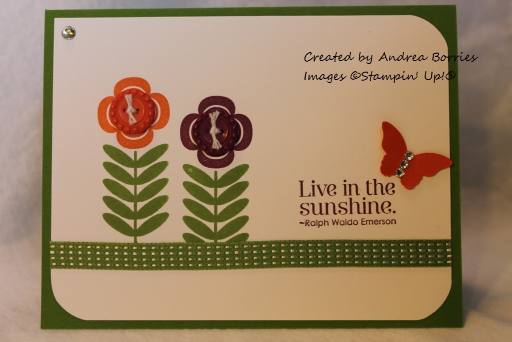
Since I'm not a St. Patrick's Day card-maker, I don't have anything particularly festive to share. But I do have a floral card that includes some green. It's a stretch, I know, but it's a fun card that I think you'll enjoy.
Supplies (all Stampin' Up!®):
Stamps: Madison Avenue, Pursuit of Happiness
Card stock: Gumball Green, Whisper White
Ink: Gumball Green, Tangerine Tango, Rich Razzleberry
Accessories: 1-1/4" circle punch, Sycamore Street ribbon and button pack, white baker's twine, Gumball Green stitched satin ribbon, rhinestones, Glue Dots
Isn't it bright and cheerful? I'm wishing I could live a bit more in the sunshine myself, especially with yet another snowstorm predicted for tonight.
I think this card is mostly self-explanatory, so I won't go into too much detail. I do want to explain, though, how I rounded the corners of the layer of Whisper White card stock: instead of using a traditional corner-rounding punch, I used a 1-1/4" circle punch. Holding the circle punch upside-down, insert the corner of the paper into the circular hole in the bottom and slide the point between the layers of metal. Then close the punch and just the corner is cut off. When I was done with the punch I used my scissors to smooth out the places where the now-rounded corners meet the straight edges. You can use different size circle punches, too; a larger circle will cut off more of the corner. It's easier to explain with pictures, but I neglected to take any photos of this step. If you're confused, post a comment below and I will try to clarify and/or create a separate post that shows how to round corners with a circle punch.
Thanks for stopping by and Erin Go Bragh!
Since I'm not a St. Patrick's Day card-maker, I don't have anything particularly festive to share. But I do have a floral card that includes some green. It's a stretch, I know, but it's a fun card that I think you'll enjoy.
Supplies (all Stampin' Up!®):
Stamps: Madison Avenue, Pursuit of Happiness
Card stock: Gumball Green, Whisper White
Ink: Gumball Green, Tangerine Tango, Rich Razzleberry
Accessories: 1-1/4" circle punch, Sycamore Street ribbon and button pack, white baker's twine, Gumball Green stitched satin ribbon, rhinestones, Glue Dots
Isn't it bright and cheerful? I'm wishing I could live a bit more in the sunshine myself, especially with yet another snowstorm predicted for tonight.
I think this card is mostly self-explanatory, so I won't go into too much detail. I do want to explain, though, how I rounded the corners of the layer of Whisper White card stock: instead of using a traditional corner-rounding punch, I used a 1-1/4" circle punch. Holding the circle punch upside-down, insert the corner of the paper into the circular hole in the bottom and slide the point between the layers of metal. Then close the punch and just the corner is cut off. When I was done with the punch I used my scissors to smooth out the places where the now-rounded corners meet the straight edges. You can use different size circle punches, too; a larger circle will cut off more of the corner. It's easier to explain with pictures, but I neglected to take any photos of this step. If you're confused, post a comment below and I will try to clarify and/or create a separate post that shows how to round corners with a circle punch.
Thanks for stopping by and Erin Go Bragh!
Tuesday, March 12, 2013
Looks like summer
Sadly, the post title does not refer to the weather here. It is supposed to warm up a bit toward the end of the week, but seeing as how we're getting some light snow flurries this afternoon, it will be quite awhile before it looks like summer outside my window. The summery goodness I do have to share with you, though, is this card:
Supplies (all Stampin' Up!® ):
Stamps: Bright Blossoms, Petite Pairs
Paper: Summer Smooches Designer Series Paper (DSP); Whisper White, Island Indigo, Lucky Limeade card stock
Ink: Island Indigo, Lucky Limeade, Rich Razzleberry, Tangerine Tango, Daffodil Delight
Accessories: 1-1/4" circle punch, Postage Stamp punch, Island Indigo baker's twine, Dimensionals
This was a quick card to make and could be suitable for many occasions simply by changing the sentiment. You could even omit the sentiment, add a fourth flower image instead and make a set of blank cards to give as a gift.
The strip of DSP along the bottom of the card is probably my favorite pattern from the Summer Smooches pack. Using a small piece such as this on a card adds some fun color and detail to your design -- and helps the sheet of DSP go a long way!
Looking at this card does make it a little easier to believe that summer is on its way. Thanks for stopping by!
Supplies (all Stampin' Up!® ):
Stamps: Bright Blossoms, Petite Pairs
Paper: Summer Smooches Designer Series Paper (DSP); Whisper White, Island Indigo, Lucky Limeade card stock
Ink: Island Indigo, Lucky Limeade, Rich Razzleberry, Tangerine Tango, Daffodil Delight
Accessories: 1-1/4" circle punch, Postage Stamp punch, Island Indigo baker's twine, Dimensionals
This was a quick card to make and could be suitable for many occasions simply by changing the sentiment. You could even omit the sentiment, add a fourth flower image instead and make a set of blank cards to give as a gift.
The strip of DSP along the bottom of the card is probably my favorite pattern from the Summer Smooches pack. Using a small piece such as this on a card adds some fun color and detail to your design -- and helps the sheet of DSP go a long way!
Looking at this card does make it a little easier to believe that summer is on its way. Thanks for stopping by!
Subscribe to:
Posts (Atom)