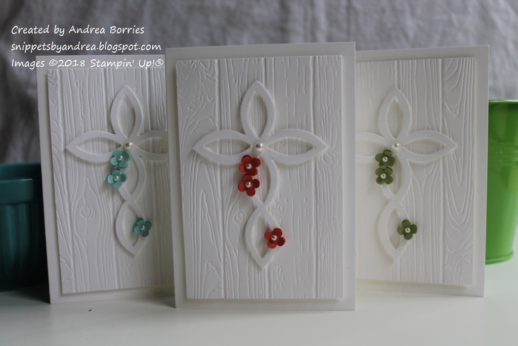
In October, we added three new members to our extended family: My youngest cousin had her first baby on the 18th, and the next day another cousin had twins. They were all baptized within a week of each other in November, so I fell back on my tried-and-true layout for religious cards:
Supplies (all Stampin' Up!):
Paper: Whisper White note cards and envelopes; Whisper White, Pool Party, Calypso Coral, Pear Pizzazz card stock
Accessories: Lattice die, Pinewood Planks embossing folder, Itty Bitty Shapes punch pack, pearls, clear Wink of Stella glitter brush pen, Dimensionals
I've used the cross made with the Lattice die for a First Communion card and for another baptism card, but I have changed up the background each time. So I hope no one minded that these three cards were all basically the same!
I kept everything white on these cards except for the pop of color provided by the flowers. But white doesn't have to mean boring! The Pinewood Planks embossing folder makes a great textured background, and I added shimmer to the crosses with a clear Wink of Stella glitter brush pen (it's hard to see the sparkle in this photo). I did want to give each card a little individuality, so I used different card stock for the punched flowers on each card. Definitely clean and simple, and I really like them.
Thanks for stopping by!
Tuesday, January 9, 2018
Monday, January 8, 2018
A set of Tranquil Tulips
Tulips are one of my favorite flowers, so I was excited to see the Tranquil Tulips host set in the 2017-18 Stampin' Up! catalog. It was the perfect set to use to create a card set for my cousin's birthday last fall.
Supplies (all Stampin' Up! unless otherwise noted):
Stamps: Tranquil Tulips
Paper: Thick Whisper White
Ink: Wild Wasabi, Garden Green, Daffodil Delight, Blushing Bride, Real Red, Melon Mambo, Fresh Fig, Memento Tuxedo Black
Accessories: Gold Deco Foil (Therm-o-web), Florence sequins (Close to My Heart), Sticky Strip
I like the layout and colors of these cards, but I do have a confession: After I was finished with the stamping, I realized I had messed up the flowers. Each flower is made with two separate stamps, one for the "back" of the flower and one for the "front." The stamps are made so that you can use the same color to stamp both images instead of having to use a light and a dark shade. I had forgotten that little tidbit, so when I stamped the flowers, I inked up the image for the "back" of the flower, stamped it first on scratch paper and then stamped it on my card base to get a lighter tone. As a result the backs of the flowers, especially the yellow and pink, are way too light. If I had just stamped directly on the card base, the image would have been naturally light enough to stamp the second image over it. Oh, well. They're still pretty tulips.
To add the gold strip along the bottom of the cards, I placed a piece of Sticky Strip adhesive all the way across the card. Then I peeled off the backing and added the Deco Foil over the exposed adhesive. Three sequins add another touch of gold to each card.
Thanks for stopping by!
Supplies (all Stampin' Up! unless otherwise noted):
Stamps: Tranquil Tulips
Paper: Thick Whisper White
Ink: Wild Wasabi, Garden Green, Daffodil Delight, Blushing Bride, Real Red, Melon Mambo, Fresh Fig, Memento Tuxedo Black
Accessories: Gold Deco Foil (Therm-o-web), Florence sequins (Close to My Heart), Sticky Strip
I like the layout and colors of these cards, but I do have a confession: After I was finished with the stamping, I realized I had messed up the flowers. Each flower is made with two separate stamps, one for the "back" of the flower and one for the "front." The stamps are made so that you can use the same color to stamp both images instead of having to use a light and a dark shade. I had forgotten that little tidbit, so when I stamped the flowers, I inked up the image for the "back" of the flower, stamped it first on scratch paper and then stamped it on my card base to get a lighter tone. As a result the backs of the flowers, especially the yellow and pink, are way too light. If I had just stamped directly on the card base, the image would have been naturally light enough to stamp the second image over it. Oh, well. They're still pretty tulips.
To add the gold strip along the bottom of the cards, I placed a piece of Sticky Strip adhesive all the way across the card. Then I peeled off the backing and added the Deco Foil over the exposed adhesive. Three sequins add another touch of gold to each card.
Thanks for stopping by!
Saturday, January 6, 2018
Pair of Pretty Petals cards
I'm back tonight with a quick post and more "clearing out the old." Here are two cards (from last summer!) featuring one of my favorite Designer Series Paper (DSP) packs, Pretty Petals.
Supplies all Stampin' Up! unless otherwise noted):
Paper: Thick Very Vanilla, Basic Black, Calypso Coral card stock; Pretty Petals DSP Stack
Accessories: Punches: Starburst, Pansy, Petite Petals, 1-1/2" circle, 2" circle, 2-1/2" circle; metallic gold thread; clear faceted gems; gold Wink of Stella glitter brush pen; champagne sequins (The Makery); Art Glitter Glue (Art Institute Glitter)
I really like the layout of this card (although if you tilt your head and squint your eyes, it looks like an out-of-proportion Mickey Mouse). I used lots of different circles and dots in the layers, paper and even the embellishments. The touches of gold in the splattered background and loops of thread add a little shine.
Supplies (all Stampin' Up! unless otherwise noted):
Paper: Thick Very Vanilla, Basic Black, Calypso Coral card stock; Pretty Petals DSP Stack
Accessories: Very Vanilla taffeta ribbon, delicate white doily, Bitty Butterfly punch, pearls, green sequins (Craft Medley - Citrus assortment), Dimensionals
This layout is a great way to use DSP. It would be fun to make a whole set of these cards with each one using a different combination of coordinating patterns. For this card, I added a small cluster of embellishments in the lower right corner to create a focal area.
Thanks for stopping by!
Supplies all Stampin' Up! unless otherwise noted):
Paper: Thick Very Vanilla, Basic Black, Calypso Coral card stock; Pretty Petals DSP Stack
Accessories: Punches: Starburst, Pansy, Petite Petals, 1-1/2" circle, 2" circle, 2-1/2" circle; metallic gold thread; clear faceted gems; gold Wink of Stella glitter brush pen; champagne sequins (The Makery); Art Glitter Glue (Art Institute Glitter)
I really like the layout of this card (although if you tilt your head and squint your eyes, it looks like an out-of-proportion Mickey Mouse). I used lots of different circles and dots in the layers, paper and even the embellishments. The touches of gold in the splattered background and loops of thread add a little shine.
Supplies (all Stampin' Up! unless otherwise noted):
Paper: Thick Very Vanilla, Basic Black, Calypso Coral card stock; Pretty Petals DSP Stack
Accessories: Very Vanilla taffeta ribbon, delicate white doily, Bitty Butterfly punch, pearls, green sequins (Craft Medley - Citrus assortment), Dimensionals
This layout is a great way to use DSP. It would be fun to make a whole set of these cards with each one using a different combination of coordinating patterns. For this card, I added a small cluster of embellishments in the lower right corner to create a focal area.
Thanks for stopping by!
Thursday, January 4, 2018
Clearing out the old
In honor of the new year, I've decided to clear out the old. Photos of "old" cards to be specific. I have several photos that have been sitting in my cyber files for months, including several of the cards I made at my craft retreats last fall. I never got around to sharing them because there was always something I liked better or something more timely or [insert various excuse here]. So for the next week or so I'm going to focus on sharing those cards before I jump into creating new cards and goodies. So here goes.
Supplies (all Stampin' Up! unless otherwise noted):
Stamps: Party with Cake
Paper: Green Galore, Whisper White card stock; recycled paper from a junk mail envelope (Current)
Ink: Memento Tuxedo Black, Project Life journaling pen
Accessories: Yellow paper flowers (Eyelet Outlet), Ice White Pearl Pen (Viva Decor), large glitter brad (American Crafts), clear Wink of Stella glitter brush pen
The starting point for these two cards was the colorful floral paper. It was part of an envelope I received last summer containing a sales flyer or coupon from Current. (Current is a company that sells stationery, holiday, home and gift items. I used to order from them frequently before I started making cards. Picking up those packages in the college mail roomwas the best. I still order occasionally; they have awesome wrapping paper.) I loved the bright colors and didn't want to just toss it, so I cut apart the envelope and made these two cards.
I've loved doing stuff like this since I was a kid: making gift tags out of greeting cards (or vice versa), collecting paint and wallpaper samples at the home improvement stores to make collages, cutting old wrapping paper into tiny pieces to make mosaic pictures. I really enjoy doing it, but I think I never shared these cards because they didn't seem "fancy" enough. They're not really anything special, but I still love that paper, and they're bright and cheery, and I made them. So why not share them?
Supplies (all Stampin' Up! unless otherwise noted):
Stamps: Geo-Graphic (Paper Smooches)
Paper: Green Galore, Berry Burst card stock; recycled paper from a junk mail envelopes (Current)
Ink: Berry Burst
Accessories: Yellow paper flowers (Eyelet Outlet), neutrals brads, Large Polka Dot embossing folder, clear Wink of Stella glitter brush pen, Ice White Pearl Pen (Viva Decor), Dimensionals
I went with a polka dot theme for this card, and I added plenty of Wink of Stella for a solid sparkle factor, although it's hard to see in the photo above. You can see it a bit better in the shot on the right. All the large embossed polka dots, as well as the smaller yellow flower, are coated with Wink of Stella. I don't know what I did before I found that amazing product!
So there are my first two "old" cards. I'll try to get more posted this weekend. Thanks for stopping by!
Supplies (all Stampin' Up! unless otherwise noted):
Stamps: Party with Cake
Paper: Green Galore, Whisper White card stock; recycled paper from a junk mail envelope (Current)
Ink: Memento Tuxedo Black, Project Life journaling pen
Accessories: Yellow paper flowers (Eyelet Outlet), Ice White Pearl Pen (Viva Decor), large glitter brad (American Crafts), clear Wink of Stella glitter brush pen
The starting point for these two cards was the colorful floral paper. It was part of an envelope I received last summer containing a sales flyer or coupon from Current. (Current is a company that sells stationery, holiday, home and gift items. I used to order from them frequently before I started making cards. Picking up those packages in the college mail roomwas the best. I still order occasionally; they have awesome wrapping paper.) I loved the bright colors and didn't want to just toss it, so I cut apart the envelope and made these two cards.
I've loved doing stuff like this since I was a kid: making gift tags out of greeting cards (or vice versa), collecting paint and wallpaper samples at the home improvement stores to make collages, cutting old wrapping paper into tiny pieces to make mosaic pictures. I really enjoy doing it, but I think I never shared these cards because they didn't seem "fancy" enough. They're not really anything special, but I still love that paper, and they're bright and cheery, and I made them. So why not share them?
Supplies (all Stampin' Up! unless otherwise noted):
Stamps: Geo-Graphic (Paper Smooches)
Paper: Green Galore, Berry Burst card stock; recycled paper from a junk mail envelopes (Current)
Ink: Berry Burst
Accessories: Yellow paper flowers (Eyelet Outlet), neutrals brads, Large Polka Dot embossing folder, clear Wink of Stella glitter brush pen, Ice White Pearl Pen (Viva Decor), Dimensionals
I went with a polka dot theme for this card, and I added plenty of Wink of Stella for a solid sparkle factor, although it's hard to see in the photo above. You can see it a bit better in the shot on the right. All the large embossed polka dots, as well as the smaller yellow flower, are coated with Wink of Stella. I don't know what I did before I found that amazing product!
So there are my first two "old" cards. I'll try to get more posted this weekend. Thanks for stopping by!
Resolutions and intentions
Happy new year! Did you bring in the new year with a bang? I had a quiet New Year's Eve at home, watching TV, playing on the computer and enjoying holiday treats.
One thing I didn't really think about this year was resolutions. I usually don't make hard and fast resolutions, per se, because I never seem to be successful with them. I think people are unrealistic about new year's resolutions and try to make grand, sweeping changes all at once and then get frustrated and quit when something goes awry. Or maybe that's just me.
I prefer the idea of choosing a trait or idea to focus on throughout the year. Maybe it's health or nature or family or gratitude. Whatever you feel needs more attention in your life.
In my yoga class this afternoon, our teacher put out slips of paper with different words on them. We could choose a word (or several) to use as our intention during class and as something to be more mindful of in the new year. There were many good options, but I was drawn to the word brave. I am a worrier. I feel like I worry about everything, all the time, and it can be exhausting. It's hard to step out of my comfort zone and be brave when I'm so focused on what could go wrong. So while I don't know yet what brave looks like for me, I think it's a good choice for me in 2018.
Incidentally, we've done this exercise in yoga class in previous years, and I've saved my slips of paper. I got them out this afternoon to see what words I've collected. I have laughter, peace, friends, two slips with strength, and another brave. So I guess strength and bravery it is.
Do you have any new year's resolutions or intentions? Whether you do or not, I hope 2018 has great things in store for you. Thanks for stopping by!
One thing I didn't really think about this year was resolutions. I usually don't make hard and fast resolutions, per se, because I never seem to be successful with them. I think people are unrealistic about new year's resolutions and try to make grand, sweeping changes all at once and then get frustrated and quit when something goes awry. Or maybe that's just me.
I prefer the idea of choosing a trait or idea to focus on throughout the year. Maybe it's health or nature or family or gratitude. Whatever you feel needs more attention in your life.
In my yoga class this afternoon, our teacher put out slips of paper with different words on them. We could choose a word (or several) to use as our intention during class and as something to be more mindful of in the new year. There were many good options, but I was drawn to the word brave. I am a worrier. I feel like I worry about everything, all the time, and it can be exhausting. It's hard to step out of my comfort zone and be brave when I'm so focused on what could go wrong. So while I don't know yet what brave looks like for me, I think it's a good choice for me in 2018.
Incidentally, we've done this exercise in yoga class in previous years, and I've saved my slips of paper. I got them out this afternoon to see what words I've collected. I have laughter, peace, friends, two slips with strength, and another brave. So I guess strength and bravery it is.
Do you have any new year's resolutions or intentions? Whether you do or not, I hope 2018 has great things in store for you. Thanks for stopping by!
Subscribe to:
Posts (Atom)
