Sunday, January 31, 2021

January Christmas cards: Gel print trees

With everything going on in the world, I almost completely forgot to make any January Christmas cards this year. Luckily I was off work this weekend, so I was able to make a few cards yesterday and share them today.

Supplies:
Stamps: A Little Christmas Carol (Unity Stamp Co), Christmas Quilt (Stampin' Up!)
Paper: Crumb Cake, Whisper White card stock; gold foil sheets (Stampin' Up!)
Ink: Crumb Cake (Stampin' Up!), Sugar Cube (Taylored Expressions)
Accessories: Perfect Pines dies (Stampin' Up!), Merry Minis punch pack (Stampin' Up!), cranberry grosgrain ribbon (Stampin' Up!), foam tape (3M)
Other: Gel plate prints in various shades of green

Years ago I made a few gel press prints with green paint. I saved them because I thought they would be perfect for die cutting Christmas trees, but I never remembered to use them. Well, since I was short on time for this batch of cards, it was the perfect solution for quick focal points. I was able to die cut twelve trees (three different sizes) from the gel press prints. I made three cards with a single tree and three cards with a trio of trees.

For the background I used a stamp I bought just before the holidays last year. It has lyrics to Christmas carols (religious and secular) in a type-style font. I love it!

I also splattered the background with white pigment ink to create the look of falling snow. To do this, I squeezed a few drops of pigment ink from the refill bottle on a clear stamp block and added a tiny bit of water. Mix it with a paintbrush and then tap the brush over the card to create the splatter. Add more ink and/or water as necessary. Depending on the size of the drops and the amount of water, it may take awhile for the splatter to dry. I ended up blotting the card fronts and then using my heat tool just a bit to help them dry.

Finally, I added a gold star to one tree on each card and brought in a bit of red with grosgrain ribbon and an enamel dot on each card.

Inside the cards I added a layer of white card stock with a sentiment stamped in Crumb Cake ink. I had some small scraps from the gel prints, so I punched out six tiny trees and added one below the sentiment in each card.

Thanks for stopping by today!


Tuesday, January 26, 2021

A visit to Atlantis

I've only been to the ocean a couple of times in my life, but I loved it and definitely hope to go back someday. I don't see that trip happening any time soon, though, so for now, I'll have to use my craft supplies to create my own ocean scenes. Here are two cards I made last summer featuring the July 2020 My Monthly Hero kit from Hero Arts and the underwater lost city of Atlantis


Supplies:
Kit: July 2020 My Monthly Hero kit (Hero Arts)
Paper: Thick Whisper White, Whisper White, Basic Black card stock (Stampin' Up!)
Ink: Intensified Black (Hero Arts)
Accessories: Foam tape (3M), Art Glitter Glue (Art Impressions), blender brush (Picket Fence Studios)

I started these cards by ink blending blue backgrounds on two white card bases. I applied the ink heavier toward the bottom of the card and lightened as I went up, leaving the card stock white at the very top of the card. I die cut the sunken city silhouette twice out of black card stock and glued each to a card base. Then I stamped the color-layering reef on white card stock, using a different color combo for each card. (The colored ink cubes were included in the kit, which is why they're not listed separately above.) I die cut those pieces and adhered them to the cards using foam tape. I finished off each card with some stamped and die-cut sea creatures (love the mermaid silhouette), a stream of bubbles, and a sentiment. I didn't add any embellishments (what?!), but a few clear droplets would be cute and would look like more bubbles.

Thanks for stopping by!


Tuesday, January 12, 2021

Lots of leaves

When I think of leaves, I often picture the colorful reds, yellows, and oranges of autumn leaves. They're just so stunning! But I have to remind myself sometimes that leaves don't need to be limited to fall cards. Here are several cards featuring leaves that would be perfect for a variety of occasions and any time of the year.

Supplies:
Paper: Solar White 110-lb card stock (Neenah); Crumb cake, textured Old Olive card stock (Stampin' Up!); On the Bright Side 6" x 6" paper pad (My Mind's Eye)
Accessories: Hanging Planter Thinlits dies (Sizzix), Bold Hello die (Simon Says Stamp), Stitched Shapes and Layering Squares dies (Stampin' Up!), Thanks die (Taylored Expressions), Regals and Neutrals Candy Dots (Stampin' Up!), Art Glitter Glue (Art Institute)

I wish we could have more houseplants in our home. I'm not always the greatest at tending to them, but I love the color and life they add. But right now we don't really have a good place to keep them -- and the cats like to chomp them and/or dig in the dirt. Sooo, yeah. But these card stock houseplants are no problem! I had fun arranging the die cuts in the left-hand card to create a little scene, and for the right card I just used one potted plant as a focal point for a simple thank-you card.

Supplies (all Stampin' Up! unless otherwise noted):
Paper: Serene Scenery Designer Series Paper (DSP) Stack, Shimmer Detailed Laser-Cut Specialty Paper
Accessories: Sparkling Clear Sequins (Pretty Pink Posh), linen thread, Art Glitter Glue (Art Institute)

This card was so easy to make. I just layered a piece of photo-style DSP onto a card base, added the dandelion over lay (which is shimmery, although you can't tell in the photo), and embellished with a few sequins and linen thread. I think the hardest part of this card was carefully cutting out the overlay, which came on a 12" x 12" sheet with other laser-cut images. But I think the end result was worth it!

Supplies (all Stampin' Up! unless otherwise noted):
Stamps: Kind & Caring Thoughts, Sweet Essentials
Paper: Whisper White, Old Olive card sstock
Ink: Old Olive, Shaded Spruce
Accessories: Jute twine (May Arts Ribbon), Halloween Night enamel dots, Nested Banners dies (Simon Says Stamp), foam tape (3M)

This card gives me a strong 1970s vibe, but it's another pretty easy one. I used one silhouette leaf image and stamped it all over a piece of white card stock with two different green inks. I layered that on an Old Olive card base and added a sentiment banner in the middle of the card with some twine looped behind it. There are also some Old Olive enamel dots on the card, but they blend in really well with the stamps and are very hard to see.

Supplies:
Stamps: Very Versatile (Stampin' Up!), From the Vault Aged Shadow (Hero Arts)
Paper: Fresh Fig, Very Vanilla card stock (Stampin' Up!)
Ink: Crumb Cake, Fresh Fig (Stampin' Up!)
Accessories: Botanical Beauty die (The Stamp Market), foam tape (3M), Art Glitter Glue (Art Institute)

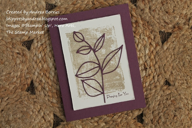
I'm not sure why, but I often seem drawn to shades of purple for sympathy-type cards. For this card I used Fresh Fig for the card base and die-cut branch. I created a neutral background with Crumb Cake ink and a shadow stamp. To add some texture and coordinate with the aged style of the background stamp, I ran my bone folder along the edges of the Very Vanilla layer.

Supplies (all Stampin' Up! unless otherwise noted):
Stamps: Rooted in Nature
Paper: Sweet Sugarplum card stock, gold foil sheets
Ink: Sweet Sugarplum, Rich Razzleberry, Art Philosophy Metallic Accents paint (Prima)
Accessories: Nature's Roots dies, Rich Razzleberry velvet ribbon, Share What You Love Artisan Pearls, Dimensionals

Here's another purple-y leaf card design, although these aren't necessarily sympathy cards. Actually, I think I stamped birthday sentiments inside these cards, but they would work for many occasions. I wish the lighting in this photo was better (I took it outside last summer in the sun, so it's too bright), so you could see how pretty the gold die-cut leaves and gold splatter on the background look with the two shades of purple. The velvet ribbon adds a fun element of texture.

On a personal note, this has been a challenging and scary week for the U.S. I never thought I would see an insurrection at the U.S. Capitol. And the fact that people sworn to uphold the Constitution and work for the good of America played a role in it, whether directly or indirectly, is maddening. I just don't understand what people are thinking or doing any more. It makes absolutely no sense. I am definitely looking forward to the presidential inauguration next week, but I'm also anxious about more violence happening around the country until then (and after? Who knows anymore). I hope that once we have a new administration in place we can begin to make progress in social justice, environmental policy, etc. There is so much work that we need to do.

Thanks for stopping by today. Wishing you peace!


Tuesday, January 5, 2021

2021 desk calendar: Flowers and leaves

I hope you've enjoyed my first two calendars: create every day and We Stand with You. I'm back today with my third and final calendar design, which features a variety of die-cut flowers and leaves.

Supplies:
Paper: Pool Party, Chocolate Chip, Shaded Spruce, Calypso Coral, Powder Pink, Whisper White, Granny Apple Green, Crumb Cake, Petal Pink, Seaside Spray, Misty Moonlight, Old Olive card stock
Accessories: Woodland Basics dies (Wplus9 Design Studio), Bouquet Bunch dies and Flower Fair dies (Stampin' Up!), sparkling clear sequins (Pretty Pink Posh), Art Glitter Glue (Art Institute)

I used a lot of different dies and card stock colors for these calendar pages. So instead of listing all the supplies after the first photo, I will list the supplies used for each set of pages after that photo.

It was fun (and sometimes a challenge!) to create a design that was seasonally appropriate. I think the March page ended up being the most "generic." I probably should have tried something like four-leaf clovers.

Supplies:
Paper: Wisteria Wonder, Pear Pizzazz, Flirty Flamingo, Melon Mambo, So Saffron, Poppy Parade, Real Red, Old Olive, Garden Green, Basic Black, Crumb Cake, Whisper White, Soft Sea Foam card stock (Stampin' Up!)
Ink: Broken China, Worn Lipstick, Wilted Violet Distress Oxide inks (Ranger); white paint pen (Posca)
Accessories: Shadow Box Card Park Add-On dies (Lawn Fawn), Flowers and Stems dies (Taylored Expressions), Poppy Moments dies and Beautiful Branches dies (Stampin' Up!), sparkling clear sequins (Pretty Pink Posh), Art Glitter Glue (Art Institute)

You can't tell in this photo, but the hydrangea on the June page is a mix of pink, blue, and purple Distress Oxide inks blended together on white card stock. It's very soft and pretty in real life.

Supplies:
Paper: Daffodil Delight, Whisper White, Pool Party, Soft Suede, Sahara Sand, Mossy Meadow, Old Olive, Cherry Cobbler, So Saffron, Highland Heather, Chocolate Chip, Cajun Craze, Crushed Curry card stock (Stampin' Up!)
Ink: Smoky Slate, Granny Apple Green, Daffodil Delight Blends markers (Stampin' Up!); Crumb Cake (Stampin' Up!)
Accessories: Floral Squares dies (Pinkfresh Studio), Funky Foliage Thinlits dies (Sizzix - Tim Holtz), Build-A-Scene Trees dies (Taylored Expressions), sparkling clear sequins (Pretty Pink Posh), Art Glitter Glue (Art Institute)

For the July page, I die cut the framed daisy twice, once out of white card stock and once out of Pool Party card stock. I used alcohol markers to color the leaves, frame, and flower center on the white piece. Then when I glued everything to the background, I popped in the Pool Party "negative" piece for the sky.

I used sparkling clear sequins on all of the pages to add a little embellishment. They are my favorite sequins!

Supplies:
Paper: Blueberry Bushel, Old Olive, Garden Green, Crushed Curry, Early Espresso, Cajun Craze, Delightful Dijon, Early Espresso, Crumb Cake, Basic Black, Real Red, Shaded Spruce, Cucumber Crush card stock (Stampin' Up!)
Accessories: Autumn Bouquet Fancy Dies (Hero Arts), 1/2" circle punch (Stampin' Up!), Bigz Autumn Accents die (Stampin' Up!), Woodland Basics dies (Wplus9 Design Studio), stylus, sparkling clear sequins (Pretty Pink Posh), Art Glitter Glue (Art Institute)

To add some texture to the leaf on the November page, I placed the die-cut leaf on a foam mat (with the back facing up) and used a stylus to create lines for veins.

I made three of this style calendar, but one of them was actually stolen. (2020 was full of surprises, wasn't it?) My sister and I had a couple of Christmas gifts for our aunt, so we gave them to our dad to drop off when he visited. Well, before he could deliver them, someone stole the bag they were in out of his car. Sigh. Certainly not a big deal in terms of monetary value, but I was bummed to think that after all that work, the calendar probably ended up in the trash. (Update: So the presents weren't stolen after all. Apparently the bag was brought into my parents' house, and my dad didn't realize it. Ha ha!)

And that's it for this year's calendars. I'll be back to sharing cards in my next post. Thanks for stopping by!


Sunday, January 3, 2021

2021 desk calendar: We Stand with You

I'm back today to share the second design I created for my 2021 easel desk calendars. This one focuses on the We Stand with You stamp set from The Stamping Village. (For the first calendar, see "2021 desk calendar: Create every day" and for the third, see "2021 desk calendar: Flowers and leaves.")

Supplies:
Stamps: We Stand with You (The Stamping Village), Tealightful Day (Pinkfresh Studio), Greetings Mix 1 (Simon Says Stamp)
Paper: Thick Whisper White, Basic Black, vellum card stock (Stampin' Up!)
Ink: Colored pencils and blender pencil (Prismacolor); Party and Spa collections inks (Catherine Pooler); Fossilized Amber, Spiced Marmalade Distress Oxide inks (Ranger); Memento Tuxedo Black (Tsukineko); Color Fuse Set #9 (Rubbernecker Stamps); Brights Collection markers, Flirty Flamingo, Mango Melody, Lemon Lime Twist, Coastal Cabana, Smoky Slate (Stampin' Up!); Stardust Gelly Roll pen, Micron black pen (Sakura)
Accessories: Here Comes the Sun stencil (Taylored Expressions), sparkling clear sequins (Pretty Pink Posh), Sparkle Silk (Fun Stampers Journey), blender brushes (Picket Fence Studio), Art Glitter Glue (Art Institute)

The We Stand with You stamp set includes twelve sentiments (and a number of related images), so I thought it would be perfect for a calendar. Once I started working, though, I realized that there was one sentiment that was just too small for a calendar page. So instead, for the month of March, I used the sentiment "I believe in you" from the set Greetings Mix 1 from Simon Says Stamp. I also used one other stamp set, Tealightful Day from Pinkfresh Studio, for a few floral images on the March and May pages.

The April page turned out to be one of my favorites. I love that the rainbow image can be repeatedly stamped to perfectly fill an A2 card (4-1/4" x 5-1/2"). (Note: For the past several years, I've made all my calendar pages the same size as an A2 card so the calendars fit in plastic card boxes for easy gifting.)

Creating a background to fit the sentiment was a challenge for some months, including July. I finally settled on stamping the row of little hearts all down the left side of the page in different shades of blue. I used a set of Color Fuse inks from Rubbernecker Stamps, which come in four shades of the same color, so I stamped light to dark to light, etc. It made me think of waves, which seemed fitting for the quote, which mentions the ocean. I really liked the way this page turned out.

The background for October was similar to July, but for October I only used one color ink -- I just stamped the heart four times before re-inking the stamp. I also used that technique for November to get the light and dark leaves.

I made four copies of this calendar, and it was the most challenging one for me. But I love the sentiments, and I'm happy with how the pages turned out. In my next post I'll share the last calendar design. Thanks for stopping by!


Saturday, January 2, 2021

2021 desk calendar: Create every day

Happy new year! Like most people, I was glad to see the end of 2020. What a crazy year. I know the change of a calendar doesn't solve problems, heal wounds, or rectify injustices. But it does feel like a glimmer of hope. Like we can sigh and say, "I made it. I survived." And I hope we can all take something (maybe many things) we learned last year and act on it to help make our lives, our communities, and our world a better place for everyone.

With all that said, a new year does require a new calendar. This year I made three different desk calendar styles, and I will share each of them in a separate post. Today's calendar features all things crafty.

Supplies:
Kit: May 2019 My Monthly Hero kit (Hero Arts)
Stamps: Crafty Turnabout (Concord & 9th); You Color My World, Empowered Words (Unity Stamp Co.); Strokes of Wisdom (Raisin Boat); Bloom with Heart (Fun Stampers Journey)
Paper: Whisper White, Basic Black, Crumb Cake, Calypso Coral, Daffodil Delight, Granny Apple Green, Pool Party, Rich Razzleberry, Highland Heather card stock (Stampin' Up!); watercolor paper (Marco); Galvanized Metallic Paper (Stampin' Up!)
Ink: Memento Tuxedo Black (Tsukineko); Smoky Slate, Crumb Cake, Calypso Coral, Daffodil Delight, Granny Apple Green, Pool Party, Rich Razzleberry, Highland Heather ink pads and/or Blends/Blendabilities markers (Stampin' Up!); C1 alcohol marker (Copic); Gansai Tambi watercolor paints (Kuretake)
Accessories: 2021 tear-off calendars (Taylored Expressions), Stitched Frames Stacklets dies (Taylored Expressions), Crafty dies (Concord & 9th); Buttons and Needle and Thread dies (Taylored Expressions), Hearts Entwined die (My Favorite Things), Fashionable Hearts Embosslits die (Stampin' Up!), "create" word die (Taylored Expressions), Art Glitter Glue (Art Institute), foam tape (3M)

My starting points for this calendar were the May 2019 My Monthly Hero kit from Hero Arts (which, as of today, is still available in their online store) and the Crafty Turnabout stamps and dies from Concord & 9th (also still currently available). All of these products are full of great images, dies, and sentiments related to crafting and creativity. I just filled in a with a few stamps and dies from other companies so I had enough images to create a unique picture for each month.

To further unify the pages I chose a rainbow-y pallet of six colors: Calypso Coral, Daffodil Delight, Granny Apple Green, Pool Party, Rich Razzleberry, and Highland Heather. I used those colors, along with a few neutrals, for all of the calendar pages. Each of the main colors was the background for two months. (And although I didn't plan it, the colors go in the same order: Pool Party, Rich Razzleberry, Daffodil Delight, Highland Heather, Calypso Coral, Granny Apple Green. That does my organized left brain a little happy!) I also opted not to use any embellishments (what?!) because I really wanted the colors and images to be the focus.

I used a black stitched frame die cut layered on white card stock to create a focal panel for each month. Some months I stayed within the frame, and some months I placed images or die cuts so they overlapped the frame. In general I think I like the overlapping style better.

I made two of this style calendar for a couple of my best crafty friends. I hope the pages make them smile and inspire them to create every day.

In my next post I'll share another desk calendar design. (To see the second calendar, see "2021 desk calendar: We Stand with You," and for the third, see "2021 desk calendar: Flowers and leaves." Thanks for stopping by!