Saturday, April 30, 2022

April Christmas cards: Ornament trio

Whew! Once again, I'm squeezing in my monthly Christmas cards just before the end of the month. This month I almost forgot to even make them. With Easter, a week of house-sitting for a friend, a few days of being sick, trying to figure out if I should sell my cards locally, and some of the dreariest, coldest "spring" weather I can remember, it has been a wild month. But I sat down yesterday and created a batch of cards in some bright, non-traditional Christmas colors.

I started with three bold jewel tones -- Bermuda Bay, Granny Apple Green, and Berry Burst (Stampin' Up!) -- and decided to pair them with the Christmas Trimmings stamp set (Wplus9 Design Studio).

The size and whimsical style of the ornament images worked perfectly with the Triple Peek-a-Boo Stitched Windows die (My Favorite Things). I die-cut the windows slightly above the middle of each card base and embossed the "merry & bright" sentiment in white below the windows.
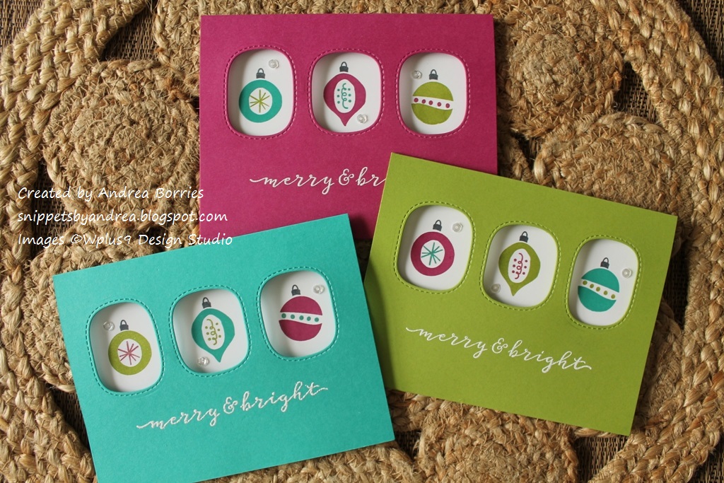
Then I adhered a layer of white card stock inside each card and stamped the ornaments through the windows. For the first card, I was worried about messing up the white panel, so I used low-tack tape to just hold the panel in place while I stamped. Then I went back and permanently glued it down after I was done stamping. But I decided that the ornaments were easy enough to stamp -- and I wanted to save a little time -- so for the rest of the cards I just adhered the white layer and then stamped.

Inside the card I stamped a sentiment, making sure it was low enough that it wouldn't show through the windows. And I still have enough space to write a little personal note.

I wanted to add a little sparkle, so I used a gel pen to trace over the accents in the middle of each ornament; I wish you could see it in the photos. I finished off the cards with a few sparkling clear sequins.

Next month I'm going on a weekend craft retreat -- for the first time in several years. I'm looking forward to it, although I have no idea what I'm going to work on. But I will try to post pictures of what I create, so maybe I'll have more than one blog post in May. :)

Thanks for stopping by!


Wednesday, March 30, 2022

March Christmas cards: Woodsy peace

Well, we're almost at the end of March, and I had to make sure I popped in to share my March Christmas card design. I don't typically think of Christmas cards as masculine or feminine, but this one, with its earthy colors and clean layout, definitely has a bit of a "guyish" feel to me.

When I make Christmas cards, I try to mix up the styles and colors so I have a variety to choose from when it's time to mail them. For January I did Santa hats with shiny red foil, and last month was bold gel prints with die-cut snowflakes. So this month I wanted to create something with a nature focus, and this image was perfect. (I love that this background-style image also includes the sentiment -- super easy!)


I used a dark, hunter green for the card base and to stamp the image. I tore the edges around the stamped image to add a bit of texture and interest. I wanted to add a little accent color, and when I started looking through my decorative papers, I knew this woodgrain-textured kraft paper was perfect. I cut a 1" strip for each card, adhered one piece to the left edge of each card base, and glued the focal panel directly on top. (I thought about using foam tape for dimension, but I decided to keep this design flat.)

I did want to add a little bit of sparkle, so I glued three copper sequins on each card. Then I used my Stardust Gelly Roll pen to trace over the pine branches on the stamped image. It's a subtle sparkle -- you can't really see it if you look at the card head on, but it shows up when you tilt the card and it catches the light.

I didn't take a picture, but the inside is stamped with "This season and always" and a small dove image, both of which are from the same set as the main image.

I had wanted to get a few more blog posts done this month, but March has been a little crazy. I decided to turn in my notice at work, and tomorrow is my last day. I don't have a new job lined up yet, but I've been unhappy for a long time, and it's caused a lot of stress and drained all my energy. It's a little scary, but now I'll be able to focus better on finding a new (and hopefully better!) job -- and I'm hoping to get in a little extra crafting time, too. :-)

Thanks for stopping by!


Sunday, February 27, 2022

February Christmas cards: Merry gel prints

As promised, I'm back with some cards using gel prints, this time for my batch of February Christmas cards.


These are definitely non-traditional Christmas cards, but I think they're fun. I looked through my stack of gel prints and chose four that had wintery (blue, purple) or Christmas (red, green) colors. I trimmed off the extra paper from each gel print and cut them in half. Then I chose card stock that coordinated with each gel print for the card bases: Blue Raspberry (Gina K Designs), Call Me Clover, Poppy Parade, and Gorgeous Grape (Stampin' Up!). I adhered each gel print 3/4" above the bottom edge of a card base.

Using the Snowflake Soiree stamp and die set (The Greetery) and the same ink colors as the card stock, I stamped small snowflakes along the top and in the bottom right corner of each card base. I die cut large white snowflakes and adhered two to each card. For the sentiment, I die cut four "Be  Merry"s out of white card stock. I used the positive die cut, the skinny letters, on the red and green cards and the negative die cuts, the outline pieces, on the blue and purple cards. (The blue and purple gel prints had white paint in them, so the bold outline pieces stood out more than the narrow letters.) To finish off the cards I added a bunch of sparkling clear sequins.

Thanks for stopping by!


Friday, February 25, 2022

Ready for spring

In my last post I mentioned sharing more cards made with gel prints, and I'm working on that. But in the meantime, I wanted to quickly pop in and share a few cards I made recently that just make me happy. Bright colors and some flowers -- I can tell I'm ready for spring!


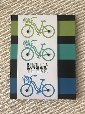
I really love the layout on this first card. The bold colors really pop against the black, although they look a little muted in this photo. And the vertical strips of colored card stock make it feel like the bicycle images are moving across the card.


A layering stencil from Pretty Pink Posh made it easy to create these daffodils, which are a lovely focal point for a spring or Easter card. I think they look especially pretty with the stitched edges of the white panel.


Clean and simple layouts are always some of my favorite. I really like the style of the flowers in this window box -- the stems and flowers are all separate stamps, so you could create a ton of different looks.


Okay, no flowers here, but ocean cards always make me think of warm weather, so I think it counts. I've had the Scenes from the Sea stencil set from Trinity Stamps for ever and finally tried it out. I'm definitely no ink-blending expert, but I think this little underwater scene turned out pretty cute.


I actually completely messed up what I intended to do for this card, which uses a stencil from Taylored Expressions. You're supposed to stamp the coordinating background stamp first and then use the stencil to fill in the flowers. I didn't even think about it and just grabbed the stencil and started ink blending on my card stock. Oops. I know I could have figured out how to position the background stamp over it, but instead I decided to just draw in the details on the flowers and leaves using the background stamp as a guide. It's not perfect, but I saved it from the recycle bin!


That's it for today's quick post. I'm planning some crafty time tomorrow, so we'll see what comes of it. Thanks for stopping by!


Sunday, February 20, 2022

Valentines for any time

This year after I finished all of my cute, punny, flowery valentines for Meals on Wheels, I wanted to do something a little nontraditional for my own valentines. Then one day while I was on Instagram, I saw a few posts featuring cut-paper collage artwork, and that gave me the inspiration I needed. So I pulled out the gel prints I didn’t use for making calendars, as well as the scratch paper from cleaning off my brayer while gel printing and some paper I painted to make a postcard last summer, and got to work. I did use hearts and some love-themed sentiments, but they're really cards that you could use any time.

Side note: Lately I've been doing my blog posts partly on the computer and partly on my phone or tablet. I've been taking pictures with my phone, and while they seem okay on the phone, they don't look great when I'm on the computer. I wish I were a great photographer, but I haven't had the time to focus on composing and editing photos. So I apologize for the less-than-stellar photos. Now, back to the valentines.

These card bases, which are about 5" x 7", are from two packs of pre-cut and -scored card bases that I've had forever. Since I was making non-traditional valentines, I decided to go with non-traditional colors, too.

For the punched hearts, I used my brayer clean-off paper. Basically it's the scratch paper I roll my brayer on when I want to switch paint colors while gel printing. I'll have to come up with a snazzier name for it. I glued six hearts onto each card base, and in the center of each heart I added a word that I stamped on white card stock and trimmed by hand. I doodled a border around each card abse and added accents around some of the hearts. (On the yellow card, I also added splatters of metallic watercolor paint before I glued on the hearts.)

Here is a peek inside the cards:

I stamped a quote from Helen Keller for the sentiment and added a mini punched heart for a touch of color.

Here are a couple more large (5"x 7") cards. I discovered that I really liked the larger format for this collage-style artwork. I am less of a fan of all the extra space inside the card, however, because I often don't have that much to write.

These hearts are punched from painted paper I originally made to create a postcard in honor of Eric Carle for a project last summer. For the card on the left, the background is a gel print, and I added three short sentiments on strips of white card stock. For the card on the right, I used a layout similar to the previous cards, but adjusted the spacing between the hearts so I could stamp and emboss a sentiment on the card base. I added more doodling on that card, too.

These two cards are smaller, I think about 4" x 5". (They were also from a pack of pre-cut card bases. I'm really trying to use some of these supplies that have been just sitting around.) Both of these backgrounds were gel prints. The left card has a painted-paper heart and embossed sentiment, and the right card has a brayer-sheet heart and a stamped sentiment cut into strips.

This batch of eight cards was probably my favorite. I used several "reject" gel prints to hand cut all the squares (approximately 2" x 2") and hearts, and it's so interesting how a print that doesn't look great as a whole sheet looks so much better when you have just a little piece of it.

I knew I wanted to use the sentiment "Do small things with great love," but I didn't have one in my stash that was the right style. So I got out an old set of small alphabet stamps and stamped them out myself. Then I cut out the individual words and glued one word over each heart. I wanted to bring in a little more white, so I used a white paint pen to draw a border around each square.

These cards inspired me to make another batch of gel prints, and I'm working on turning those into cards. Hopefully I'll be back to share some of those cards soon. I've also added a new "gel printing" category under the "Labels" section of my blog, so you can just click on that if you ever want to see gel press ideas. Thanks for stopping by!