Thursday, May 13, 2021

The nature of masculine cards

I don't know about you, but I always seem to need to replenish my stash of birthday cards, especially the masculine ones. And I know that many cardmakers (myself included) sometimes struggle with making masculine cards. So today I am going to share some guy-friendly cards featuring different nature images.

Supplies (all Stampin' Up! unless otherwise noted):
Stamps: A Touch of Ink
Paper: Whisper White, Crumb Cake, Early Espresso card stock; Wood Textures Designer Series Paper (DSP) Stack
Ink: Memento Tuxedo Black, Pumpkin Pie, Cajun Craze, Pear Pizzazz, Old Olive, Mossy Meadow, Crumb Cake
Accessories: Halloween Night Enamel Dots, Natural Trim Ribbon, Burlap Ribbon, Birthday Cheer dies (Honey Bee Stamps), Happy Birthday die (Avery Elle), Tiny Attacher (Tim Holtz), foam tape (3M)

I know butterfly images are often associated with feminine cards, but that seems silly  -- butterflies are just insects, after all. So I challenged myself to make a couple of masculine cards with butterfly images. I think the style of this stamp set worked well for that challenge because the images aren't too delicate or ornate.

For the stamped layers, I used one half-sheet of white card stock and covered it with the butterfly, leaves, and splatter images. When I stamped the "filler" images for the leaves and butterflies, I used markers to apply the ink so I could get some shading. It's hard to tell on the leaves (the lighter part of the leaves is actually part of the stamp, so I probably could have just used one color with those), but you can definitely see the two shades on the butterfly wings.

For the rest of the cards I focused on neutral colors, woodgrain patterns, and word dies that didn't have a lot of flourish. I think all of those elements work together to create a couple of great masculine cards.

Supplies:
Stamps: You're a Fungi (Hero Arts)
Paper: River Rock, Very Vanilla card stock (Stampin' Up!)
Ink: River Rock (Stampin' Up!), Chocolate Truffle amalgam ink (Gina K Designs)
Accessories: Wonky Stitched Circles dies (My Favorite Things), Burlap Ribbon (Stampin' Up!), Tiny Attached (Tim Holtz), Neutrals Candy Dots (Stampin' Up!), sponge (Stampin' Up!), foam tape (3M)

I love these mushroom images, and paired with the punny sentiment "You're a fungi!" they're perfect for a masculine card. Here are a couple of tips and tricks for this card:

-- To make the background, I positioned several of the mushroom images on a large acrylic block. Then I stamped all the images together a few times, rotating the block to change the orientation of the mushrooms. Much quicker than repeatedly stamping each individual image.

-- I love using a mini stapler to attach burlap ribbon for a couple of reasons. A) Regular adhesive can be visible between the fibers because burlap doesn't have a tight weave, and B) the metal adds an extra bit of texture and a masculine feel. On this card I used two staples crossing each other on each end of the ribbon; on one of the cards above I placed the staples parallel to each other for a different look.

Supplies:
Paper: Crumb Cake, Whisper White card stock (Stampin' Up!); On the Bright Side 6" x 6" paper pad (My Mind's Eye)
Accessories: Paper Layering Feather die (Hero Arts), Woodland Silhouettes I dies (Taylored Expressions), Layering Ovals dies (Stampin' Up!), Neutrals and Regals Candy Dots (Stampin' Up!), linen thread (Stampin' Up!), foam tape (3M), Art Glitter Glue (Art Institute Glitter)

I made these two cards a long time ago, so I'm a little fuzzy on the exact details. I know I started with a paper pack that had this fun chevron print in several colors. I cut strips of each color and then did my best to line up the different strips so the chevrons appear continuous. (I think I was a little more successful with the card on the left.) I attached the strips of patterned paper to a piece of copy paper so I was able to just trim the edges and adhere it to the card base instead of trying to get the proper placement directly on the card.

For the card on the left, I used a die to cut an oval out of the patterned papers, and then I glued a white die-cut oval inside the opening. For the card on the right, I just adhered a Crumb Cake die-cut oval on top of the patterned paper. Then I added a die-cut deer silhouette to one card and two feathers to the other and finished each card with a few enamel dots.

I had a bit of the patterned paper "mash up" left over, so I added a strip to two panels of white card stock. I stamped sentiments on the panels and then adhered them inside the cards. (Unfortunately I didn't jot down where these sentiments are from, so I don't have that in the supply list. Sorry!)


Supplies:
Stamps: Stunning Silhouettes (Raisin Boat), Field Notes (Taylored Expressions)
Paper: Early Espresso, Old Olive card stock (Stampin' Up!)
Ink: Early Espresso (Stampin' Up!), Distress Oxide inks (Ranger)
Accessories: Beautiful Wings Embosslit (Stampin' Up!), Stitched Frame Stacklets dies (Taylored Expressions), Clear Drip Drops (Taylored Expressions), Art Glitter Glue (Art Institute)

This card started with the background layer, which I made at least two years ago and found in my box of bits and pieces. It was one of my early creations when I first tried using Distress Oxide inks. I don't know which exact colors I used, but it seemed perfect for a nature-y masculine card.

I wanted a silhouette image, so I stamped a few cattails along the bottom of the panel using Early Espresso ink. I die cut an Old Olive stitched frame and glued it to the panel. Then I stamped the sentiment in the upper right quadrant and attached the piece to an Early Espresso card base. To add just a bit of embellishment, I added three clear droplets (I like to think of them as rain or dew on nature-themed cards) and a tiny die-cut/embossed butterfly. (Hey! Look at that -- another butterfly on a "guy card"!)

I hope these cards give you some ideas for masculine cards. And I hope to be back soon with another post. Lately it seems like whenever I think I'll be able to get back to a more regular blog-posting schedule, something happens that throws everything off. So thanks for sticking around and stopping by today!


Thursday, April 29, 2021

Free As a Bird

We've had a stretch of cool, rainy weather in my neck of the woods, but today was a beautiful sunny day. The perfect time to share a few spring-y cards made with the Free As a Bird stamp set.

Supplies (all Stampin' Up!):
Stamps: Free As a Bird
Paper: Whisper White, Balmy Blue, So Saffron card stock
Ink: Balmy Blue, So Saffron, Memento Tuxedo Black; Blends markers - Balmy Blue, So Saffron, Soft Suede, Granny Apple Green
Accessories: Stitched Nested Labels dies, Subtles and Neutrals Candy Dots

I love this stamp set, so I used a simple layout for these two cards, allowing the image of birds on a branch to hold the spotlight. I colored the images with Blends alcohol markers and die cut them with a stitched label die. For the card bases I used So Saffron and Balmy Blue card stock and tone-on-tone stamping to add a few flowers and leaves on the background. I added two enamel dots to each label shape for just a little embellishment.

Supplies (all Stampin' Up! unless otherwise noted):
Stamps: Free As a Bird
Paper: Crumb Cake, Whisper White, Shimmery White, Rich Razzleberry card stock
Ink: Crumb Cake, Coastal Cabana, Rich Razzleberry
Accessories: Small Stitched Rectangle Stackables dies (Lawn Fawn), Stitched Nested Labels dies, It's My Party enamel dots, water brush (Close to My Heart), foam tape (3M)

These two cards are the result of a virtual card-making challenge I did with a crafty friend. I selected the color combo (Crumb Cake, Coastal Cabana, and Rich Razzleberry), and she picked the stamp set -- but we didn't know ahead of time what the other person had chosen. It's a bit of an unconventional color pallet for this stamp set -- but I think I made it work.

For the card on the left, I stamped a few images from the set in each of the colors on a panel of white card stock. I die cut the panel, matted it with Rich Razzleberry card stock, and then adhered it to a Crumb Cake card base. I stamped the sentiment on a strip of white card stock and added a few hand-cut stamped images from the stamp set.

For the card on the right, I wanted to try something a little different. I stamped the image on Shimmery White card stock using Crumb Cake ink, carefully watercolored parts of the image using a water brush, and then die cut it with a stitched label die. For the Crumb Cake card base I stamped a few images and a sentiment using Crumb Cake ink and added a strip of Rich Razzleberry card stock. I adhered the focal panel over the Rich Razzleberry card stock using foam tape and finished the card with a couple of enamel dots.

Thanks for stopping by!


Sunday, April 25, 2021

April Christmas cards: Polar bear parade

For this month's Christmas cards, I decided to pull out an old favorite stamp set I haven't used in awhile and finish up a partially used pack of Designer Series Paper (DSP) from a few years ago. The result was a polar bear parade.

Supplies:
Stamps: Polar Bears (Stampin' Up!), Christmas Sampler (Paper Smooches)
Paper: Whisper White, thick Whisper White card stock (Stampin' Up!); All Is Calm Specialty DSP (Stampin' Up!)
Ink: Pretty Peacock, Basic Gray (Stampin' Up!); Pretty Peacock, Old Olive, Mint Macaron, Smoky Slate, Blush, Bronze Blends/Blendabilities markers (Stampin' Up!); W1 Sketch marker (Copic)
Accessories: Large and Small Stitched Rectangle Stackables dies (Lawn Fawn), white rhinestones (Taylored Expressions), foam tape (3M), Art Glitter Glue (Art Institute)

I used a very simple layout, with one piece of DSP covering the card base, another piece across the middle (either horizontally or vertically), and then the stamped image and sentiment on a panel of white card stock in the middle of the card base. I was able to make 12 card bases, so I used each polar bear image for four cards.

I used alcohol markers to color the images, but I didn't have the same colors as those that were in the DSP. So I tested some similar colors and found several good substitutes: light Old Olive instead of Pear Pizzazz, light Pretty Peacock instead of Lost Lagoon, and light Mint Macaron instead of Soft Sky. (I actually do have the old Soft Sky Blendabilities markers, but the color did not look right with the DSP; Mint Macaron was actually much closer.) If I'd had to color larger images, these substitutions might not have worked as well, but for the little bit of coloring on these cards, they were perfect. It also helped that the colors in the DSP had a watercolor look with variations in the shading, instead of one solid color.

I finished the cards with a few white rhinestones for just a little sparkle. I even managed to use up that pack of rhinestones, too!

With these twelve cards done, I had a few bigger scraps of DSP left, so I pulled out some other dies and punches and made two additional cards.

Additional supplies:
Paper: Lost Lagoon, Smoky Slate card stock (Stampin' Up!)
Accessories: Big Peace Sugar Script die (Birch Press Design), Hexagon punch (Stampin' Up!), Perfect Pines Frame dies (Stampin' Up!), Snowflake Confetti die (Taylored Expressions), rhinestones (Stampin' Up!), shimmer spray (Avery Elle), leftover pieces from Paper Pumpkin kit (larger snowflakes)

I think these two cards were harder to make than the polar bear design because I was trying to figure out how to most efficiently use the DSP scraps. But I think I was pretty successful because I only threw out a few small pieces. And I have fourteen more Christmas cards done!

Thanks for stopping by!


Wednesday, April 21, 2021

Find the beauty

Well, I thought I might get back on track with blogging this month, and then another police officer killed another Black man in Minnesota, and it's just so heartbreaking and infuriating. The grief and anger and protests and curfews and law enforcement tactics and everything weigh so heavily on my heart that it's hard to find any creative energy. And I hate that it's not shocking that this continues to happen -- across the country -- again and again.

Thankfully, when the verdict came back yesterday in the Derek Chauvin trial, he was found guilty on all three charges. Although I know that doesn't take away the grief of George Floyd's family, I'm relieved that Chauvin was held accountable, and I hope it's truly just a step in the right direction.

So with all the heaviness we're feeling in the world right now I decided to share a simple set of cards that makes me think of finding little bits of beauty amidst the darkness.


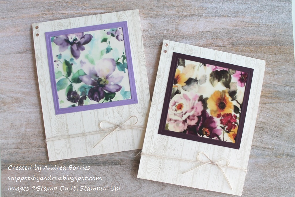
Unfortunately I didn't write down a supply list for these cards, but I can tell you that the flower images are from a sheet of Vintage Hues Art Acetate from Stamp On It, and the background stamp is Hardwood from Stampin' Up! I die cut a coordinating frame for each flower image and used shimmer paint to stamp the background. I gave this card set to my aunt, and I also included a set of sentiment strips mounted on foam tape so she could add a sentiment to the front of each card if she wanted to.

Another reason I decided to share this set of cards today was because I've been thinking about how I can use my talents to help bring about social change. I have a lot of respect for the protestors and community organizers who have the courage to express outrage and demand justice, but that's not one of my gifts. And while I've donated money, signed petitions, and contacted some politicians (though I need to do that more often, too), I want to do something more. So I've been tossing around the idea of creating some card sets to sell, with all of the money going to a social justice organization(s).

I haven't decided on any of the specifics of this possible plan. For instance, what types of card sets should I make? Basic floral/nature cards, like these? Something with inspirational or social justice quotes? More "artsy" cards? I'm also not sure how the logistics of selling the cards would work (e.g., just selling locally and in-person or via e-mail/blog/Instagram). Should I sell a fewer number of sets each month or have a larger selection less often? I don't necessarily want this to be overly "official," but I also don't want to just throw something together. So if you have any thoughts or suggestions, I'd love to hear them!

Thanks for stopping by today. Wherever you are, I hope your day is filled with peace and hope.


Wednesday, April 7, 2021

Easy technique for multicolored stamp images

I'm still having a hard time focusing on card making, so I'm going to work on sharing some cards I made a while back and never posted. For today, here is a clean and simple, gender-neutral card that you could use for any occasion.

Supplies (all Stampin' Up! unless otherwise noted):
Stamps: All the Good Things, By the Bay
Paper: Whisper White, Pool Party card stock
Ink: Pumpkin Pie, Basic Black
Accessories: Layering Circles dies, blue sequins (Paper Pumpkin leftovers), Corner Chomper (We R Memory Keepers), foam tape (3M), Art Glitter Glue (Art Institute)

I love that this card focuses on stamping -- with a little twist. I think these multicolored koi look pretty realistic, and it's so easy to create this look. Just ink the stamp in the main color (I used Pumpkin Pie) and then, using a marker, randomly scribble black spots on the stamp. That's it! When you stamp the image on paper, you have a fun multicolored koi fish. This technique would be great for a variety of images, such as butterflies, flowers, balloons, and even "chunky" sentiment stamps.

To make the focal layer for this card, I used white card stock and repeatedly inked, colored, and stamped the large and small koi fish images until I was happy with the arrangement. (I did clean the stamp after each impression so my ink pad didn't end up with black spots.) I rounded two opposite corners of the white card stock to mimic the curve of the fish and then mounted it on a Pool Party card base. I die cut the sentiment with a circle die, added a Pool Party circle to the back, and adhered it to the card base with foam tape. I finished the card with a few light blue sequins, which reminded me of bubbles in a pond.

Here's another tip I shared a couple of years ago, but I think it's a good reminder. If you have a stamp that contains multiple images, you can cut it apart and use them separately. (Really! I promise nothing bad will happen.) The large koi image I used for this card was actually on one stamp with a sentiment. I liked the sentiment, but I wanted to be able to use the fish separately without having to mask the sentiment every time. So I did a little stamp surgery by carefully slicing apart the stamp (I have this set in cling-mounted red rubber). I made sure to pull the blade without using a sawing motion, and I didn't worry about having a perfectly straight cut. In fact, it helps if it's a little imperfect -- then if I do want to use the two parts together, I can just join them up like puzzle pieces before attaching them to a clear block. (I haven't tested this process yet with clear photopolymer or acrylic stamps. You can certainly cut those apart; I'm just not sure how easy it would be to match the pieces back together since those materials are more pliable than rubber.)

That's it for me today. My bright spot this week is that I finally have my first appointment for the COVID-19 vaccine on Friday afternoon. Yippee! I know I will still need to be careful, wear a mask, etc., but it will be good to have one worry eased a little bit. I hope you are having a happy, healthy week. Thanks for stopping by!