Friday, June 17, 2022

A few cards with flowers

Before I post my June Christmas cards (which are already done - yay!) I decided I should share something a little more seasonal, so here are a few cards featuring a variety of flowers.

The background and flowers on this card are images from the Flowing Florals from Gina K Designs. The background is actually one corner-style image that I stamped four times. For the colored flowers, I inked the stamps with yellow ink and then tapped a light orange ink spot on the flower centers and tips of the petals to create a two-toned look. I did the same with two shades of green for the leaves. After everything was stamped, I used a white paint pen to add tiny dots and lines on all the images (background and flowers) for a different look.

Here is a picture of the inside of the card; I had a couple of extra flowers and didn't want to waste them. Also, this is a large card (about 6" x 6"), so I made my own envelope with the Envelope Punch Board. I used a lightweight brown paper bag and decorated it with some patterned paper and punched flowers. I didn't get a photo, but it was a fun way to upcycle a plain bag!

I put these two cards together using a bunch of bits and pieces from my unfinished pieces stash -- you know, the shapes you die cut or backgrounds you stamp that end up not working for their intended projects, so you save them for something else. I put all those odds and ends in various plastic boxes (the old clamshell-style cases that Stampin' Up! used to use are great), and sometimes it's a fun challenge to pull them out and see what I can create.

This one is a very clean and simple sympathy card. I used a two-step tulip stamp set and sentiment strips for the focal point. To add interest to the background, I splattered yellow ink and rubbed a brown ink pad along the edges of the card front. Two simple enamel dots in the lower right corner finish off the card.

Here are two more sympathy cards (I needed a few when I made these last fall). These cards were also made with some pieces from my unfinished stash. I realize that the images are not technically flowers, but I think they're close enough to include them in this post. You could easily switch out these images and use flowers instead.

I'm trying to decide if I should go back to listing supplies for my cards and projects. I do enjoy not having to keep track of that when I'm creating a card. And I often use retired supplies that can no longer be purchased anyway. But it feels kind of incomplete to just have the pictures. If you have a preference either way, I'd love you to leave a comment and let me know!

Thanks for stopping by!


Saturday, May 21, 2022

May Christmas cards: Ombre peace

Well, hello there! Here it is ten whole days before the end of the month, and I'm already sharing my Christmas cards for May. Look at me go! And this month I also created my cards for Ellen Hutson's May Essentials Challenge. It's a layout challenge, and I'll admit I was stuck for a bit. But I'm pleased with the end result -- a clean and simple, ombre, out-of-the-box (at least for me) Christmas card.


I wanted to use the Brushstroke Christmas stamp set (Essentials by Ellen) because I've had it for quite awhile and only used it, I think, once. The tricky part is that the set is primarily sentiments with a few accent images (various stars and a splatter). 

I chose the sentiment I wanted to use ("peace on earth") and decided to create an ombre effect to make the sentiment more of a focal point. I was able to achieve that really easily with a set of Color Fuse inks from Rubbernecker Stamps (I used the BG set) and my stamp positioner. I placed the white card stock layer in my stamp positioner and placed the "peace" stamp near the top right corner of the card stock. I stamped it first in the lightest blue, slid the card stock up about 5/8", stamped the next shade of blue, and repeated the process until all four colors were stamped. (Since I was working from light to dark, I didn't clean my stamp between colors, just at the end before I switched back to the lightest blue for the next piece.) I used the darkest blue to stamp "on earth" below the last "peace," then added the strip of Cool Caribbean card stock (a retired Stampin' Up! color) and a glittery silver star.


I used Island Indigo card stock for the card base (another retired Stampin' Up! color) and stamped three different star images using the darkest blue ink. Then I used some metallic watercolor paint to add silver splatter along the bottom and edges of the card base. I applied foam tape to the back of the white panel and attached it to the card base. I didn't add any other embellishments because I liked the clean white card stock.

I kept the inside of the card simple, with a layer of white card stock, a stamped sentiment, and a few of the stars in the lightest blue this time. What do you think of the results?

So, I mentioned in my last post that I was planning to have cards to share from my craft retreat this month. Well, the retreat was last weekend, but I didn't get to go. I wasn't feeling well a few days before (nothing contagious, thank goodness), so I let people know I wasn't sure I'd make it. I was really disappointed, but I wasn't crazy about being a four-hour drive from home if I got worse, especially since I wasn't driving myself. Then the night before I felt better, so I thought I would try to just throw some things together in the morning and see if I could still make it. But we had a big storm that night and got a ton of heavy rain in a very short period of time ... and we ended up with water in our finished basement. Sigh. So no retreat for me. 

We spent a few days trying to clean up with towels, fans, and a dehumidifier. We pulled up a bunch of carpet and flooring (all wet underneath), and then this week we had a company come in to cut out drywall, clean/spray for mold, and set up heavy duty equipment to finish drying it out. Thankfully nothing else was ruined, but now half of our basement is demolished, the stuff we had to move is all over the living room, we have to fix the landscaping on one side of the house so it hopefully doesn't happen again, and then we have to replace the flooring and walls, repaint, etc. Argh. It's a lot. Part of me is thankful I'm not working right now, because that would just be one more thing. But the other part of me knows that the income would be helpful, to say the least. I just need to figure out how to focus on job searching with everything else going on.

With all that said, I do have some other cards I've been wanting to share -- some recent, and some from a while ago -- so I will try to post those when I can. Maybe it will be a good distraction when everything else is overwhelming. :) Thanks for stopping by!


Saturday, April 30, 2022

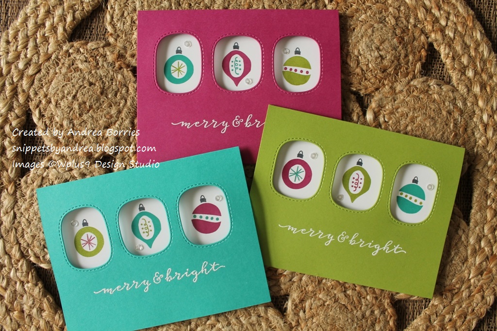
April Christmas cards: Ornament trio

Whew! Once again, I'm squeezing in my monthly Christmas cards just before the end of the month. This month I almost forgot to even make them. With Easter, a week of house-sitting for a friend, a few days of being sick, trying to figure out if I should sell my cards locally, and some of the dreariest, coldest "spring" weather I can remember, it has been a wild month. But I sat down yesterday and created a batch of cards in some bright, non-traditional Christmas colors.

I started with three bold jewel tones -- Bermuda Bay, Granny Apple Green, and Berry Burst (Stampin' Up!) -- and decided to pair them with the Christmas Trimmings stamp set (Wplus9 Design Studio).

The size and whimsical style of the ornament images worked perfectly with the Triple Peek-a-Boo Stitched Windows die (My Favorite Things). I die-cut the windows slightly above the middle of each card base and embossed the "merry & bright" sentiment in white below the windows.

Then I adhered a layer of white card stock inside each card and stamped the ornaments through the windows. For the first card, I was worried about messing up the white panel, so I used low-tack tape to just hold the panel in place while I stamped. Then I went back and permanently glued it down after I was done stamping. But I decided that the ornaments were easy enough to stamp -- and I wanted to save a little time -- so for the rest of the cards I just adhered the white layer and then stamped.

Inside the card I stamped a sentiment, making sure it was low enough that it wouldn't show through the windows. And I still have enough space to write a little personal note.

I wanted to add a little sparkle, so I used a gel pen to trace over the accents in the middle of each ornament; I wish you could see it in the photos. I finished off the cards with a few sparkling clear sequins.

Next month I'm going on a weekend craft retreat -- for the first time in several years. I'm looking forward to it, although I have no idea what I'm going to work on. But I will try to post pictures of what I create, so maybe I'll have more than one blog post in May. :)

Thanks for stopping by!


Wednesday, March 30, 2022

March Christmas cards: Woodsy peace

Well, we're almost at the end of March, and I had to make sure I popped in to share my March Christmas card design. I don't typically think of Christmas cards as masculine or feminine, but this one, with its earthy colors and clean layout, definitely has a bit of a "guyish" feel to me.

When I make Christmas cards, I try to mix up the styles and colors so I have a variety to choose from when it's time to mail them. For January I did Santa hats with shiny red foil, and last month was bold gel prints with die-cut snowflakes. So this month I wanted to create something with a nature focus, and this image was perfect. (I love that this background-style image also includes the sentiment -- super easy!)


I used a dark, hunter green for the card base and to stamp the image. I tore the edges around the stamped image to add a bit of texture and interest. I wanted to add a little accent color, and when I started looking through my decorative papers, I knew this woodgrain-textured kraft paper was perfect. I cut a 1" strip for each card, adhered one piece to the left edge of each card base, and glued the focal panel directly on top. (I thought about using foam tape for dimension, but I decided to keep this design flat.)

I did want to add a little bit of sparkle, so I glued three copper sequins on each card. Then I used my Stardust Gelly Roll pen to trace over the pine branches on the stamped image. It's a subtle sparkle -- you can't really see it if you look at the card head on, but it shows up when you tilt the card and it catches the light.

I didn't take a picture, but the inside is stamped with "This season and always" and a small dove image, both of which are from the same set as the main image.

I had wanted to get a few more blog posts done this month, but March has been a little crazy. I decided to turn in my notice at work, and tomorrow is my last day. I don't have a new job lined up yet, but I've been unhappy for a long time, and it's caused a lot of stress and drained all my energy. It's a little scary, but now I'll be able to focus better on finding a new (and hopefully better!) job -- and I'm hoping to get in a little extra crafting time, too. :-)

Thanks for stopping by!


Sunday, February 27, 2022

February Christmas cards: Merry gel prints

As promised, I'm back with some cards using gel prints, this time for my batch of February Christmas cards.


These are definitely non-traditional Christmas cards, but I think they're fun. I looked through my stack of gel prints and chose four that had wintery (blue, purple) or Christmas (red, green) colors. I trimmed off the extra paper from each gel print and cut them in half. Then I chose card stock that coordinated with each gel print for the card bases: Blue Raspberry (Gina K Designs), Call Me Clover, Poppy Parade, and Gorgeous Grape (Stampin' Up!). I adhered each gel print 3/4" above the bottom edge of a card base.

Using the Snowflake Soiree stamp and die set (The Greetery) and the same ink colors as the card stock, I stamped small snowflakes along the top and in the bottom right corner of each card base. I die cut large white snowflakes and adhered two to each card. For the sentiment, I die cut four "Be  Merry"s out of white card stock. I used the positive die cut, the skinny letters, on the red and green cards and the negative die cuts, the outline pieces, on the blue and purple cards. (The blue and purple gel prints had white paint in them, so the bold outline pieces stood out more than the narrow letters.) To finish off the cards I added a bunch of sparkling clear sequins.

Thanks for stopping by!