Tuesday, September 29, 2020

September Christmas card: Watercolor lights

September has been a challenging month for me. I'm anxious about basically everything, I'm tired and on edge, and I just haven't been feeling very creative. I get excited about the idea of card making; I look forward to having days off work so I can sit in my craft space and make a bunch of cards. But when those days come, I get stuck, nothing seems to work, and I'm just not into it.

So for my September Christmas cards, I made literally one card. Here it is:

Supplies:
Paper: Watercolor paper (Strathmore), Real Red card stock (Stampin' Up!)
Ink: Watercolor paints (Beam Paints), Stardust glitter Gelly Roll pen (Sakura), ultra fine point black permanent marker (Sharpie)

One beautiful afternoon last week, I gathered up some basic painting supplies and decided I was going to watercolor in the back yard. (Actually, now that I think about it, it was the first day of autumn, but the weather felt like summer, and I was painting something wintery. Funny!) The first thing I wanted to try was painting a string of lights. I chose a few bright colors from my palette and painted three oblong bulb shapes for each color. (I need more practice to make them the same shape!) I tried to space them out across the paper and have them pointing different directions, and I also left a little white spot on each one for a highlight or reflection.

I set aside the paper to do some other watercolor painting (some successful, some not), and once the paint was dry I used an ultra fine point permanent marker to draw a base on each bulb and then the loopy string connecting them all. To make it into a card I trimmed the panel just a bit and adhered it to a red card base. This card is about 4-1/2" x 6", so it's larger than the traditional A2-size card. Maybe the bigger size makes up for it being the only one.

I debated for a long time whether I should add anything else to the card. Maybe a little stamped sentiment tucked into an open space? Or a large die-cut word across the middle? Some sequins? I finally settled on using a sparkly gel pen to draw a few tiny lines at the end of each bulb to make it look like they are shining. I'm not sure I'm in love with that detail, but it's done.

And there you have my one and only Christmas card for September. I really only need to make a few more cards to be set for this year, so I'm not too concerned. I'm doing an online card-making event next week, and I think we'll be making a few holiday cards then, so that will probably be enough for me.

Thanks for stopping by!


Friday, September 25, 2020

Kangaroos and tigers and elephants, oh my!

Earlier this week I took a little time to try to organize all the card photos I still need to share on my blog (there's a lot!). I grouped them into different categories, and today's cards feature a variety of wild animals.

Supplies:
Kit: April 2020 My Monthly Hero kit (Hero Arts)
Paper: Whisper White, Basic Black, Crumb Cake, Lemon Lime Twist card stock (Stampin' Up!)
Ink: Crumb Cake, Lemon Lime Twist (Stampin' Up!); Memento Tuxedo Black (Tsukineko)
Accessories: Clear droplets (Pretty Pink Posh), foam tape (3M), Art Glitter Glue (Art Institute)

These two cards were made with the April 2020 My Monthly Hero kit, which was full of Australia-themed images and sentiments. I decided to use a bunch of the animal images to fill up an entire panel for a fun guy-friendly birthday card.

To create the stamped panel, I set up a two-step process in my stamp positioner. First I cut a piece of white card stock to the size I wanted. I placed the card stock in one corner of my stamp positioner and started arranging the stamps on the card stock. (I knew I wanted to use the "hoppy birthday to roo" sentiment, so I made sure to put the kangaroo near the lower right corner.) Once I was happy with how it looked, I closed the lid of the stamp positioner to pick up the stamps. I test stamped the images on scratch paper and then removed the kangaroo stamp. I inked up all the rest of the images with the colored ink and stamped them on the white panels. I re-inked and stamped a couple of times to get good ink coverage and then cleaned off the stamps. I repeated the process with another piece of card stock and the second ink color.

Then I moved my white card stock to a different corner of the stamp positioner and set the kangaroo stamp on the card stock. I picked it up with the lid of the stamp positioner, inked it with black ink and stamped the image, repeating to get good ink coverage.

Once both panels were done, I matted them with black card stock and adhered them to coordinating card bases. I stamped the sentiment on two strips of white card stock and used foam tape to attach each one just below the kangaroo image. I finished the cards with a few clear droplets (nothing too girly).

Supplies:
Kit: June 2019 My Monthly Hero kit (Hero Arts)
Paper: Whisper White, Basic Black, Shaded Spruce, Crumb Cake card stock (Stampin' Up!); Solar White 110-lb card stock (Neeneah)
Ink: Colored pencils - PC1063, PC935, PC918, PC1003, PC912, PC909, PC946, PC945, PC939, PC901, PC995, PC908 (Prismacolor); Memento Tuxedo Black (Tsukineko); Garden Green, Old Olive (Stampin' Up!)
Accessories: Princess sequins (Craft Medley), blender brush (Picket Fence Studios), foam tape (3M), Art Glitter Glue (Art Institute), gamsol blending kit (Taylored Expressions)

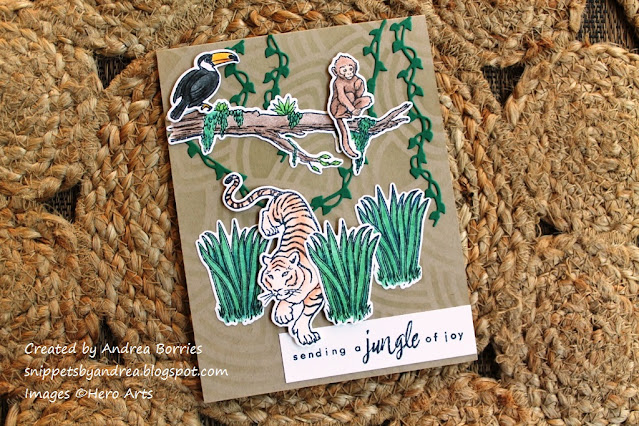
To make these two cards I broke out another My Monthly Hero kit that I hadn't used yet. I'm not great at coloring realistic animals, so I was a little intimidated by this kit. But I looked up some sample cards made with the kit to get some coloring ideas and then went to work with my colored pencils and gamsol. Overall, I think they turned out pretty good.

I colored the elephant first because that seemed the most manageable: mostly gray with a little pop of purple. I also colored two flowers so I could bring in more purple. For the background I used the leaf stencil included in the kit and blended two shades of green ink. I matted that pieces with black card stock and added a strip of white stamped with "happy birthday" across the bottom half of the card. The strip acted as the ground for the elephant and flowers, which I attached with foam tape. I mounted the whole panel on a white card base and added three purple sequins for a little sparkle.

For the second card, I colored and die cut several pieces: a toucan, monkey, tiger, branch, and three grass clusters. I used the leaf stencil for the background again, but this time using Crumb Cake ink on a Crumb Cake card base for a subtle textured look. I die cut a few fancy vines and arranged them to look like they were hanging from the top of the card. I arranged the rest of the pieces to create a scene and added the sentiment on a strip of white card stock at the bottom of the card.

Supplies (all Stampin' Up!):
Stamps: Moroccan Nights, Lucky Elephant, Itty Bitty Birthdays
Paper: Whisper White, Crumb Cake card stock
Ink: Crumb Cake, Basic Gray, Rich Razzleberry, Island Indigo, Crushed Curry
Accessories: Gold Glitter Enamel Dots, Dimensionals

There's not much to explain for these cards; they're both made with basic stamping, a layered sentiment, and some enamel dots. I had wanted to try using the Moroccan Nights and Lucky Elephant stamp sets together for awhile, and I think they complement each other well. I will note that for the medallion stamp in the background, I stamped the image on scratch paper before stamping it on the card panel so the ink was lighter.

Thanks for stopping by!


Wednesday, September 23, 2020

Simple, stunning silhouettes

If I want to make a clean and simple card that looks impressive, one of my favorite designs is to use nature silhouettes in black over a colored background. Over the years I've posted quite a few of these cards with all kinds of backgrounds, from watercolor (evening sky, sunset) and Color Burst powders to alcohol inks and even pieces of different colored card stock. Well, I hope you're not tired of them, because I have a few more to share today.

Supplies:
Stamps: Organic Set #2, Organic Set #4 (Rubbernecker)
Paper: Whisper White, Basic Black, Island Indigo card stock (Stampin' Up!)
Ink: Color Fuse Set #9 (Rubbernecker), Memento Tuxedo Black (Tsukineko)
Accessories: Rectangle masking stencils (Taylored Expressions), blending brush (Picket Fence Studios), Mermaid Mix sequins (Pretty Pink Posh), clear droplets (Pretty Pink Posh), Moonshine Confetti (Hero Arts), shimmer spray made with Shimmer Liquid Watercolor (Taylored Expressions), foam tape (3M), Art Glitter Glue (Art Institute)

For the background on these silhouette cards, I used rectangle masking stencils to cover the white border on the card fronts and then blended a few different shades of blue ink in the opening, starting with the lightest shade on top and moving to the darkest on the bottom. (My blending at the bottom of the cards is definitely a little splotchy, but I don't think that detracts from the cards too much.)

Once the backgrounds were done, I stamped the silhouette images and sentiments using black ink. I placed the images so that they extended past the edges of the blended panel just a little; that technique probably has an official art or design term, but I just really like the way it looks. To create a bit of sparkle on the cards I added droplets of shimmer spray (see photo below), and then I adhered the panels to card bases. The final touch was a different type of embellishment on each card

For the last couple of cards I used a similar background technique but switched the silhouettes to die cuts instead of stamps.

Supplies:
Paper: Very Vanilla, thick Very Vanilla, Basic Black card stock (Stampin' Up!)
Ink: Color Fuse set #9 (Rubbernecker)
Accessories: Rectangle masking stencils (Taylored Expressions), Wildflowers Thinlits dies (Sizzix), blender brush (Picket Fence Studios), Sparkle Silk (Fun Stampers Journey), foam tape (3M), Art Glitter Glue (3M)

It's hard to tell in the photo, but I used vanilla card stock for these cards, which has a slightly softer feel than white. I also used a different size masking stencil (both sizes come in the package) to make a smaller blended panel. And my blending is much smoother and less blotchy on these cards!

I used Sparkle Silk to add some shimmer on the panels and then adhered the black die-cut silhouettes. Again, I let them extend past the blended panel. I used foam tape to attach the panels to vanilla card bases and keep the clean look.

Thanks for stopping by!


Friday, September 18, 2020

Shana tova!

This year Rosh Hashanah, the Jewish new year, starts at sundown today, Sept. 18. I'm not Jewish, but I think it's important, this year especially, for everyone to learn and understand more about other cultures, races, and religions. So I decided to make a Rosh Hashanah card to send to one of my Instagram friends.


Supplies:
Stamps: Fall Fun, Make a Difference (Stampin' Up!)
Paper: Thick Whisper White, Whisper White card stock (Stampin' Up!)
Ink: Real Red, Crushed Curry, Gumball Green, Early Espresso (Stampin' Up!)
Accessories: Layering Mini Stencils Set 40 (Stampers Anonymous), Nested Banners dies (Simon Says Stamp), jute twine (May Arts Ribbon), blender brush (Picket Fence Studios), Box of Chocolate sequins (Craft Medley), foam tape (3M), Art Glitter Glue (Art Institute)

Since I don't have any specific stamps related to Rosh Hashanah, I had to look through my supplies to see what would work. I learned that apples and honey are common symbols of Rosh Hashanah to symbolize wishes for a sweet year, so I kept that in mind.

I thought I had a large apple stamp, but after multiple searches through my stamp bins and boxes, this was the best one I could find. (I must have given away or sold the other set.) The woodcut style wasn't exactly what I had in mind, but I made it work! I used markers to apply ink to the stamp since I wanted the stem and apple to be different colors. I stamped several red, yellow, and green apples and then cut them out by hand.

I don't have any stamps that include images of honey or honey pots, although I do have quite a few bees. But I wanted a monochromatic pattern for the background, so I decided to use honeycombs instead. I have a honeycomb stencil, but it is a narrow tag-size stencil, so to create this background I positioned the stencil at one side of the white card base, applied ink with a blender brush, then moved the stencil and applied more ink. I repeated that process until I was happy with the background, and then I used a marker to doodle a frame.

To make the sentiment, I chose one of my alphabet sets and spelled out "shana tova," which means "good year" in Hebrew. I die cut the sentiment with a small banner die and used foam tape to adhere it to the card base. Then I added the apples, some with foam tape and some glued directly to the card. I added a twine bow to the stem of one of the apples and finished off with a few brown sequins.

If you celebrate Rosh Hashanah, I wish you a sweet new year filled with joy, peace, and good health. Thanks for stopping by!


Thursday, September 17, 2020

A crafty life

Do you ever find yourself buying new craft supplies -- ones that you really like and are very excited about -- and then never using them? I know I do. Sometimes it's because I have other projects I need to finish first. Or maybe it's patterned paper that is just too pretty to cut up. And other times I'm just not sure what to make.

For the past several months I've been trying to make a point of playing with ten unused craft supplies each month: stamp sets, papers, embellishments (sequins, ribbon, etc.), dies, or whatever. Several of those unused supplies have included past My Monthly Hero kits from Hero Arts. I love subscribing to the kits, but sometimes life gets in the way, and they just seem to stack up. 

One of the kits I finally used this summer was from May 2019 (yikes! over a year ago!) and featured all kinds of crafty images and sentiments. Perfect to make cards for crafty friends!

Supplies:
Kit: May 2019 My Monthly Hero (Hero Arts)
Paper: Solar White 110-lb card stock (Neenah); Whisper White, Basic Black card stock (Stampin' Up!)
Ink: Memento Tuxedo Black (Tsukineko); alcohol markers - Flirty Flamingo, Pineapple Punch, Mango Melody, Granny Apple Green, Pool Party, Crumb Cake, Smoky Slate (Stampin' Up! Blends/Blendabilities)
Accessories: Sparkling clear sequins (Pretty Pink Posh), Frame in Frame 2 Cutting Plate (Taylored Expressions), Corner Chomper (We R Memory Keepers), foam tape (3M), Art Glitter Glue (Art Institute)

I'll admit, when I first pulled out this kit I wasn't entirely sure what to make, even though I think it's adorable. But I'm really happy with how these cards turned out.

For the first card I cut a panel of white card stock to 4" x 5-1/4", just slightly smaller than an A2 card base. I placed the card stock in my stamp positioner and masked off a strip near the bottom of the panel for a visual reference. Then I chose several of the stamps from the kit and placed them on the exposed strip of card stock until I had an arrangement I liked. I closed the lid of my stamp positioner to pick up all the stamps, applied the ink, and stamped the images on the white card stock. I removed the masks, colored the images with alcohol markers, and stamped a sentiment in the lower right corner just below the images. I rounded the corners of the panel and adhered it to a white card base using foam tape. Since this is such a clean card, I didn't want to add to much embellishment, so I settled on three clear sequins for just a touch of sparkle. (How could I make a crafty-themed card without sequins?!)

For the second card, I stamped a bunch of the images from the kit on white card stock, colored them with alcohol markers, and then cut them out with the coordinating dies. I love all these fun little pieces! I used a white card base again, but this time I added a black die-cut scalloped frame. I arranged the die-cut pieces inside the frame, and once I was happy with how they looked, I glued them in place. I used foam tape for the little "for you" card in the middle to add a little dimension and finished off the card with three clear sequins.

This layout would be fun to try with other themes, too, such as flowers, leaves, or different holiday-themed images. (Pumpkins, bats, and ghosts would be so cute for Halloween!) Here's a tip: color and cut out a few more images than you think you'll need. That gives you more possibilities for your card front, and if you do end up with extra pieces, you can always add them to the inside of your card. (That's what I did, although I forgot to take a picture.)

Thanks for stopping by today!


Wednesday, September 16, 2020

Gnome card set

A few months ago a friend asked me if I could make a gnome-themed card set for her, and my answer was of course! I knew immediately that I wanted to use the adorable gnome stamps and dies from Lawn Fawn, and here is what I created:

Supplies:
Stamps: Oh Gnome! (Lawn Fawn)
Paper: Whisper White, Real Red, Basic Gray, So Saffron, Crumb Cake, Granny Apple Green card stock; Crumb Cake note cards and envelopes (Stampin' Up!)
Ink: Memento Tuxedo Black (Tsukineko); Crumb Cake (Stampin' Up!); alcohol markers - Real Red, So Saffron, Night of Navy, Granny Apple Green, Bronze, Ivory, Blush (Stampin' Up! Blends/Blendabilities); W1, W3 (Copic)
Accessories: Oh Gnome and Mushroom House dies (Lawn Fawn), Glossy Accents (Ranger), Art Glitter Glue (Art Institute), Dimensionals (Stampin' Up!), Glue Dots (Stampin' Up!)

Aren't they cute? I love the little mushroom house with its chimney and all the other details. And it was the perfect size for this card set.

Because I was making a set of these cards -- and because I'm not a great color-er --  I wanted a layout that didn't have too much coloring. So I used the Oh Gnome stamp set for just the gnomes and sentiments and then die cut colored card stock for the rest of the layout.

In some ways all the die-cutting is probably just as time-consuming as coloring, since you have to cut multiples and then glue everything together. But for me there's less chance of messing it up, and if I do, it's easy to just cut a new piece. It's so aggravating to spend time coloring an image and then do something silly like go outside the lines or make a stray mark.

For the details on the mushroom house I added a door and window (with light yellow card stock behind to make it look like a cozy lit-up house), some grass with a couple of red tulips, a hanging lantern, and a chimney. I also used Glossy Accents to fill in the white circles on the mushroom top to add a little shine since I didn't use any other embellishments.

 
I stamped, colored, and cut out six gnomes: three girls and three boys. I assembled the mushroom houses, added a gnome to each, and adhered them to the Crumb Cake note card bases, leaving space at the bottom for the sentiment. I chose three sentiments and stamped each one on two cards, making sure there is a boy gnome and girl gnome for each sentiment.

Inside the cards I added a panel of white card stock stamped with two mushrooms. I even stamped a gnome sitting on a mushroom on the front of the envelopes!

Thanks for stopping by today!


Monday, September 7, 2020

Bright, bold botanicals

We are definitely having a fall day today. It's been cool, dreary, and rainy, and while I don't mind the weather, it does seem to be affecting my mood a bit. So I'm going to create a little sunshine by sharing a few of those summery cards I mentioned in my last post. Here are some bright and bold botanicals:

Supplies:
Stamps: Rustic Botanicals (Essentials by Ellen), Tiny Words Birthday (Simon Says Stamp)
Paper: Whisper White, thick Whisper White, Basic Black, Poppy Parade, textured Bermuda Bay card stock (Stampin' Up!)
Ink: Poppy Parade, Daffodil Delight, Lemon Lime Twist, Granny Apple Green, Coastal Cabana, Bermuda Bay (Stampin' Up!); Memento Tuxedo Black (Tsukineko)
Accessories: Rustic Botanicals dies (Essentials by Ellen), Stitched Rectangles Thinlits (Sizzix), sparkling clear sequins (Pretty Pink Posh), jute twine (May Arts Ribbon), Art Glitter Glue (Art Institute), Dimensionals (Stampin' Up!)

I think the Rustical Botanicals stamp set is one of my favorite sets. I love the different styles of flowers and leaves. But even more, I love that I can create a bright, colorful card just by stamping; I don't need fancy techniques or a lot of coloring. Don't get me wrong, I enjoy those things, too, but I love good old stamping.

I used the same basic supplies for all of these cards, so I'll just give a brief rundown of each style. I started by selecting which images I wanted to use from the set and then choosing one ink color for each image. For this first card, I stamped the images on white card stock and cut them out with the coordinating dies. Using foam tape, I adhered the pieces to a panel of white card stock I had cut out with a stitched rectangle die. I adhered the whole panel to a white card base and added a twine bow for a simple embellishment.

For these cards and the ones below, I randomly stamped the botanical images all over a full sheet of white card stock. Then using a stitched rectangle die, I cut out four panels, one for each card. For these two cards, I mounted the panels on neutral card bases (one black, one white). I cut smaller stitched rectangles out of white card stock, stamped a birthday sentiment on each and then added a few die-cut images around the sentiments. I adhered each of those panels to a card base and added a bunch of clear sequins.

For these two cards, I mounted the background panels on black card stock to create a narrow border and then adhered them to bright card bases (one Poppy Parade, one textured Bermuda Bay). I finished the cards in the same way as the previous two: sentiment on smaller rectangle surrounded by die-cut images and sparkly sequins.

I hope these bright botanicals brought a little sunshine into your day! Thanks for stopping by!


Saturday, September 5, 2020

The first fall cards

It seems that as soon as the calendar hit September 1, our weather took a turn toward fall. Although we technically still have a couple weeks left of summer, the mornings and evenings this week have definitely been cooler, and I love it. So in honor of my favorite season, I'm going to share my first two fall cards of the year.

I actually created both of these cards a couple of months ago, when the heat and humidity were in full force, so I could submit them to a stamping and scrapbooking magazine. Unfortunately, they weren't chosen for publication. But on the plus side, that means I can finally share them here.

Supplies:
Stamps: Hero Florals Sunflower K6288 (Hero Arts), Mini Strips - Harvest (Taylored Expressions), Woven Plaid Background (Concord & 9th)
Paper: Whisper White, Crumb Cake, Night of Navy card stock (Stampin' Up!)
Ink: Night of Navy (Stampin' Up!); colored pencils - PC 901 Blue Indigo, PC 945 Sienna Brown, PC 946 Dark Brown, PC 1034 Goldenrod (Prismacolor)
Accessories: Wood Frame Nested Frame Cuts Infinity Dies (Hero Arts), Mini Strips Die (Taylored Expressions), Vintage Photo Distress Stickes (Ranger), jute twine (May Arts Ribbon), 4mm Clear Droplets (Pretty Pink Posh), foam mounting tape (3M), 1/4" Scor-Tape (Scor-Pal), Art Glitter Glue (Art Institute), Gamsol (Gamblin), paper blending stumps (unknown)

I love the combination of colors and textures on this card. I started by stamping the Woven Plaid Background on a Night of Navy card base using Night of Navy ink. Then I stamped the sunflower image on white card stock also using Night of Navy ink. I colored the sunflower with colored pencils -- I used a dark blue pencil for the shadows -- and blended with Gamsol. Then I cut out the sunflower - by hand! (I actually forgot I had done that until I was trying to figure out why I hadn't included a sunflower die on my supply list. This stamp doesn't have a die!) I decided the flower needed a little more oomph, so I coated the middle of the flower with Vintage Photo Distress Stickles. It adds a great texture and a nice subtle sparkle, if that makes sense.

I struggled with the rest of the card layout for a while before I finally settled on the finished design. To keep with the rustic feel, I cut a wood frame from Crumb Cake card stock. I tied a bow of jute twine around the right side of the frame and then adhered it to the card base.

For the sentiment, I stamped the Mini Strips - Harvest stamp on white card stock using Night of Navy ink, then die cut the strips and chose two that fit with my card. I tucked the right edge of the strips under the right side of the frame, just below the bow, and glued them down. (I can't remember for sure, but I may have adhered the strips to the back of the frame before gluing down the frame.)

I used foam tape to add the sunflower near the upper left corner, positioning it so it overlapped the frame. For a final little embellishment, I added three clear droplets to the card.

Supplies:
Paper: Solar White 110-lb card stock (Neenah), cold-press watercolor paper (Strathmore)
Ink: Gansai Tambi watercolor paint - 42 Aureolin, 44 Yellow Ochre, 46 Burnt Sienna, 47 Raw Umber Deep, 53 Sap Green, 62 Turquoise Blue, 90 Gold (Kuretake)
Accessories: Sitting Pretty, Sitting Pretty Fall Accessories, Sitting Pretty Spring Accessories dies (Taylored Expressions); jute twine (May Arts Ribbon); Simply Scored SCoring Tool (Stampin' Up!); 1/4" Scor-Tape (Scor-Pal); foam mounting tape (3M); Art Glitter Glue (Art Institute Glitter)

I absolutely love, love this card, so I have to admit that it stung a bit to know it wasn't chosen for the magazine. I'm not sure that I'll be able to give this one away - I may have to get a little frame for it!

I started by die cutting all the little pieces from watercolor paper, painting them, and then setting them aside to dry. I think my favorite pieces are the blue jars and the sky behind the window frame - I love that it looks like there are hints of clouds in the sky. To make the sky, I just did a light blue wash on a scrap of watercolor paper and glued the frame on top. Then I just trimmed right around the frame. For the Harvest sign, I painted the base of the sign rust and the letters gold. Then after I glued the sign to the card base, I just glued the letters back inside the openings.

For the card base, I wanted something clean so it wouldn't detract from the little painted pieces. But the flat white card base was a little too plain, so I used a scoring board to make score lines 1/8" apart all across the card to look like beadboard. Then I used a bit of the gold watercolor paint to add a bit of gold splatter on the card base. Then I adhered all the pieces to the card base, using tiny pieces of foam tape for the shelf and the larger blue jar to add a little dimension.

There you have it - my first two fall cards for the season. I made a few more yesterday, and I'll be working on Halloween cards soon. But I still have plenty of flowery, summery cards left to share, too. (Honestly, I make those kinds of cards all year long.) Thanks for stopping by!