Thursday, June 19, 2025
Gel print collage cards
Wednesday, April 23, 2025
Masculine flowers?
I'm back with a couple more cards I made in October during craft weekend. This time I used the Lovely Blossoms Turnabout stamp (Concord & 9th). I challenged myself to see if I could make a masculine card with flowers. Here are the results:
I think the colors of these cards and the fact that the flowers aren't too "flowery" make both of these good masculine cards. They might not work for every guy, but then no card is right for every person. What do you think? Would you give a card with flowers to a man?
Thanks for stopping by!
Monday, March 17, 2025
Waterfront masculine cards
Masculine cards can be a challenge to create, so I always appreciate new ideas. If you're like me, here are a couple of clean and simple masculine cards I created with the Waterfront stamp set (Stampin' Up!):
I used earth tones to create a mountain scene with several images from the stamp set. (I liked how the scene turned out, so I went ahead and made a second one.) I cut out the scenes with a stitched square die and then stamped each sentiment in the lower right corner. I adhered each panel near the top of a navy card base, leaving an equal border around the left, top, and right edges of the panel. To add a simple embellishment I wrapped a length of burlap trim around the front of each card base and secured it with two mini staples.
Thanks for stopping by!
Saturday, February 22, 2025
February Christmas cards: Vintage style
After my vibrant, colorful northern lights cards in January, I decided to do something completely different for February. So I used one stamp set and a couple of ink pads to make these vintage-style Christmas cards:
I made eight of these cards (and one prototype that had a few differences), and I think they turned out pretty good. I always try to have different styles in my Christmas cards, and I like the slightly masculine feel of these cards.
I used the Home for Christmas stamp set (Stampers Anonymous - Tim Holtz) and stamped the car and tree image on a piece of cream card stock using Soft Suede ink. Using a blender brush, I applied Crumb Cake ink to the panel around the outside of the stamped image. Then I blended a bit of Soft Suede ink just around the edges of the panel for a little more depth. I matted the panel with a piece of Early Espresso card stock and set it aside.
For the card base, I used Crumb Cake card stock and stamped pine branches and a pine cone with Soft Suede ink in the upper left corner. I stamped more branches and pinecones around the card base with Crumb Cake ink to add subtle interest to the background. I also blended a bit of Crumb Cake ink around the edges of the card base.
I wanted a little something else in the background, so I added some Liquid White Snowflake Paper Splatter (Picket Fence Studios) to look like falling snow. I adhered the stamped panel to the middle of the card base and then stamped the perfect sentiment -- "Dashing through the snow" -- in the lower right corner. For the last touch I added two metallic enamel dots on the focal panel.
I didn't take a picture of the inside of the cards, but I added a layer of cream card stock stamped with a sentiment in Soft Suede and a couple of pine branches and a pinecone in Crumb Cake.
Thanks for stopping by!
Friday, August 9, 2024
A little Type Talk
I've had the Type Talk (Concord & 9th) stamp and die set for I-don't-even-know-how-many years, and I had never used it. I love the set, but I think I was a little intimidated and not sure what to do. So last week I pulled it out, searched online for some inspiration, and created two birthday cards.
Friday, July 19, 2024
Emboss resist card set
I’m back to share another card set from card-making spree last month. For this set I wanted to make something all-occasion, without sentiments, that could be used just about any time you need a card.
I decided to skip the stamping and use some old Specialty Designer Series Paper (DSP, Stampin’ Up!) to make a set of emboss resist cards. The paper is white with a clear-embossed pattern, so when you apply ink to the paper the pattern resists the color and stays white.
I chose two patterns for my cards: flowers and foliage. I applied ink to the DSP using blending brushes. For the flower pattern I used a couple shades of pink for the flowers and yellow and green for the foliage (I love how it looks like the sun shining through the leaves).
I matted each ink-blended panel with black card stock and then adhered them to white card bases. For the focal images I die cut circles of white card stock embossed with a woodgrain pattern and added black die-cut butterflies. I applied glue to just the body of each butterfly so the wings can be gently pulled up for some dimension. I finished the cards with sequins -- gold for the leaves and clear for the flowers.
Thanks for stopping by!
Saturday, April 27, 2024
Nature Walk collage-stamped cards
Recently I used the Nature Walk stamp set (Gina K Designs) to make four cards. I used collage-style stamping and a variety of ink pads in earthy colors to make my own piece of patterned card stock. I then cut that piece into four A2 panels and got to work on the cards.
For the first two cards I trimmed the panels just a bit, splattered them with copper watercolor, and matted them with copper card stock cut to an A2 size. I added natural trim or twine to each panel, along with a die-cut focal image (sentiment or butterfly), and then adhered the panels to A2 card bases. I finished each card with a few copper sequins.
For the second two cards, I trimmed the stamped panels a bit smaller, but I again added the copper splatter and matted the panels with copper card stock. I added a die-cut sentiment to each card and used a Tiny Attacher to add a snippet of natural trim or crochet trim at the top of each panel. I used cream-colored card bases and adhered a strip of coordinating card stock across each one. Using foam tape I attached each panel to a card base and finished them with copper sequins.
Thanks for stopping by!
Tuesday, October 10, 2023
Lil' Squatch
Today's card is one I made ages ago -- maybe a couple of years ago, I'm not even sure. I love the card, but I never shared it because the photo isn't great and has a lot of shadows. But then I thought that it kind of looks like the sun is streaming through trees, which fits with the theme of the card. At any rate, here is the card:
I made this card to send to a friend's father, who was having health problems at the time. It's not your typical get-well card, I know, but I think if I were in that situation, I would like a card that made me smile. And this little sasquatch and punny greeting definitely do that.
The main products I used on this card were the Wood Grain Planks die (Memory Box) for the background and the Lil' Squatch stamp and die sets (Ellen Hutson) for the focal images. I used colored pencils and Gamsol to color the images. I added the sentiment on a white banner and kept the embellishments simple -- just a bit of hemp twine and a small red brad in the upper left corner.
Thanks for stopping by -- and may the forest be with you!
Tuesday, April 18, 2023
Wetlands birthday greetings
I've been trying to be a little more thrifty with my crafting budget recently. Sometimes it's a bummer not to be able to get the latest and greatest stamps or tools. But it also means that I can "rediscover" the stamp sets I already own. That's what I did last weekend with the Wetlands stamp set from Stampin' Up!.
I loved combining the stamps from this set with a bit of ink blending. For the card on the left, I stamped the goose first then masked it and stamped the reeds a few times. I let the mask in place and lightly blended blue ink for the sky and green ink for the grass. Then I removed the mask and added a tiny bit of kraft ink to the goose for some shading. I left the bottom portion of the panel white to stamp a sentiment and also added a few sequins. I matted the panel with black card stock and adhered it to a green card base. I wanted to add one more embellishment, so I stapled a folded piece of neutral ribbon in the upper right corner.
For the card on the right, I was inspired by a few samples I saw online, like this card by Alisa Tilsner. (When I'm stuck with a stamp set, I do an image search for the name of the stamp set and company to get ideas.) To make my card I tore a piece of masking paper in half, making sure it wasn't a straight tear. I placed the two halves of the masking paper on a piece of white card stock, leaving a few inches of space between them and off-setting the pieces so the torn edges didn't match up. In the opening on the white card stock I stamped the image of the birds in the middle and the reeds at either edge. Then I started ink blending: kraft on the bottom half (darker at the bottom, lighter toward the middle), light blue in the middle, and dark blue along the top. To make the horizon line, I used a piece of masking paper with a straight edge, placed it a little above the top of the "sand" and lightly blended over it with the dark blue ink. Then I removed all the masking paper, stamped the sentiment, and added a few sequins. I matted the panel with black card stock and adhered it to a kraft card base.
I was really pleased with how these cards turned out -- and it was fun inking up an old stamp set. Thanks for stopping by!
Monday, March 13, 2023
Party pets
The past year or so I've been trying to be more thoughtful in my craft purchases, partly because of my budget and partly because I still have a good number of stamp sets that haven't ever seen ink. The stamp set I used for today's cards, from the June 2021 My Monthly Hero kit from Hero Arts, was one of those sets. But not any more! I made four cards featuring some cute cats and dogs that are definitely ready for a party.
Tuesday, February 28, 2023
Masculine nature-inspired cards
When I need to make masculine cards, I often turn to my nature-themed stamps. I know not all guys are interested in nature and animals -- and plenty of women are -- but the images and colors often seem to lend themselves to masculine cards. So here are four nature-inspired cards made with two Stampin' Up! sets: Rooted in Nature and Nature's Beauty.
I had a fun surprise when I sat down to make these cards: I opened up the stamp case and found almost all of these pieces already stamped and die cut, ready to go! (Even the Crumb Cake card base on the left was already stamped.) I just added the birthday banner on the left-hand card and the card base, frame, and brown background for the right-hand card.
I love all the different tree elements in this stamp set, but I'll admit that I have a hard time combining them in a way I like. (That probably explains why all the pieces were in the stamp case -- I got frustrated and put everything away.) For these cards I just played around and layered pieces, trying to keep everything balanced. And all-in-all I think they turned out pretty well.
When I used the Nature's Beauty stamp set, I wanted to combine the images with a birch tree embossing folder. For the fox card, I embossed a piece of blue card stock and then lightly rubbed my Soft Suede ink pad over the card stock so the raised trees caught the ink. I stamped the fox using Soft Suede ink and I wanted to add some color without actually coloring. So I used copper metallic watercolor and quickly painted it over the fox. (I wasn't particularly careful, but I did try to limit the water I used so it didn't cause the Soft Suede ink to bleed.) Then I used the paint brush to splatter some copper ink on the embossed background piece.
When the paint was dry, I adhered the background to a Soft Suede card base. I die cut the fox with a stitched circle die and lightly sponged Soft Suede ink around the edges of the circle and the edges of a birthday sentiment strip. I adhered those two pieces to the card with foam tape and finished the card with a few metallic dots.
For the deer card, I wanted the trees to be white, so I applied white ink directly to the side of the embossing folder with the tress raised up. Then I placed a piece of Soft Suede card stock inside the embossing folder and ran it through my Big Shot. Because I applied the ink to the raised part of the folder, that meant the trees were pressed into the piece of card stock.
For the focal image on this card, I stamped the deer and a few of the grass images on a piece of white card stock. I stamped a birthday sentiment on a strip of white card stock and sponged ink around the edges of both pieces. To add a little more texture, I stapled a small piece of burlap trim to the upper left corner of the focal layer. I added both pieces to the card base using foam tape.
I made most of these cards into birthday cards, but they would be good for many different occasions -- just change or omit the sentiment.
Thanks for stopping by!
Wednesday, August 31, 2022
You're a fungi
I've got one last challenge card to post for August. Whew! It's been years since I've done so many blog posts in one month! This card is my second one for the August challenge at Stay Crafty with a Blog Named Hero. The theme is "It's Hip to Be Square," and each project needs to include a square(s) in some way. For this card, I went with a clean and simple masculine design.
Supplies:
Stamps: You're a Fungi (Hero Arts)
Paper: Stone woodgrain card stock (Hero Arts); Mossy Meadow, Soft Suede card stock (Stampin' Up!)
Ink: Versamark (Tsukineko)
Accessories: White embossing powder (Hero Arts), Neutrals Candy Dots (Stampin' Up!), 1-1/4" square punch (Stampin' Up!), foam tape (3M)
I wanted to use a neutral color palette, so for the card base I chose a piece of gray woodgrain card stock from an old My Monthly Hero kit. I could have cut the piece in half to make two card fronts, but I decided to score and fold it and use the whole piece for the card base. (Since this is a simple card, I like the extra detail of the woodgrain texture, and it's nice to feel it on the back of the card, too. Makes it seem a little more special.)
I love all the images and punny sentiments in the You're a Fungi stamp set, so I started by figuring out which of the mushrooms would fit in a 1-1/4" square and stamping them on a deep green card stock with Versamark ink. For some of the bitty mushrooms I was able to just fit two of them in one square. I embossed the images with white embossing powder and punched them out. (My embossing is not great. I know all the tips and tricks, but I often still struggle with it, which is one of the reasons I don't do it often. Luckily the rustic feel of this card means the imperfect embossing isn't too big a deal.)
I wanted to include the "you're a fungi!" sentiment, but it was too long to fit in one of the squares. I fixed that by stamping the sentiment in two steps. First I inked up just the "you're a" with Versamark and then stamped it on brown card stock. I cleaned off the stamp and then inked and stamped "fungi!" just below the first part of the sentiment. Then I embossed it and punched it out. Problem solved! And I love how it stands out on the different color of card stock.
I arranged the six squares in the center of the card base and attached them with foam tape. (The gap between the squares is about 1/4".) To finish the card I added three gray enamel dots in the upper left corner. I really like how they add just a little more interest, but since they're the same color as the background, they don't distract from the stamped images.
I'd forgotten how fun it is to do challenges -- maybe I'll try to keep it up and enter again next month. Thanks for stopping by!
Wednesday, March 30, 2022
March Christmas cards: Woodsy peace
Well, we're almost at the end of March, and I had to make sure I popped in to share my March Christmas card design. I don't typically think of Christmas cards as masculine or feminine, but this one, with its earthy colors and clean layout, definitely has a bit of a "guyish" feel to me.
When I make Christmas cards, I try to mix up the styles and colors so I have a variety to choose from when it's time to mail them. For January I did Santa hats with shiny red foil, and last month was bold gel prints with die-cut snowflakes. So this month I wanted to create something with a nature focus, and this image was perfect. (I love that this background-style image also includes the sentiment -- super easy!)
I used a dark, hunter green for the card base and to stamp the image. I tore the edges around the stamped image to add a bit of texture and interest. I wanted to add a little accent color, and when I started looking through my decorative papers, I knew this woodgrain-textured kraft paper was perfect. I cut a 1" strip for each card, adhered one piece to the left edge of each card base, and glued the focal panel directly on top. (I thought about using foam tape for dimension, but I decided to keep this design flat.)
I did want to add a little bit of sparkle, so I glued three copper sequins on each card. Then I used my Stardust Gelly Roll pen to trace over the pine branches on the stamped image. It's a subtle sparkle -- you can't really see it if you look at the card head on, but it shows up when you tilt the card and it catches the light.
I didn't take a picture, but the inside is stamped with "This season and always" and a small dove image, both of which are from the same set as the main image.
I had wanted to get a few more blog posts done this month, but March has been a little crazy. I decided to turn in my notice at work, and tomorrow is my last day. I don't have a new job lined up yet, but I've been unhappy for a long time, and it's caused a lot of stress and drained all my energy. It's a little scary, but now I'll be able to focus better on finding a new (and hopefully better!) job -- and I'm hoping to get in a little extra crafting time, too. :-)
Thanks for stopping by!
Thursday, June 24, 2021
Belated Father's Day
I'm a little late in sharing my Father's Day card this year -- or maybe I'm just really early for next year! -- but I thought it might spark ideas for masculine cards you may need for other occasions. (And my dad did get this card on time, which is the important part.) It's a simple layout that relies on cool patterned paper and a few die cuts.
Supplies:
Stamps: All the Fixings stamp and die combo (Taylored Expressions)
Paper: Thick Whisper White, Real Red, Gray Granite card stock (Stampin' Up!); Galvanized Metallic Paper (Stampin' Up!); Welcome Home 6" x 6" paper pad (Carta Bella)
Ink: Memento Tuxedo Black (Tsukineko)
Accessories: Screw brads (unknown), foam tape (3M), Art Glitter Glue (Art Institute)
I knew I wanted to use the All the Fixings stamp and die combo for my dad's Father's Day card, but I wasn't sure what to do for the rest of the card. I flipped through some of my paper pads and found this sheet that looks like a blueprint. It was perfect! I trimmed the sheet down to A2 size (4-1/4" x 5-1/2") and glued it to a heavy white card base.
To make the tools, I die cut the shapes from Galvanized Metallic Paper and Real Red card stock. Then I trimmed the "handles" off the red pieces and glued them onto the metallic ones.
I stamped the sentiment on a piece of gray card stock (I chose a shade that was close to the color of the metallic paper) and matted it with red to create a narrow border along the top and bottom. I added two screw-shaped brads on the left side of the strip and used foam tape to attach it to the card base. Then I just added the die-cut tools.
I'm bummed that I forgot to take a picture of the inside of the card. I stamped a sentiment (from the same set) that said "You're a little nuts, but we still love you!" and added a few die-cut hex nuts. My dad has a good sense of humor, so I think he appreciated it. :)
A quick note before I go: I know my blog posting has been sporadic, to put it nicely, and it will probably continue that way for the next few months. My sister and I are planning to buy a house (eep!), which is both exciting and terrifying. We'll have a lot of work to do, so I don't know how much time I'll have for card making and blogging. I do still have a number of cards I haven't shared, though, so I will work on getting those posted here and there.
Thanks for stopping by!
Saturday, May 15, 2021
One layout, two cards
In my last post, I shared several masculine cards featuring nature images. Today I have two cards with the same layout -- but by altering the images and colors, I gave one a masculine feel and one a feminine feel.
Supplies:
Stamps: Nature Backgrounds (Dare 2B Artzy)
Paper: Chocolate Chip, Bordering Blue, Really Rust, Mint Macaron card stock (Stampin' Up!); Natural Touch Specialty Paper (Stampin' Up!)
Ink: Bordering Blue, Really Rust, Mint Macaron (Stampin' Up!)
Accessories: Small Stitched Rectangle Stackables dies (Lawn Fawn), Happy Birthday day (Avery Elle), Neutrals Candy Dots (Stampin' Up!), Art Glitter Glue (Art Institute)
The Nature Backgrounds stamp set from Dare 2B Artzy was perfect for my little experiment. The set contains seven different nature background images, so for the first card I chose three that seemed more masculine or neutral.
I chose an earthy color pallet of Chocolate Chip, Bordering Blue, Really Rust, and Mint Macaron. I paired each of the images with one of the three lighter colors and stamped on the card stock using the coordinating ink. Then I die cut each stamped piece with a stitched rectangle die and attached them to a Chocolate Chip card base. Tip: Glue down the two pieces on the sides first, lining them up with the edges of the card front. Then adhere the middle piece, centering it between the other two.
I die-cut "happy birthday" once from Chocolate Chip card stock and once from a wood-textured paper. (You could use just about any sentiment with these images, but I always seem to need birthday cards.) I layered the two pieces together and added the sentiment on the card front across the stamped panels. I finished the card with two simple Chocolate Chip enamel dots.
Supplies:
Stamps: Nature Backgrounds (Dare 2B Artzy)
Paper: Soft Suede, Petal Pink, Soft Sea Foam, So Saffron card stock (Stampin' Up!); Natural Touch Specialty Paper (Stampin' Up!)
Ink: Petal Pink, Soft Sea Foam, So Saffron
Accessories: Small Stitched Rectangle Stackables dies (Lawn Fawn), Celebrate die (My Favorite Things), champagne rhinestones (Stampin' Up!), Art Glitter Glue (Art Institute)
For the feminine version of this card I chose three more flowery images and a lighter color pallet: Soft Suede, Petal Pink, Mint Macaron, and So Saffron. I also used a word die with a script-style font and champagne-colored rhinestones as the embellishment. But the layout and stamping/die-cutting process is the same.
The bonus with this layout is that it can be made to fit almost any occasion by changing the sentiment, colors, and/or images. You could even use patterned paper, embossed card stock, or ink blended backgrounds instead of stamping the three panels. And the cards wouldn't be too hard to mass produce for the holidays. The possibilities are endless!
Thanks for stopping by today!
Thursday, May 13, 2021
The nature of masculine cards
I don't know about you, but I always seem to need to replenish my stash of birthday cards, especially the masculine ones. And I know that many cardmakers (myself included) sometimes struggle with making masculine cards. So today I am going to share some guy-friendly cards featuring different nature images.
Supplies (all Stampin' Up! unless otherwise noted):
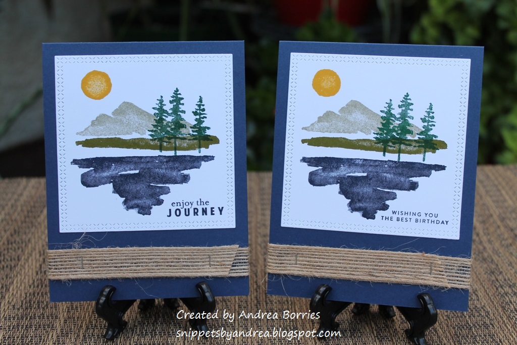
Stamps: A Touch of Ink
Paper: Whisper White, Crumb Cake, Early Espresso card stock; Wood Textures Designer Series Paper (DSP) Stack
Ink: Memento Tuxedo Black, Pumpkin Pie, Cajun Craze, Pear Pizzazz, Old Olive, Mossy Meadow, Crumb Cake
Accessories: Halloween Night Enamel Dots, Natural Trim Ribbon, Burlap Ribbon, Birthday Cheer dies (Honey Bee Stamps), Happy Birthday die (Avery Elle), Tiny Attacher (Tim Holtz), foam tape (3M)
I know butterfly images are often associated with feminine cards, but that seems silly -- butterflies are just insects, after all. So I challenged myself to make a couple of masculine cards with butterfly images. I think the style of this stamp set worked well for that challenge because the images aren't too delicate or ornate.
For the stamped layers, I used one half-sheet of white card stock and covered it with the butterfly, leaves, and splatter images. When I stamped the "filler" images for the leaves and butterflies, I used markers to apply the ink so I could get some shading. It's hard to tell on the leaves (the lighter part of the leaves is actually part of the stamp, so I probably could have just used one color with those), but you can definitely see the two shades on the butterfly wings.
For the rest of the cards I focused on neutral colors, woodgrain patterns, and word dies that didn't have a lot of flourish. I think all of those elements work together to create a couple of great masculine cards.
Supplies:
Stamps: You're a Fungi (Hero Arts)
Paper: River Rock, Very Vanilla card stock (Stampin' Up!)
Ink: River Rock (Stampin' Up!), Chocolate Truffle amalgam ink (Gina K Designs)
Accessories: Wonky Stitched Circles dies (My Favorite Things), Burlap Ribbon (Stampin' Up!), Tiny Attached (Tim Holtz), Neutrals Candy Dots (Stampin' Up!), sponge (Stampin' Up!), foam tape (3M)
I love these mushroom images, and paired with the punny sentiment "You're a fungi!" they're perfect for a masculine card. Here are a couple of tips and tricks for this card:
-- To make the background, I positioned several of the mushroom images on a large acrylic block. Then I stamped all the images together a few times, rotating the block to change the orientation of the mushrooms. Much quicker than repeatedly stamping each individual image.
-- I love using a mini stapler to attach burlap ribbon for a couple of reasons. A) Regular adhesive can be visible between the fibers because burlap doesn't have a tight weave, and B) the metal adds an extra bit of texture and a masculine feel. On this card I used two staples crossing each other on each end of the ribbon; on one of the cards above I placed the staples parallel to each other for a different look.
Supplies:
Paper: Crumb Cake, Whisper White card stock (Stampin' Up!); On the Bright Side 6" x 6" paper pad (My Mind's Eye)
Accessories: Paper Layering Feather die (Hero Arts), Woodland Silhouettes I dies (Taylored Expressions), Layering Ovals dies (Stampin' Up!), Neutrals and Regals Candy Dots (Stampin' Up!), linen thread (Stampin' Up!), foam tape (3M), Art Glitter Glue (Art Institute Glitter)
I made these two cards a long time ago, so I'm a little fuzzy on the exact details. I know I started with a paper pack that had this fun chevron print in several colors. I cut strips of each color and then did my best to line up the different strips so the chevrons appear continuous. (I think I was a little more successful with the card on the left.) I attached the strips of patterned paper to a piece of copy paper so I was able to just trim the edges and adhere it to the card base instead of trying to get the proper placement directly on the card.
For the card on the left, I used a die to cut an oval out of the patterned papers, and then I glued a white die-cut oval inside the opening. For the card on the right, I just adhered a Crumb Cake die-cut oval on top of the patterned paper. Then I added a die-cut deer silhouette to one card and two feathers to the other and finished each card with a few enamel dots.
I had a bit of the patterned paper "mash up" left over, so I added a strip to two panels of white card stock. I stamped sentiments on the panels and then adhered them inside the cards. (Unfortunately I didn't jot down where these sentiments are from, so I don't have that in the supply list. Sorry!)
Supplies:
Stamps: Stunning Silhouettes (Raisin Boat), Field Notes (Taylored Expressions)
Paper: Early Espresso, Old Olive card stock (Stampin' Up!)
Ink: Early Espresso (Stampin' Up!), Distress Oxide inks (Ranger)
Accessories: Beautiful Wings Embosslit (Stampin' Up!), Stitched Frame Stacklets dies (Taylored Expressions), Clear Drip Drops (Taylored Expressions), Art Glitter Glue (Art Institute)
This card started with the background layer, which I made at least two years ago and found in my box of bits and pieces. It was one of my early creations when I first tried using Distress Oxide inks. I don't know which exact colors I used, but it seemed perfect for a nature-y masculine card.
I wanted a silhouette image, so I stamped a few cattails along the bottom of the panel using Early Espresso ink. I die cut an Old Olive stitched frame and glued it to the panel. Then I stamped the sentiment in the upper right quadrant and attached the piece to an Early Espresso card base. To add just a bit of embellishment, I added three clear droplets (I like to think of them as rain or dew on nature-themed cards) and a tiny die-cut/embossed butterfly. (Hey! Look at that -- another butterfly on a "guy card"!)
I hope these cards give you some ideas for masculine cards. And I hope to be back soon with another post. Lately it seems like whenever I think I'll be able to get back to a more regular blog-posting schedule, something happens that throws everything off. So thanks for sticking around and stopping by today!
Wednesday, April 7, 2021
Easy technique for multicolored stamp images
I'm still having a hard time focusing on card making, so I'm going to work on sharing some cards I made a while back and never posted. For today, here is a clean and simple, gender-neutral card that you could use for any occasion.
Supplies (all Stampin' Up! unless otherwise noted):Stamps: All the Good Things, By the Bay
Paper: Whisper White, Pool Party card stock
Ink: Pumpkin Pie, Basic Black
Accessories: Layering Circles dies, blue sequins (Paper Pumpkin leftovers), Corner Chomper (We R Memory Keepers), foam tape (3M), Art Glitter Glue (Art Institute)
I love that this card focuses on stamping -- with a little twist. I think these multicolored koi look pretty realistic, and it's so easy to create this look. Just ink the stamp in the main color (I used Pumpkin Pie) and then, using a marker, randomly scribble black spots on the stamp. That's it! When you stamp the image on paper, you have a fun multicolored koi fish. This technique would be great for a variety of images, such as butterflies, flowers, balloons, and even "chunky" sentiment stamps.
To make the focal layer for this card, I used white card stock and repeatedly inked, colored, and stamped the large and small koi fish images until I was happy with the arrangement. (I did clean the stamp after each impression so my ink pad didn't end up with black spots.) I rounded two opposite corners of the white card stock to mimic the curve of the fish and then mounted it on a Pool Party card base. I die cut the sentiment with a circle die, added a Pool Party circle to the back, and adhered it to the card base with foam tape. I finished the card with a few light blue sequins, which reminded me of bubbles in a pond.
Here's another tip I shared a couple of years ago, but I think it's a good reminder. If you have a stamp that contains multiple images, you can cut it apart and use them separately. (Really! I promise nothing bad will happen.) The large koi image I used for this card was actually on one stamp with a sentiment. I liked the sentiment, but I wanted to be able to use the fish separately without having to mask the sentiment every time. So I did a little stamp surgery by carefully slicing apart the stamp (I have this set in cling-mounted red rubber). I made sure to pull the blade without using a sawing motion, and I didn't worry about having a perfectly straight cut. In fact, it helps if it's a little imperfect -- then if I do want to use the two parts together, I can just join them up like puzzle pieces before attaching them to a clear block. (I haven't tested this process yet with clear photopolymer or acrylic stamps. You can certainly cut those apart; I'm just not sure how easy it would be to match the pieces back together since those materials are more pliable than rubber.)
That's it for me today. My bright spot this week is that I finally have my first appointment for the COVID-19 vaccine on Friday afternoon. Yippee! I know I will still need to be careful, wear a mask, etc., but it will be good to have one worry eased a little bit. I hope you are having a happy, healthy week. Thanks for stopping by!