The batch of cards I'm sharing today was definitely the most time-consuming of the gel-print cards I made this time around. But I think they were worth the effort.

For these cards, I used various gel prints to make all the parts of the underwater scenes. I chose one main print for the background/water for each card, cut it with a stitched rectangle die, and adhered it to a white card base. To create the sand I tore a brown gel print into wide strips and cut the bottom and sides of each stripe with the stitched rectangle die so it would match the stitching on the background. Then I used bits and pieces left over from a variety of other gel prints to create fish, kelp, coral, and seashells with the School of Fish die (Memory Box) and the Build-a-Scene - Underwater dies (Taylored Expressions). I even used a gel print to make the sentiment strip. I played around until I was happy with the arrangement and then glued everything down. I finished with some sequins to create the look of bubbles.

I don't usually stamp directly on the gel prints because they have a rough texture. But I wanted to stamp some little schools of fish in the background to add more depth. I tried Distress Oxide inks (Faded Jeans and Broken China) and VersaFine (Onyx Black). All of the inks worked, but I did notice that the images stamped with Distress Oxides got sort of blurry as they dried, as if the ink was bleeding. Luckily that was fine for these cards -- it's sort of an underwater effect, which is perfect.
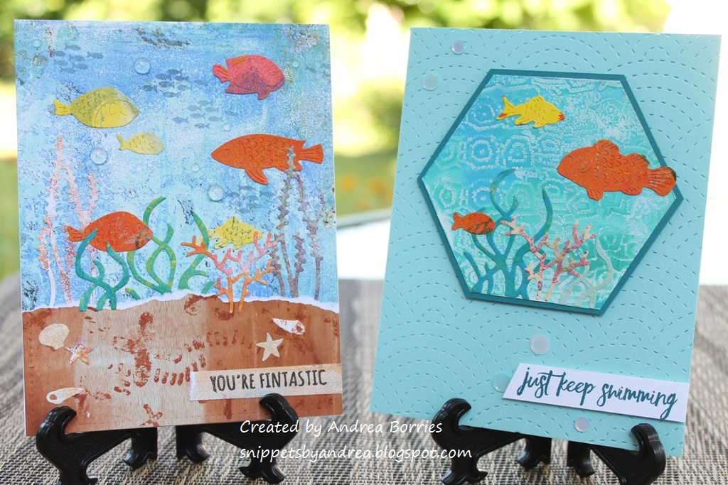
I made one more card like the first two, although I did change the sentiment, and then I tried a different card layout. I have a set of small, shaped gel presses, and one of them is a hexagon. I had a hexagon print that looked like it would make a good underwater scene, so I trimmed off the extra paper, matted it with blue-green card stock, and then trimmed down the mat. I added the die-cut pieces and set the piece aside to work on the card base. I chose light aqua card stock and die cut the card front with the Fanfare Cutting Plate (Taylored Expressions) on the card front. The pattern reminds me of scales or waves, and I think it adds a nice, subtle detail. I used foam tape to attach the focal piece and a sentiment strip, and I finished the card with clear sequins.
Thanks for stopping by!

There's something 'fishy' going on here! Love all the different colours! These would make great cards for males! I always struggle with those :-( I must remember this idea.
ReplyDeleteSunshine.
Oops, I forgot something! On the first two cards, the one on the right, did you tear the aqua coloured card to get the white line? It looks like a wave breaking on the sand! Very impressive! I also see it on the last photo on the card on the left. However you did it, it looks great! Another tip I must remember!
ReplyDeleteSunshine.
Thanks, Sunshine! The white line is from tearing the brown gel print. You can kind of see on the two cards next to each other that the top edge of the “sand” on one card would match up with the top edge on the other card. So one piece had the white edge and the other one didn’t. Hope that makes sense.🙂
Delete